
This logo is from FareShare; a charity based in Hull & Humber. They take quality, in date food that would have otherwise gone to waste and redistribute it to charities, schools and community groups across Hull and Humber, who then cook the food and redistribute it to vulnerable people (FareShare, 2019).
Conceptual design is important, especially in relation to charities as it can give the intended audience a vague insight into what they do and can generate further interest for the right audience. As you can see in the logo, they have used conceptual design to portray a hand holding an apple within their design. This could represent the charities mission of taking the current issue of food waste and aiding the issues surrounding feeding those in poverty.
The hand within the image of the apple is to portray them giving food to those who need it and gives their audience a vague insight into what they do, even if they have not heard of them before. The apple can also be seen as a symbol for good health as evidenced in the phrase “an apple a day keeps the doctor away”. The graphic designer for this charity may have used the apple to show that this charity can bring good health to the people they help. By using a large red font for the word ‘FareShare’ it gives the sense of urgency compared to the muted colour green they have used.

This charity works to aid in the moral and mental improvement of offenders in the Hull and Humber area, by offering services in education and rehabilitation. They offer assistance to offenders to attempt to prevent reoffending in the future, through local projects that aid in reintroduction to society (Humbercare, 2021).
Conceptual design has not been used within this design and it can be questioned as to how relevant the image of the butterfly can apply to this charity or their message. Although attempt has been made to make the word ‘humbercare’ stand out with the white outline, it could be argued that unless shown on a dark background, it is significantly less effective. By using conceptual design to convey their message it could entice a new, relevant audience to gain interest in their cause.
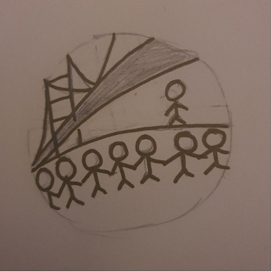
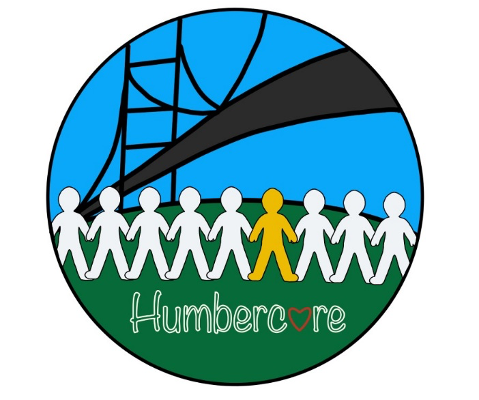
The redesign of this logo includes a basic image of the Humber bridge to give indication of the area the charity covers and uses the basic shape of a person to attempt to represent society, with the previous offender in yellow to represent them re-joining society. The colour yellow has been used to symbolise hope and positivity (vistaprint, 2019). By using this colour to represent the offender re-joining society it is giving the message of hope and positivity that this charity attempts to give the offender with their work. The red heart in place of the ‘a’ in Humbercare is to attempt to push the values of care that this charity holds and by using the colour red it draws the eye to the care section of the charity name. It has been attempted to draw attention to the yellow figure by using a less bold font and keeping the figure relatively central to the design.
References
FareShare (2019) How we work. Available online: https://faresharehullhumber.org/how-we-work. [accessed 05.10.2021].
Humbercare (2021) who are Humbercare?. Available online: https://www.humbercare.org.uk/about.php [accessed 06.10.2021]
Verywellmind (2021) The colour psychology of green. Available online: https://www.verywellmind.com/color-psychology-green-2795817 [accessed 05.10.2021]
Vistaprint (2019) colour meanings and the art of using colour symbolism. Available online: https://99designs.co.uk/blog/tips/color-meanings/ [accessed 07.10.2021]