Typography is the way that designers and artists arrange words, letters, and text to portray visual communication. This can be done through several means, such as font, size, kerning, arrangement, leading or tracking. Using typography, a designer can control what text the reader is likely to see first and in what order. Designs that use typography can also include images and are not limited to the use of text; but it is also important that emphasis is not placed on too many areas at once, as it will confuse the eye and detract from the concept (Dabner et al., 2020).
Change for life is a government run campaign within England that aims to provide support to families to encourage a healthier lifestyle. Established in 2009, the campaign followed the government’s healthy weight, healthy lives strategy to promote healthy living (Change for life, 2009).
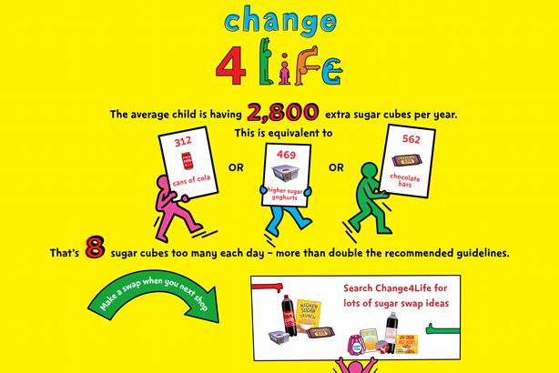
In terms of typography this design highlights the most important aspects of their message to give the audience a basic understanding as to what the purpose of the poster is. The statistics have the numbers in red and in a larger type to emphasize them and they are in the colour red which can indicate something negative. This design places emphasis in the right areas, but also not so much emphasis in the poster that it detracts attention. This design also uses imagery in their design, which makes it easier for the message to be received. For example within the word ‘life’ in change 4 life, they have created it using images of people being active, which relates to their cause. They have also included images within their facts in the centre, which is on boards held by stick figures. By doing this they have made their message clear and easy to understand.
The font and colours used looks almost child-like which can be confusing as the target audience for this company is parents. By using this font, it could cause confusion and attract attention from the wrong audience.
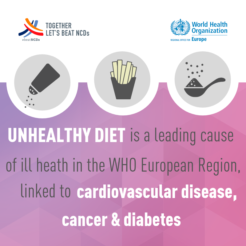
This is an advert put together by the World Health Organisation to raise awareness of the impact an unhealthy diet can have on the body. This could be seen as an example of bad typography because although attempt has been made to emphasize key words within the text, the kerning could seem a little off in places and colours used do not give the impression of any urgency with the message. It seems as if the advert does not draw the eye to any particular area of the poster and it unlikely to be memorable.
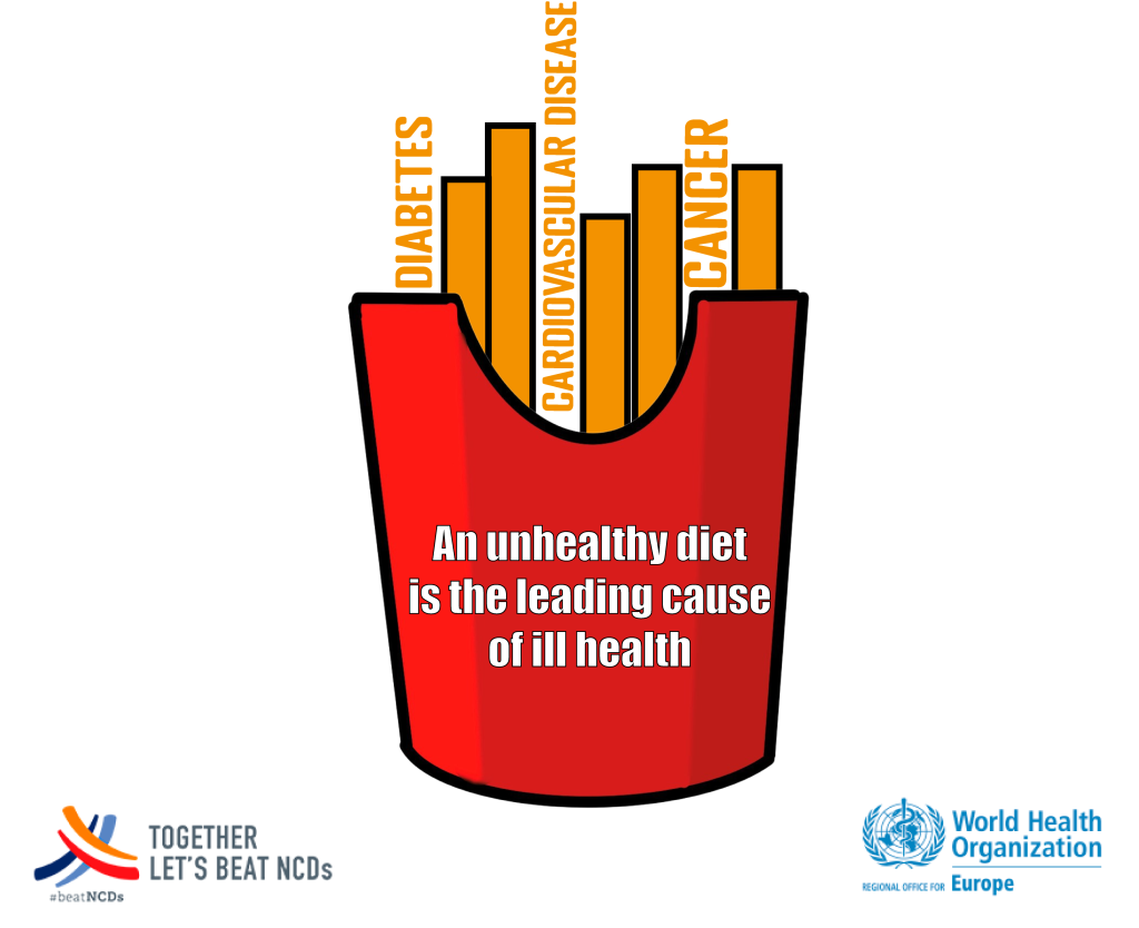
By definition typography must convey a message, even if the message is not entirely clear by words alone (Dabner et al., 2020). By using the words initially attempted to highlight in the previous design, and using them to create the imagery of fries; or an unhealthy diet, it gives the words meaning that is easy to understand from a glance. The colour red has been used to indicate both a negative subject matter and to point towards a major fast food distributor that also uses the colour red. The yellow colour was made using orange tones to contrast with the red allowing the typography to stand out and to get a message across.
References
Change4life (2019) About change4life. Available online: https://www.nhs.uk/change4life/about-change4life [accessed 11.10.2021]
Dabner, D. & Stewart, S. & Vickress, A. (2020) Graphic Design School. London: Thames & Hudson.