Graphic standards provide a simple set of rules that are to be followed in branding for graphic design, which covers colour, composition, and typography.
Keeping the branding as close to the logo as possible is very important for Rooted in Hull. Rooted in Hull took six months to get this logo approved and it incorporates the focus of the business very well. The logo shows a root/plant in the centre with the containers that they use to grow their produce surrounding the root/plant. The following graphic standards have been created for Rooted in Hull.

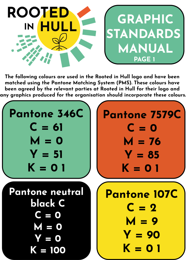
The first page covers colour for Rooted in Hull. The colours used in pantone format were found using adobe illustrator, by converting the format of the colour swatches to pantone solid coated. Although these are the main colours that should be used, a muted colour such as grey or a warmer shade of white could be used subject to the approval of the organisation.

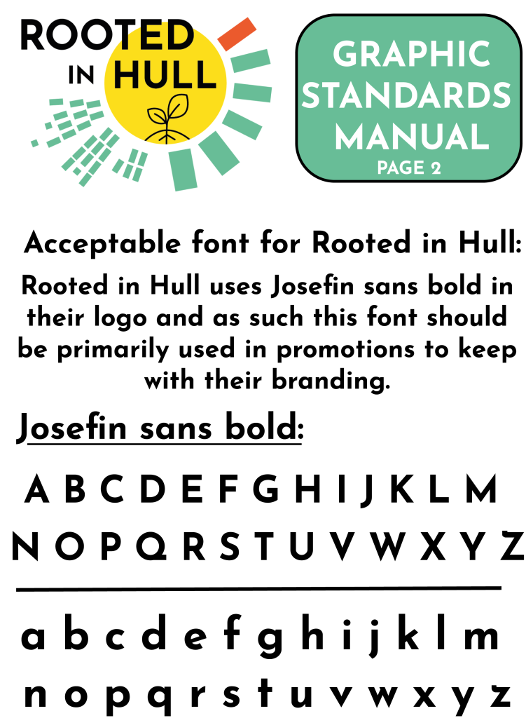
From researching different fonts to find the one Rooted in Hull used, the Josefin sans bold was the most similar, being identical to the one shown in the logo. It would be best practice to use this font when creating for Rooted in Hull to keep designs familiar for both them and their customers.

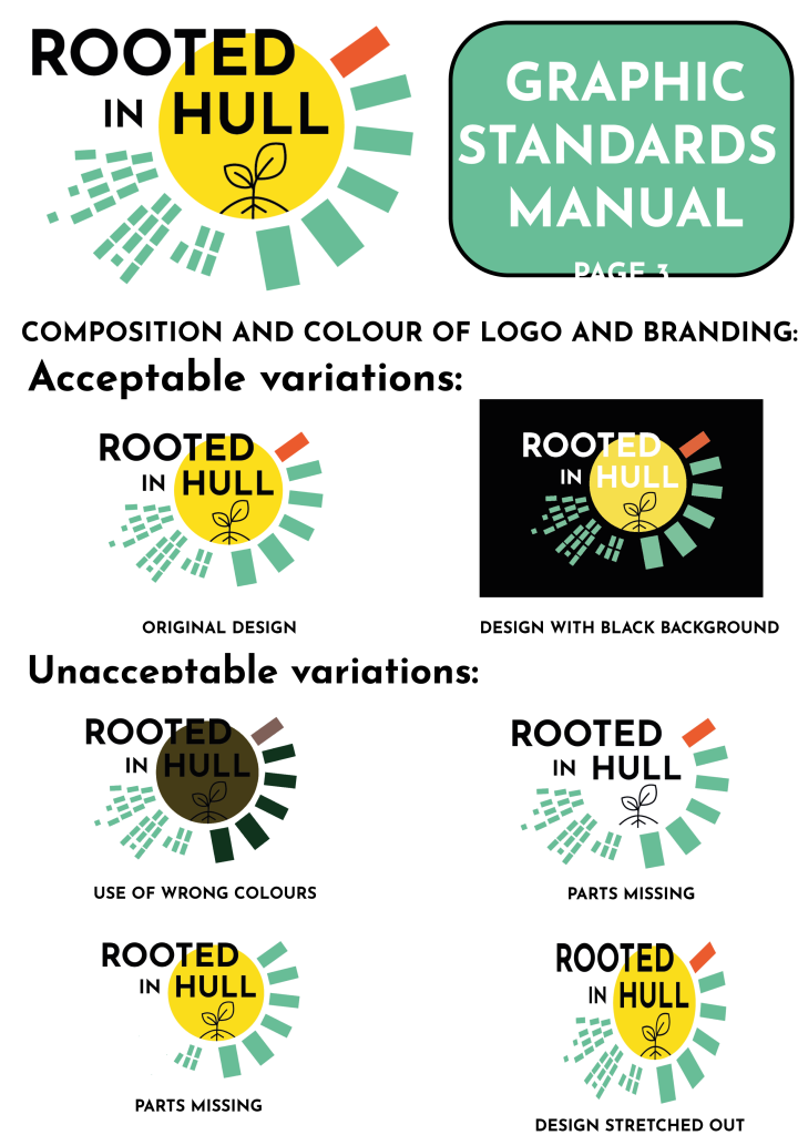
The third pages covers the composition and colour for using the Rooted in Hull logo. It is acceptable to have 2 variation of the logo to suit a black and a white background, but any variation with the use of wrong colours, missing parts, or with the design stretched out is unacceptable.