Following receipt of the email from Adrian of Rooted in Hull, containing the client brief for their bakery, the following logo has been created.
In the brief the client asked for use of the hammer and sickle to portray community. For this logo the sickle has been made to look like a pizza tray for an oven and part of an image from adobe stock has been used of a pizza (Adobe Stock, n.d.) by use of a clipping mask on Adobe Illustrator. The hammer has still been used so the logo has a sense of community and also shows the audience what the purpose of the bakery is. The name “Rooted in Pizza” has been chosen to keep with the Rooted in Hull theme.
This design combines the logo for Rooted in Hull and a new design for the bakery to create an alternate for the client. The design centres around a pizza cutter to make it obvious what the purpose of the bakery is and it uses the same font as the Rooted in Hull logo.
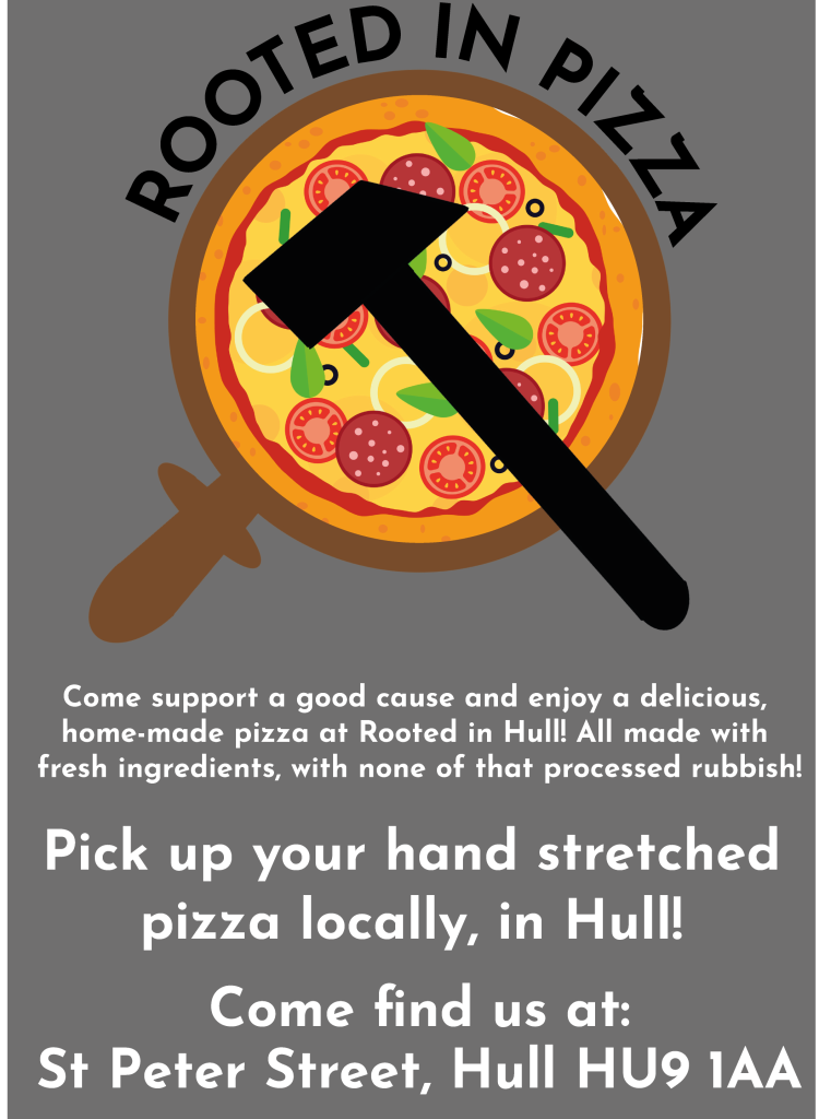
This leaflet was created with the client brief in mind. It incorporates Rooted in Hull’s values by mentioning the good cause and also uses white on grey with the logo in an attempt to “keep it edgy” as requested in the email from Adrian Fisher.
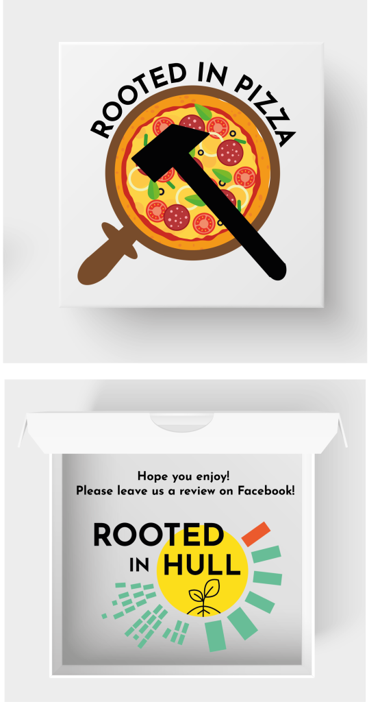
The pizza box branding incorporates the logo created to the client’s brief on the front and the logo for Rooted in Hull on the inside of the box to show their connection. The customer is reminded following consumption of their pizza to leave a review on Rooted in Hull’s Facebook page in an attempt to increase their social media following through recommendation.
References:
Rooted in Hull logo: Rooted in Hull (n.d.) Available at: www.rootedinhull.org.uk [Accessed 05.04.2022]
Adobe Stock (n.d.) Available at: https://stock.adobe.com/uk/images/whole-and-chopped-pizza-icon-vector-collection-on-white-background/298726375?prev_url=detail [Accessed 17.04.2022]