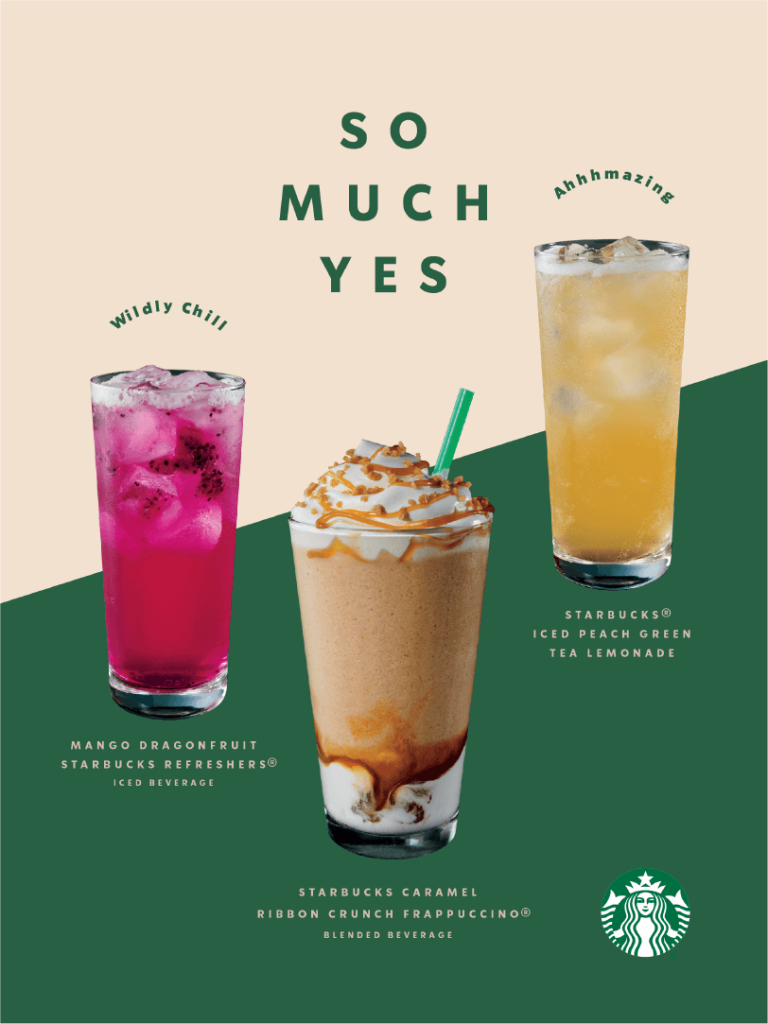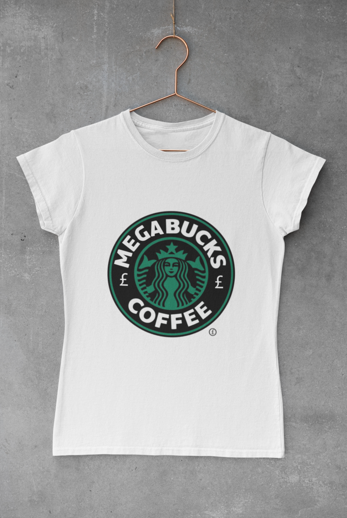
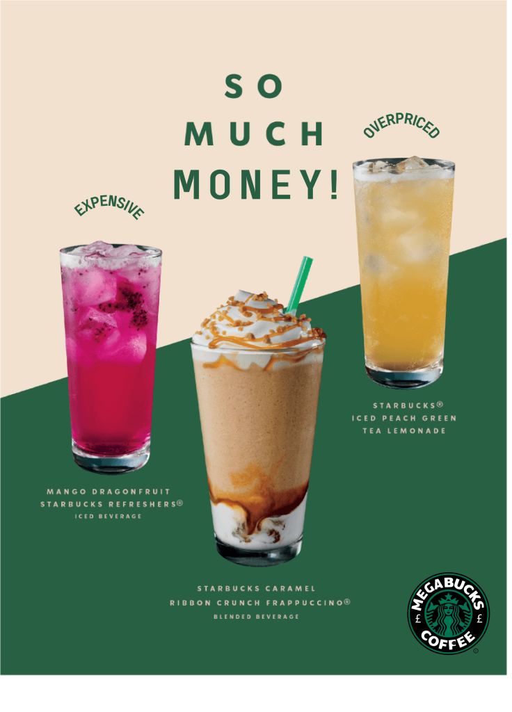
For this brief it was asked to satirise a logo and to hijack one of their adverts. For this starbucks, was changed to megabucks to signify their high prices. The colour green was used to symbolise money and pound signs were added. This was then put onto a t shirt template on inkthreadable.co.uk. Following the redesign the hijacked advert now says “so much money” and expensive and overpriced rather than the original wording and the new logo added.