Following initial design for the app (shown above), it was desided a mood board would be created to reevaluate what the design of the app should incorporate. It was decided that this would be changed because, the colours used initially seemed to clash and didn’t connect to the festival at all. It was also noted that the design should be changed significantly, due to it having an amateur like appearance, and not relevant to the app being as a companion for while at the festival.
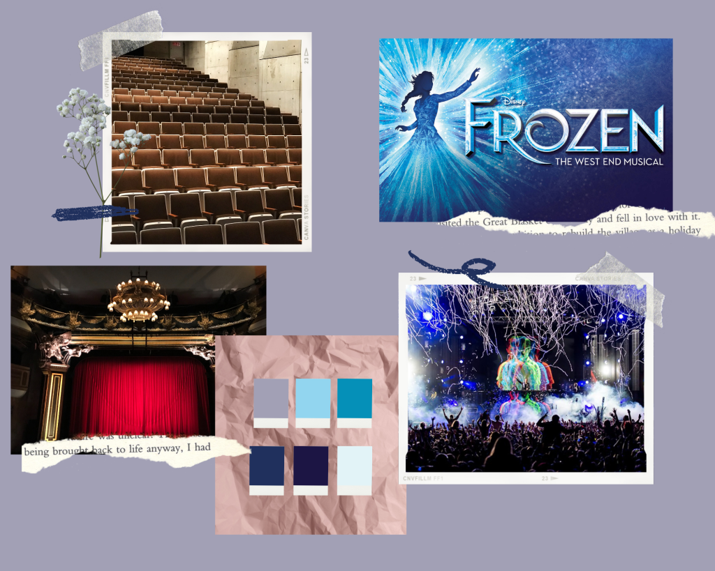
On the mood board it shows the main aspects of the festival that was wanted to be highlighted within the design for both the app and the website. One of the images is the poster for the headline act Frozen the musical. From this the colour scheme was created and this was used in the graphic standards manual (Post 5).
The mood board also includes an image from BBC Radio 1 Big Weekend 2017, which was held in Hull. This was included as it was decided that the event would be held in the same place as this event was; Burton Constable Hall.
The above is the onboarding for the app. The following is the reasons why this sequence was chosen and research on onboarding within apps.
With this app, users are likely to only use it a limited number of times, as it really only serves purpose while the user is attending the festival. This means the user will have a limited amount of time to learn how to use the app and are likely to be distracted upon first opening if they are already in attendance at the festival. Due to this it was decided that the app be kept as simple to navigate as possible with the onboarding screens showing how to use the app, rather than a lengthy log in/sign up process that they are likely to not have time for. It could be argued that if the user is likely to be on a time restraint then why have an onboarding process at all, but without at least a simple, yet relevant tutorial on how to use the app, then the user may struggle to navigate it and it could take them more time to understand the navigation this way rather than reading the tutorial. It’s also worth noting that it is not known whether the user has any difficulties in terms of learning or other problems that might make it difficult for them to navigate the app without instructions, and so by having an onboarding screen with clear instructions, it makes the app more likely to be accessible for all.
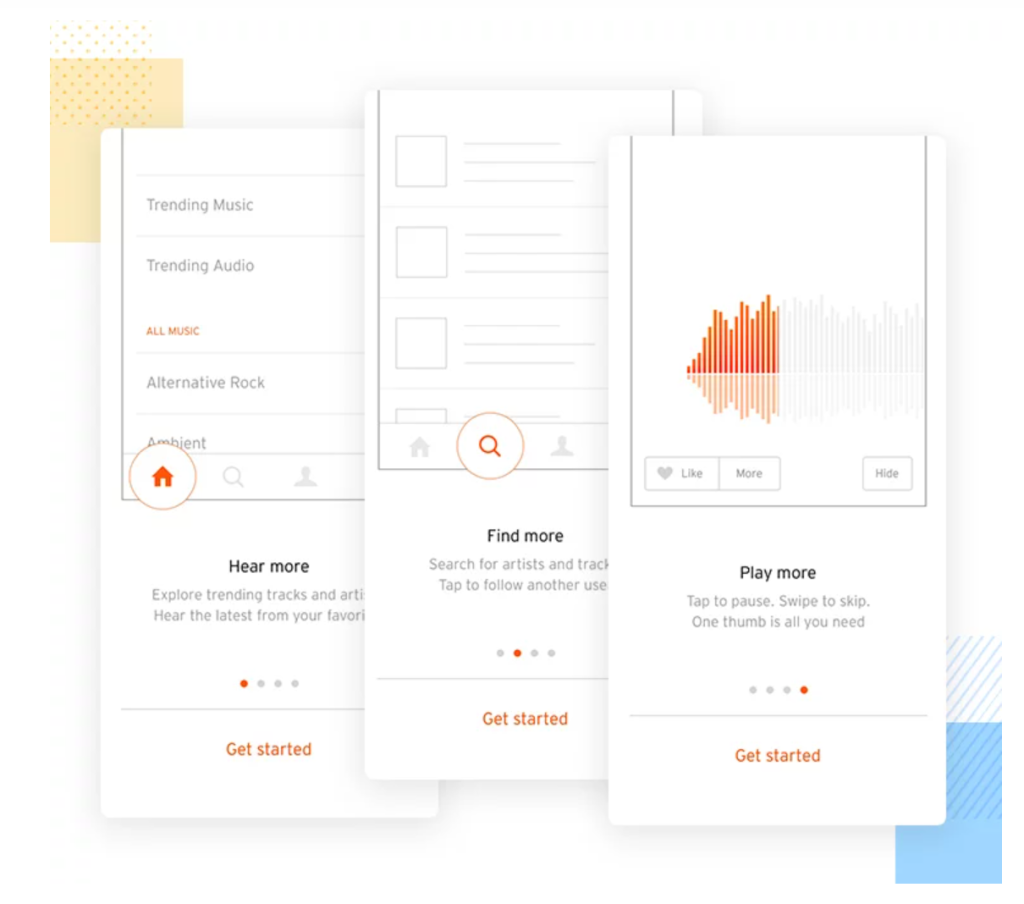

Onboarding for this app has taken inspiration from the images above, and uses an instructional process for the user. As seen in the images above, they are using dots to tell the user how many screens there are remaining of the onboarding, so they can see when they will be able to use the app. If there isn’t an indication as to when they will be able to access the app, the user could get bored and exit before even reaching the main app.
The onboarding uses swipe to go to the next step, which was made using the drag option in XD. It then ends with a timer on the second to last screen which then prompts a continue button to appear.
References:
Justinmind (2020), Mobile app onboarding: best practices and examples. Available online: https://www.justinmind.com/blog/app-onboarding/ [Accessed 07.09.2022].