This task was based upon responsive web design. By ensuring a webpage is responsive, it means that the webpage is accessible on desktop, tablet and mobile devices. Elementor, has a view for each of the devices, so you are able to look and see how the page will look on different devices without having to actually look on the devices themselves.
For the first part of this task, we were asked to open an Elementor page and name it ‘responsive’.
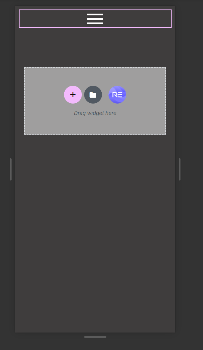
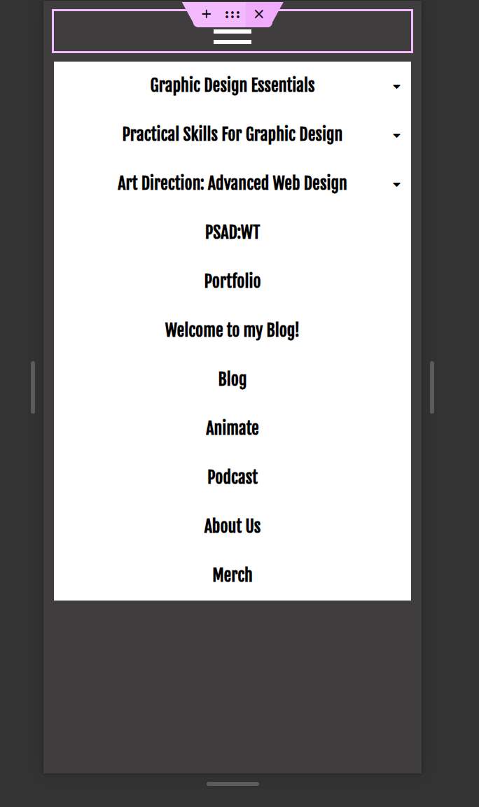
We were then told to add a ‘NAVMENU’, from Royal Addons, and practice using the hamburger menu in responsive mode.
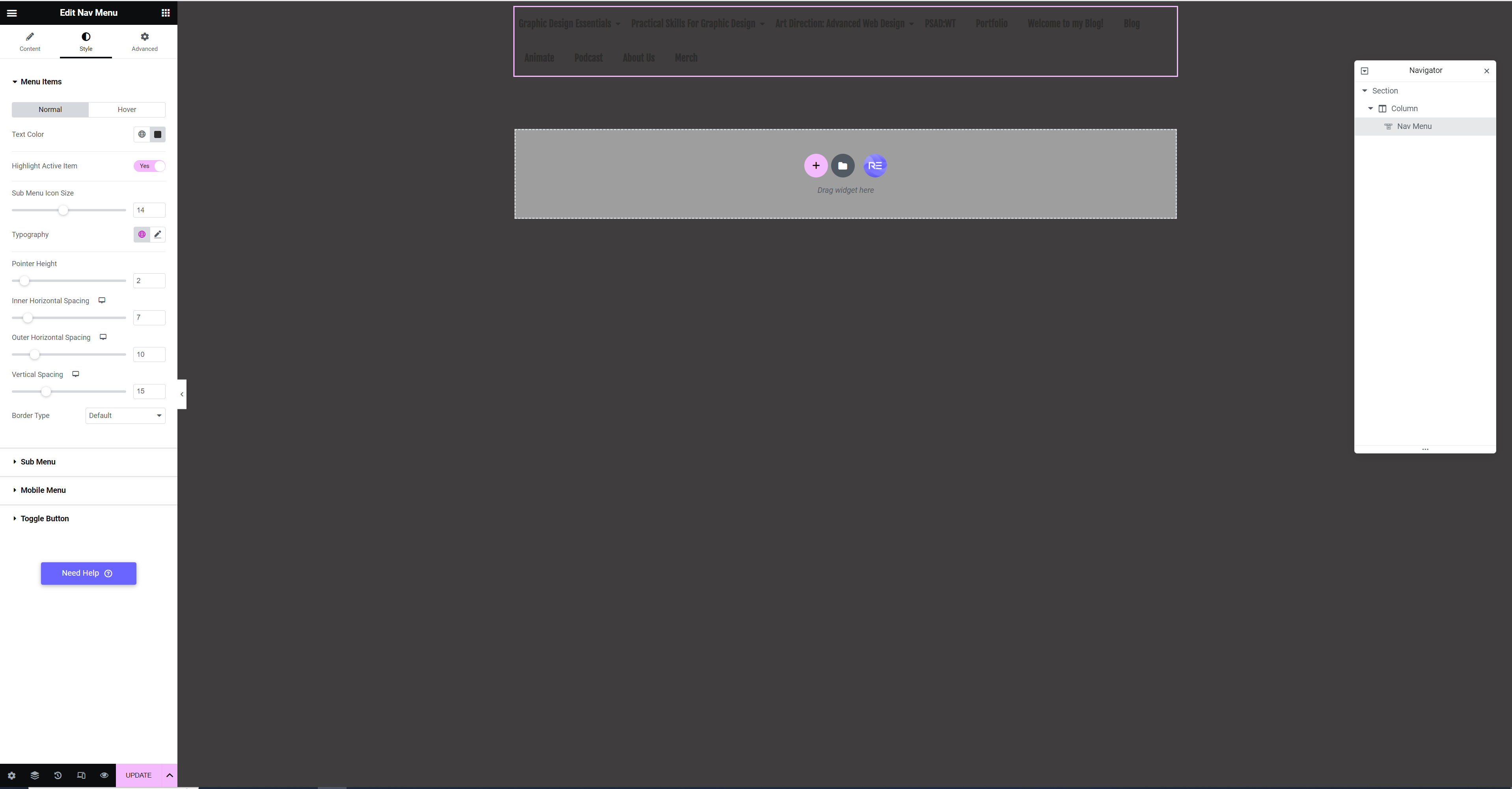
When I added the NAVMENU the typography colour was similar to my background colour so I changed it to white, so it was more easily seen.
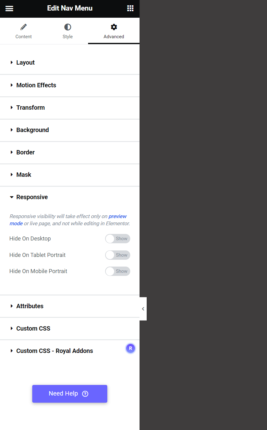
Elementor gives the option of hiding parts of the page when viewed on specific devices. For example, if you had an image that was suitable for desktop but not mobile or tablet, you could hide it on mobile and tablet.
From there we were asked to produce a webpage on the importance of being carbon neutral and ensure it is responsive. For this task I decided to do a simple landing page, that also works for mobile and tablet, using menu anchors. I have produced a screen recording of the site, with the parts not used for certain modes, greyed out.