For this task we were asked to look at a site that Chris Newell helped build many years ago: https://www.spellzone.com/.
We were asked to analyse the site and its onboarding process, while using Rolfe’s ‘What? So what? Now what?’ (fearlessculture.design, n.d.):
Do an analysis of the onboarding and the design of the pre login or registration part of the site:
Spellzone is an online learning platform that specialises in teaching spelling to a range of abilities, with the level being calculated at onboarding through data entry. By giving users a spelling test when they register to gauge their ability, it ensures that the site is accessible to more users by changing depending on ability. This allows users to improve their spelling through methods that are not too advanced for them, and in turn ensures more users can benefit from the website.
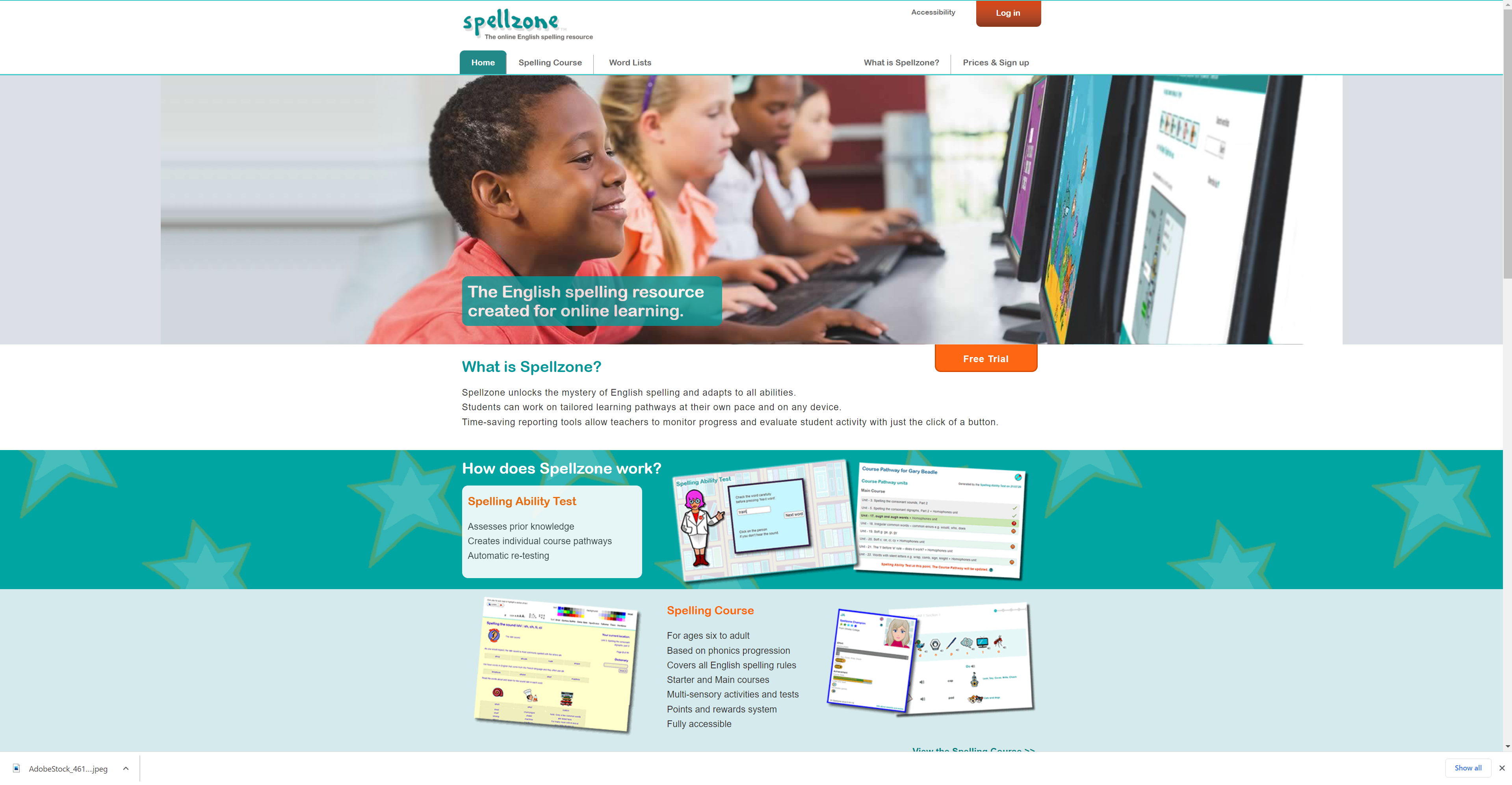
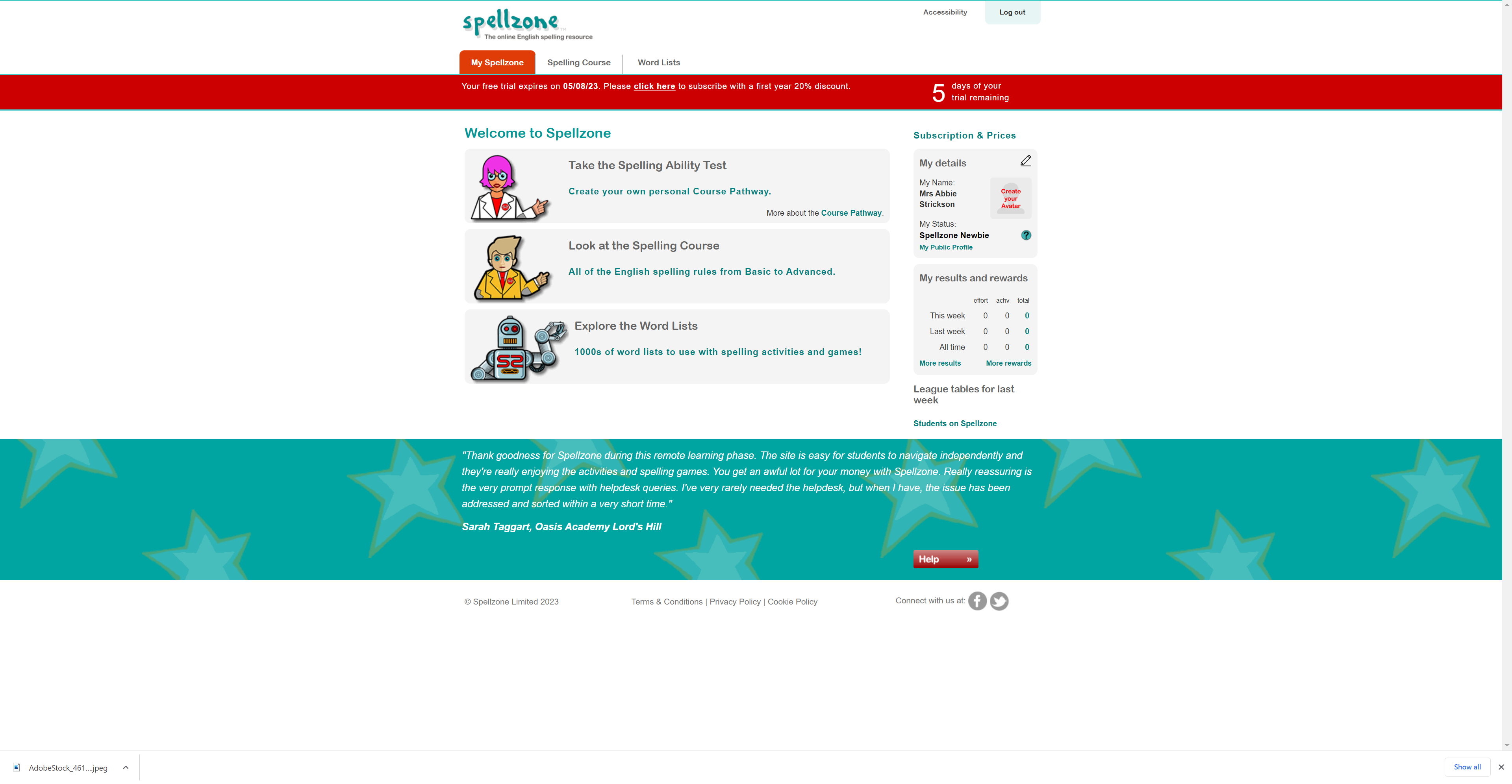
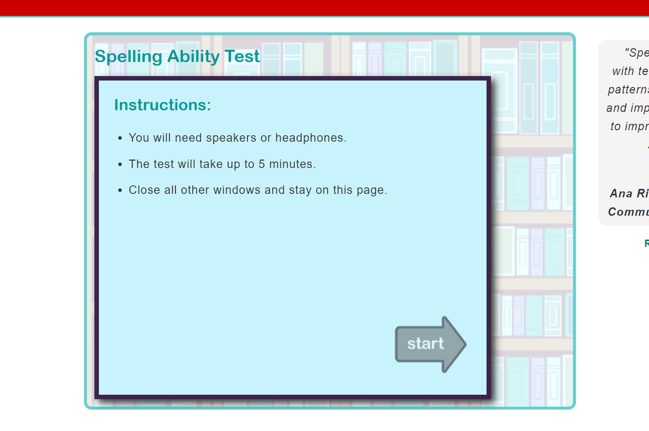
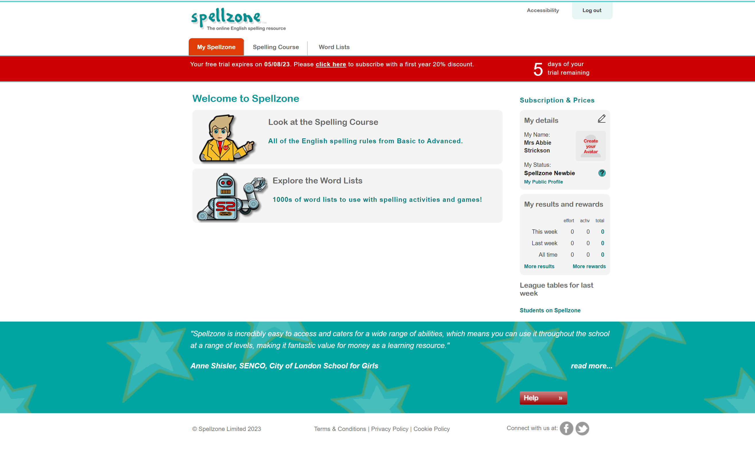
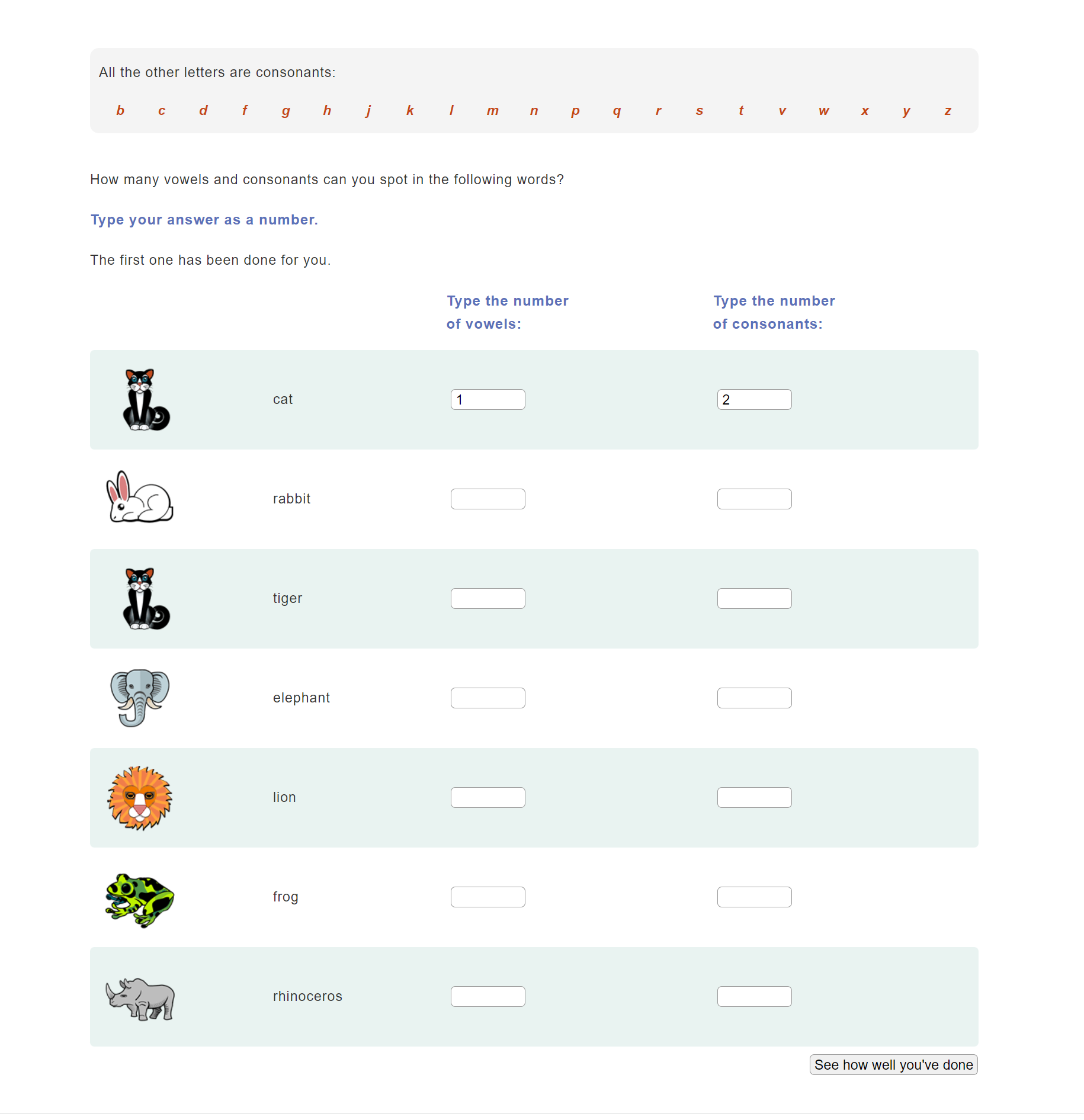
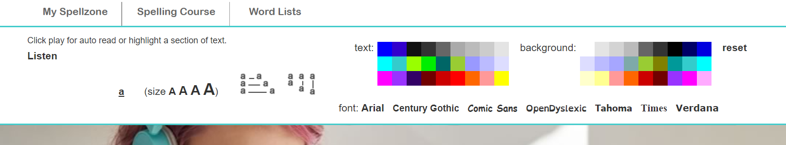
The onboarding process of creating a member log in and having the user take an ability test to customise their experience on the site, allows the user to get a more specific learning experience, making it easier for them to get appropriate spelling education. The site also has the option of being able to change the font size, colour and background depending on your accessibility needs, which makes the website even more accessible.
Do an analysis of the target market:
The target market for this website can be a range of ages, that need assistance or would like to improve their spelling. Due to the customisation of content depending on ability, the site is not limited to a certain group and is likely to be accessible to most.
Are there things that could be done to broaden the appeal to other markets and improve the user experience
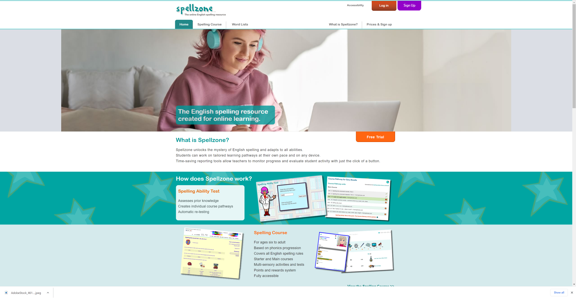
This website can be a little confusing in parts because from the homepage the majority of images show children in a learning environment, which may cause older people they could target to assume the site is only for children, when its customisable. This could limit the users willing to use/ pay for this site.
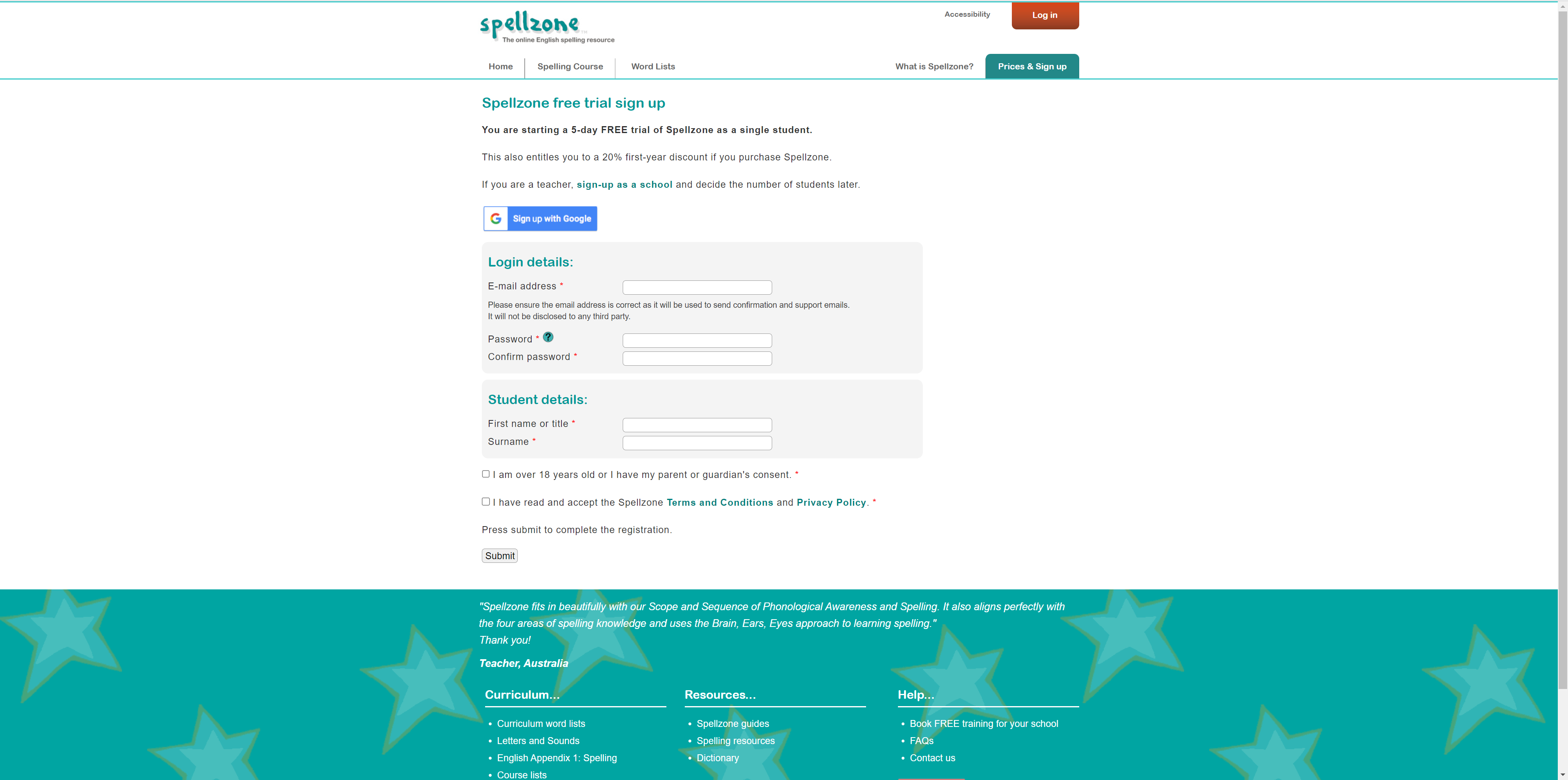
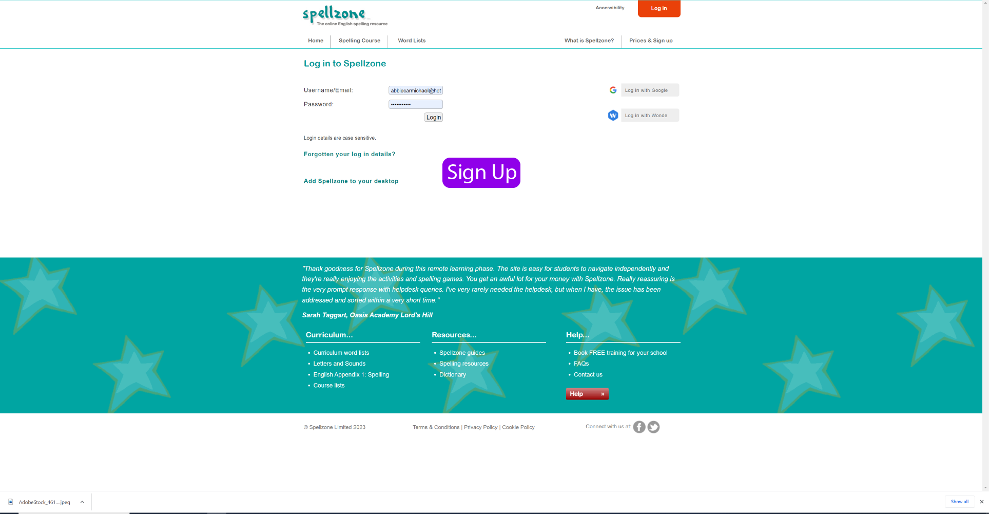
I also found it was not incredibly obvious where to sign up for the site and initially thought there was only the option to log in. To improve this, a link to sign up could be added to the log in page.
Work up some visuals to show your suggested enhancements.
Reference list
fearlessculture.design. (n.d.). What? So What? Now What? | By Gustavo Razzetti. [online] Available at: https://www.fearlessculture.design/blog-posts/what-so-what-now-what#:~:text=discover%20better%20solutions.-.