Over the years logos have gone from being an essential but at times uninspiring aspect of a business to being the intriguing, thought-provoking logos we associate with some of the biggest industry experts we see today (Silver, 2001).
For this assignment the brief is to create an energy drink for the over 60s with a clear brand, ending with a stop-motion animation that advertises our product.
The concept of the brand name for the energy drink is a play on the word ‘boomer’. According to the Cambridge Dictionary is “a person born during the period between approximately 1945 and 1965 following the Second World War, when there was a baby boom” (Cambridge Dictionary, 2023). This would cover the target audience for this task and because the target audience is people residing in the United Kingdom, the brand will be incorporating a comedy element to encourage people to buy this product as an impulse purchase or even a joke, but once tasted could become their new go-to drink.
According to Smashing Magazine, “A concept or “meaning” is usually behind an effective logo, and it communicates the intended message. A logo should be able to be printed at any size and, in most cases, be effective without color.” (Smashing Magazine, 2009). With this in mind the first draft of Boomer was created. The brand tries to encourage a feeling of nostalgia and use an old western theme with a bold font to make it clear to read.
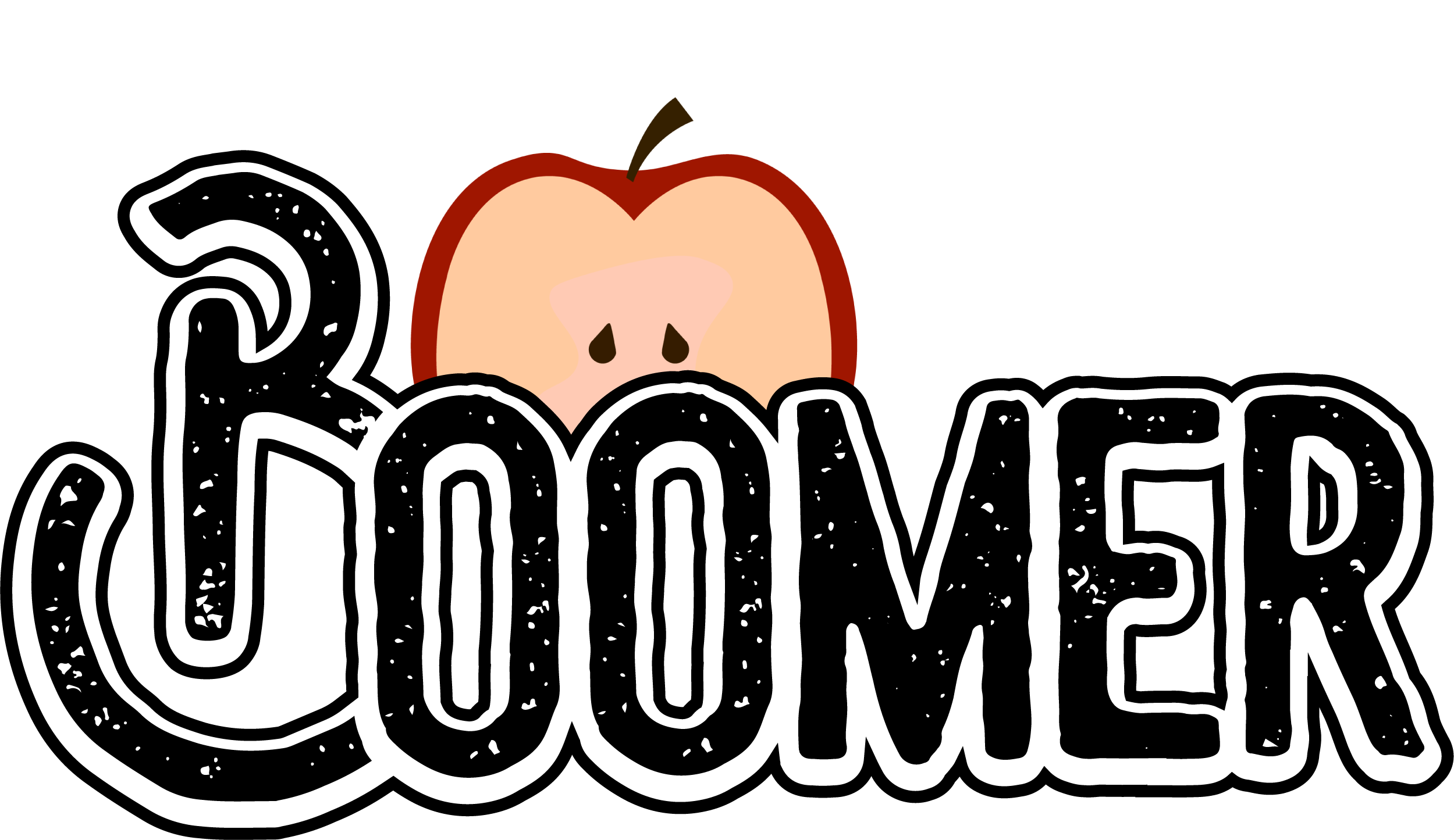
Following review and feedback on the first logo, it seemed clear that there was not a clear conceptual element to this logo and the design needed revising. After discussion with other students and Robert, it was mentioned that Boomer was going to be offered in five different flavours. It was then suggested that elements from each flavour could be used in place of the sun (So for the flavour orange, there would be half an orange rather than the sun). After receiving this suggestion, it was decided that this would be the best course of action for this logo and the logo was redesigned, with slight alterations depending on flavour.
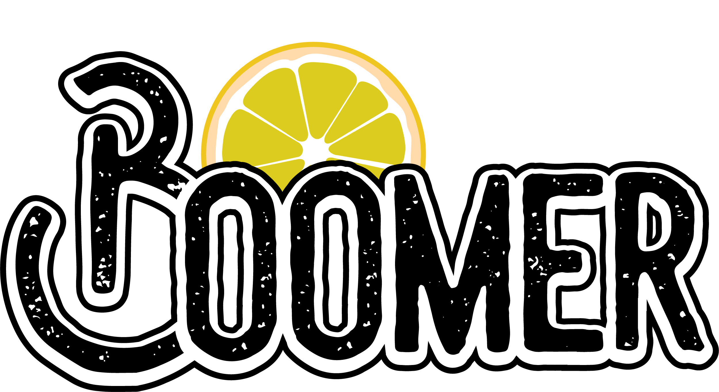

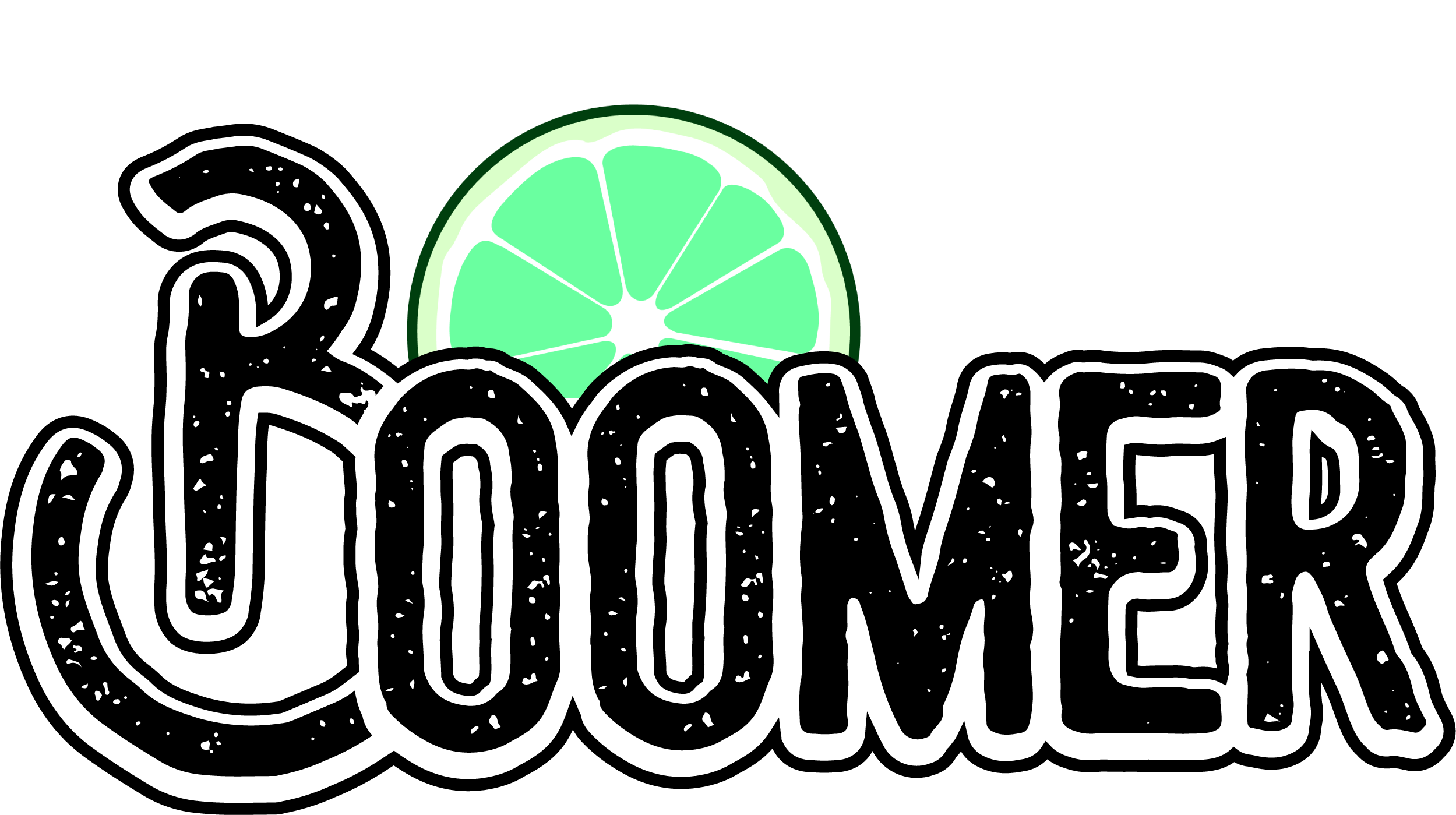
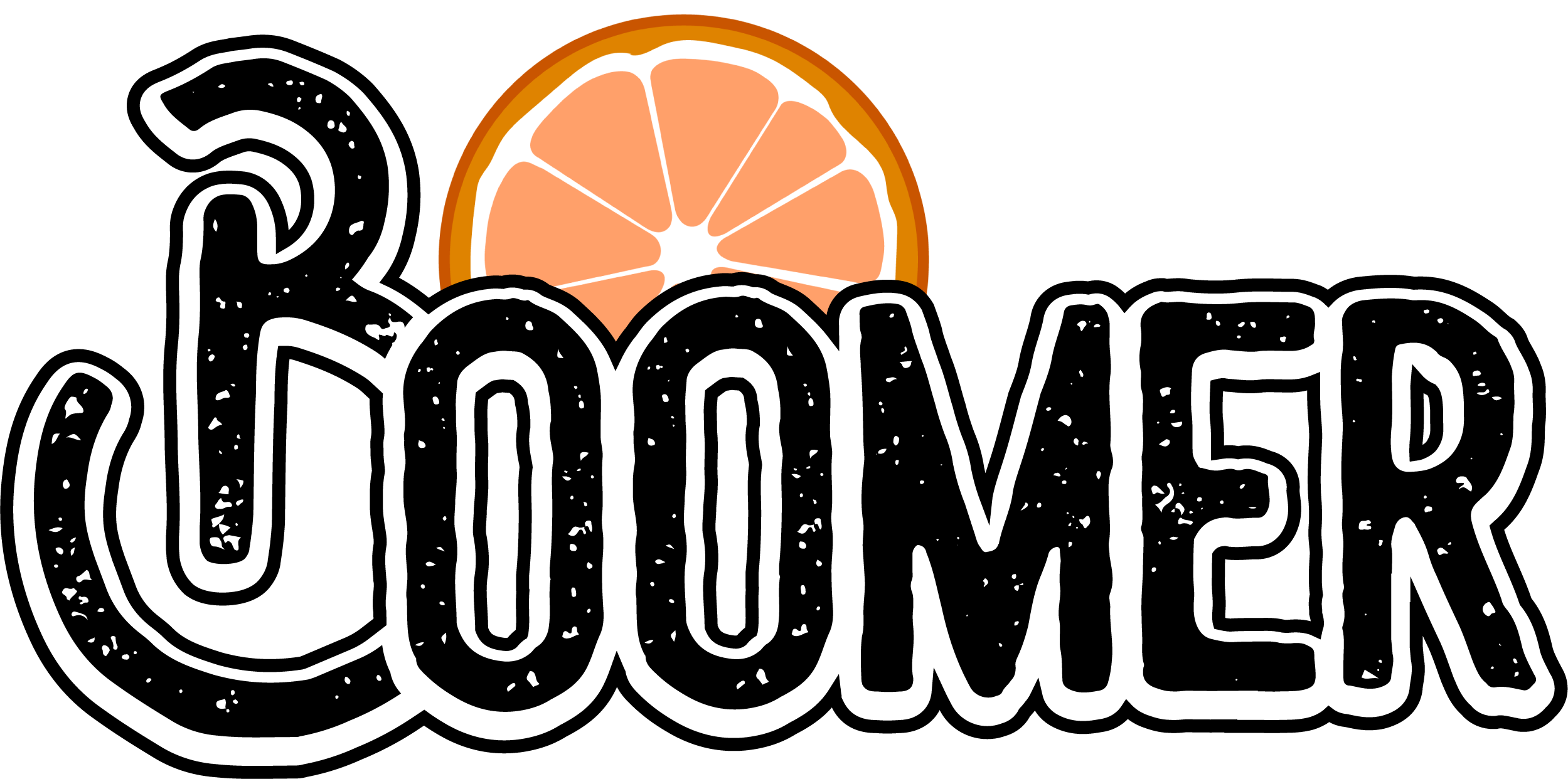
One of the logos was then edited to ensure it was still recognisable in black and white.

From looking at this revision of the logo(s) and from feedback in class, it appeared that the fruit not only didn’t quite represent the sun, but also wasn’t cohesive with the typography in the logo. It seemed the only way forward was to go back to the beginning and look at the first logo. The first logo seemed closer to the concept of Boomer than the revision, so it was then decided to try a similar concept to the original, but make the sun also represent an explosion (the boom in boomer).
For the final draft of boomer, it was attempted to make aspects of the logo more cohesive by using similar line work to the line work used in the typography and the outline. The final log is also conceptual because the lines could represent both the sun and an explosion.
Following this, it really showed the importance of teamwork in the creative industry and how even in previous assignments the final product/design is often one that has had input from other students or lecturers. The University of Silicon Valley discuss the importance of teamwork in their article and state “Of course, a team has a larger cumulative knowledge base across more minds with more ideas. Used effectively, this results in more condensed production processes. If the team is a well-organized one, this also ensures better productivity, often higher quality, more creative output, longer-lasting motivation, greater efficiency and faster delivery.” (University of Silicon Valley, 2017).
References:
Cambridge Dictionary (2023) Boomer. Available Online: https://dictionary.cambridge.org/dictionary/english/boomer
Silver, L (2001) Logo Design That Works. Gloucester: Rockport Publishers Inc.
Smashing Magazine (2009) Vital Tips for Effective Logo Design. Available Online: https://www.smashingmagazine.com/2009/08/vital-tips-for-effective-logo-design/#:~:text=What%20Makes%20A%20Good%20Logo,it%20communicates%20the%20intended%20message.
University of Silicon Valley (2017) The Importance of Collaboration and Teamwork in the Creative Industry. Available Online: https://usv.edu/blog/importance-collaboration-teamwork-creative-industry/