“One complaint that is common among older adults is that they seem to be more tired, more easily fatigued, and generally have less energy.” (Invigor Medical, 2020). With this considered, it seems strange that in terms of energy drinks there is very little out there marketed towards an older market, especially when they seem to be in need of energy the most. Which leaves the older market leaning towards products such as Berocca and caffeinated products such as coffee or tea.

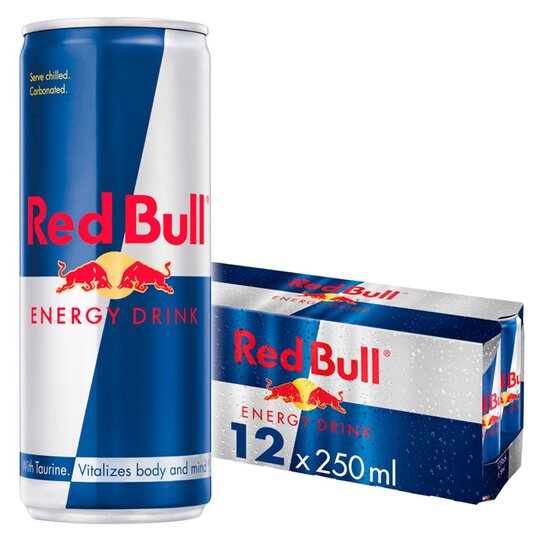
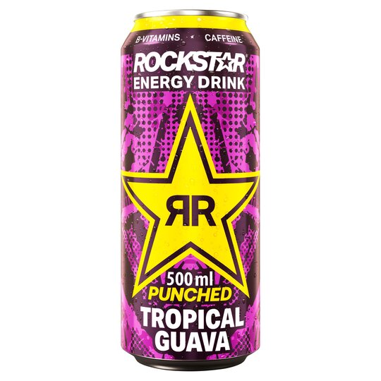
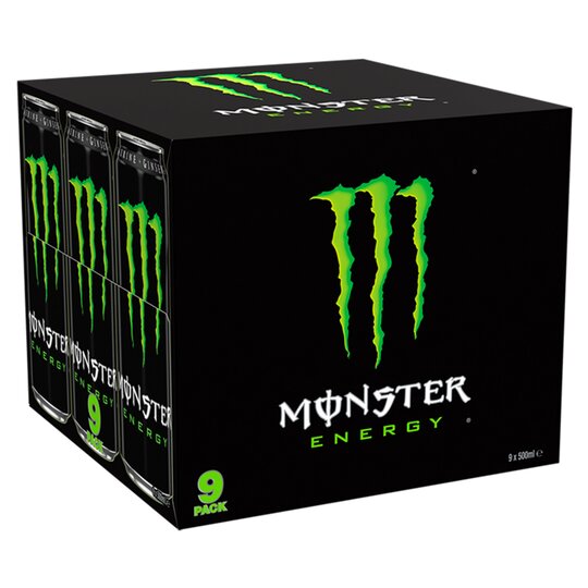
Unlike energy products targeted towards a younger audience, Berocca uses clear text, with a bright colour palette to bring in their audience. Today’s energy drinks have a very sharp, harsh style with colours that stand out to ensure they stand out in such a crowded market (Smith K., 2014). Colour can also impact emotion with the older audience, with white, brown, yellow, green, red and blue being especially popular with the older communities (Warner, C., 2017).
With the packaging for Boomer, it seemed important to try and not associate it with current brands in the energy drink industry to really try and get the attention of the intended audience. For the first draft of the packaging using the first draft of the logo, pastel colours were used to try and differentiate from the other energy drinks in the market, but it seemed to not quite hit the mark for the brand.
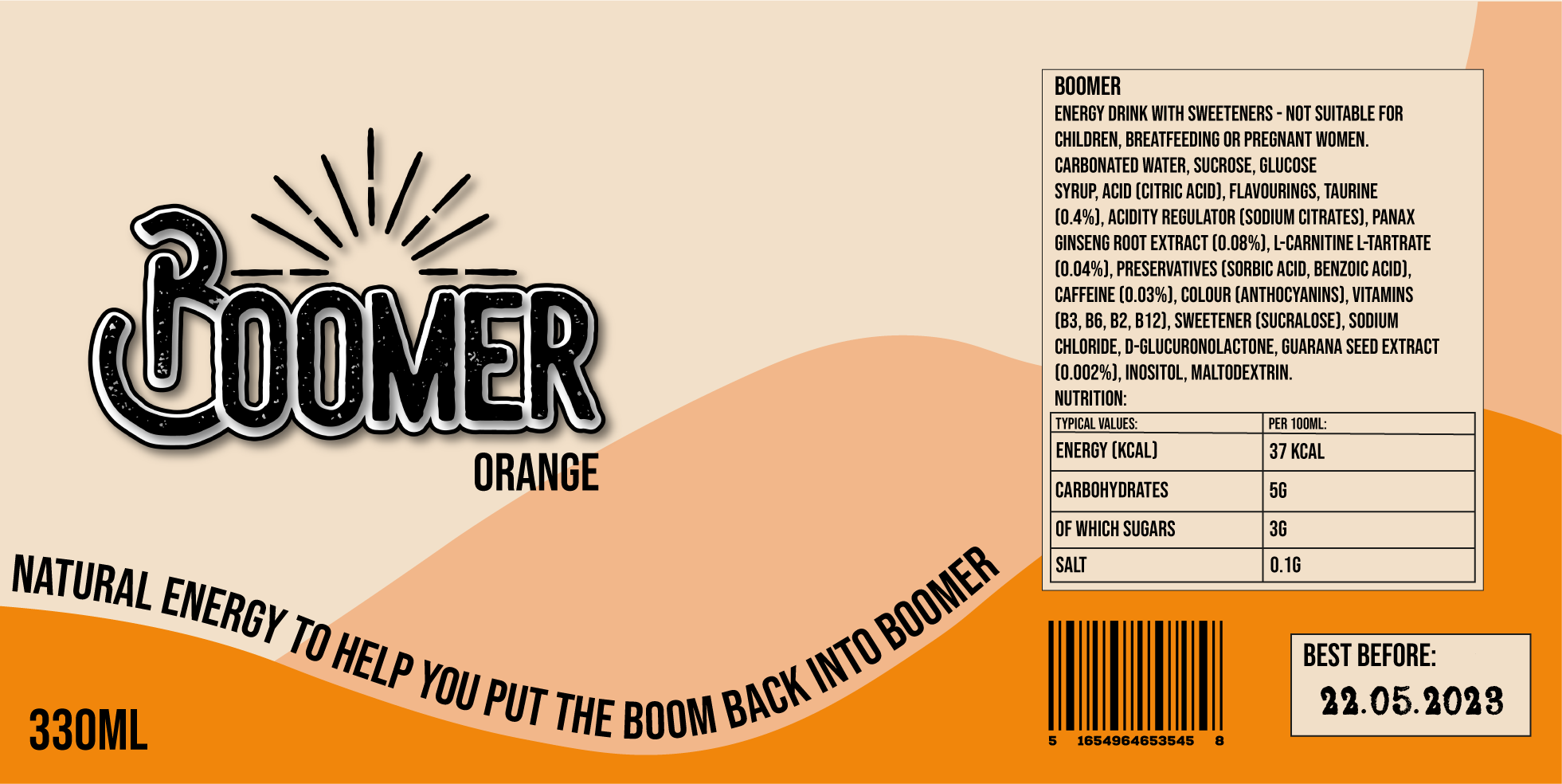
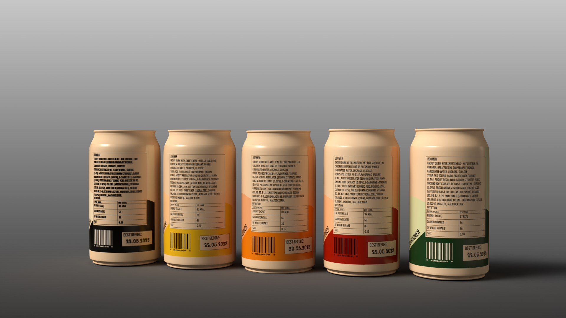
According to Gov UK, energy drinks must have the following information on the can (Government Digital Sevice, 2012):
- the name of the food
- a ‘best before’ or ‘use by’ date
- any necessary warnings
- net quantity information
- a list of ingredients (if there is more than 1)
- the country or place of origin, if required
- the lot number or use-by date
- any special storage conditions
- instructions for use or cooking, if necessary
If suppliers of energy drinks choose not to follow these regulations or are found guilty of dishonest labelling, then this is a criminal offence and can face unlimited fines (www.ts-p.co.uk, 2023).
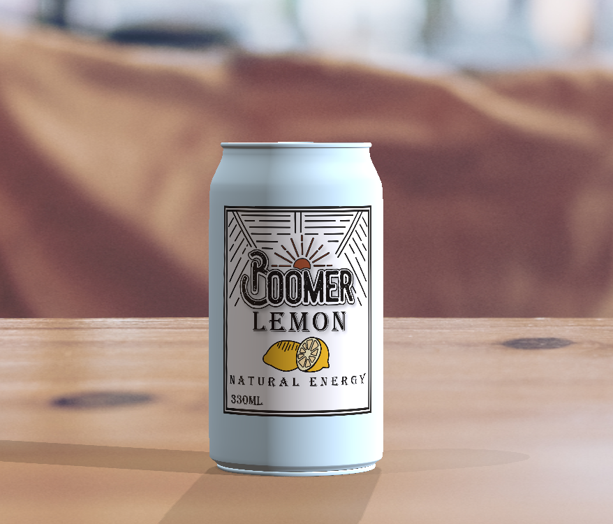
Following the first draft of packaging and the revision of the logo, it was decided that the brand would benefit from leaning more towards the bright colours used by Berocca and combined with the logo, could give the impression of both energising and an older market.
Due to the logo not working with differing colours/concepts for individual flavours, it was decided that the packaging would be the identifying factor for the flavour of the product. This, along with the flavour written clearly on the can, will make it as easy as possible for the consumer to understand the flavours.
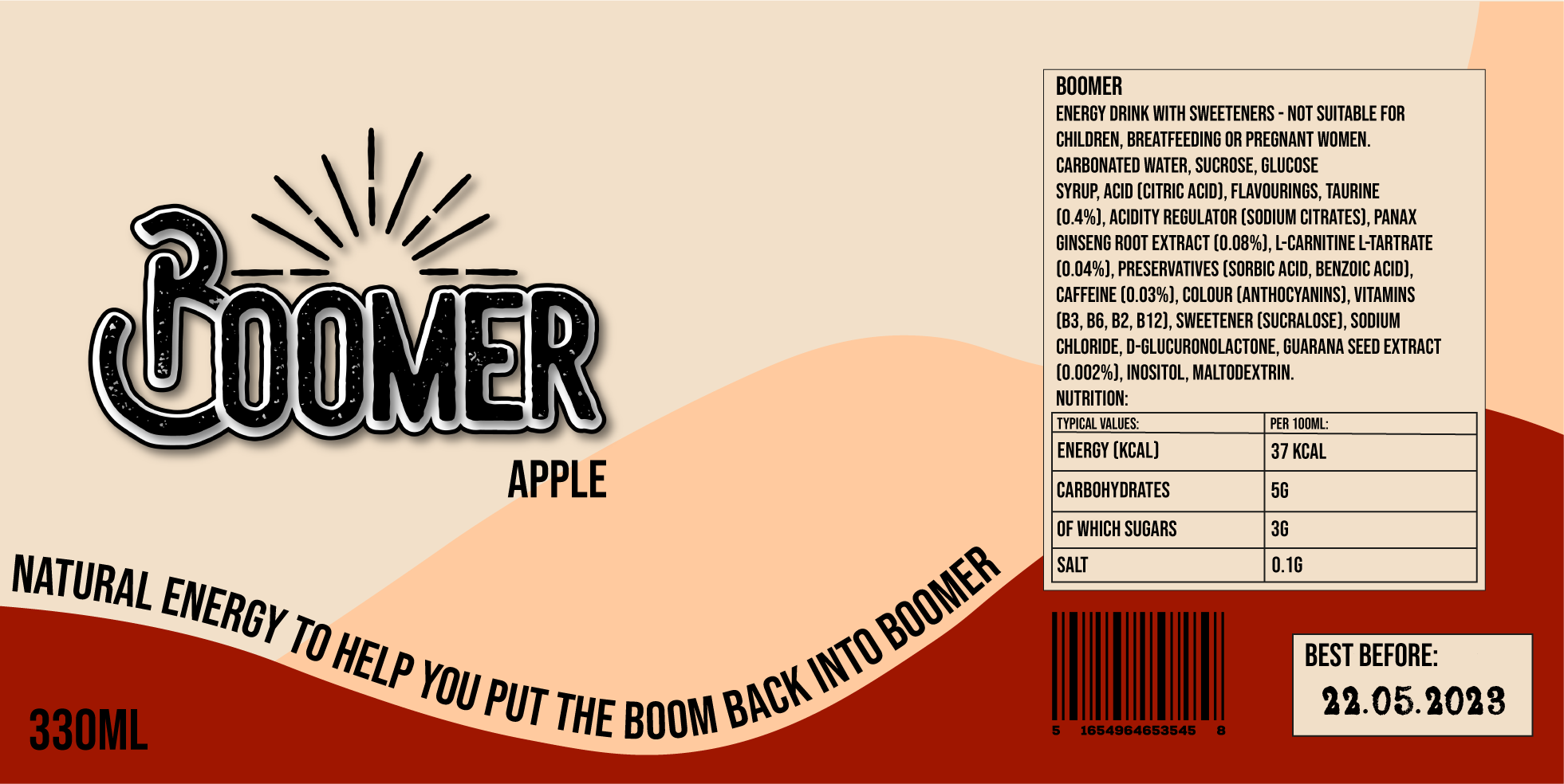
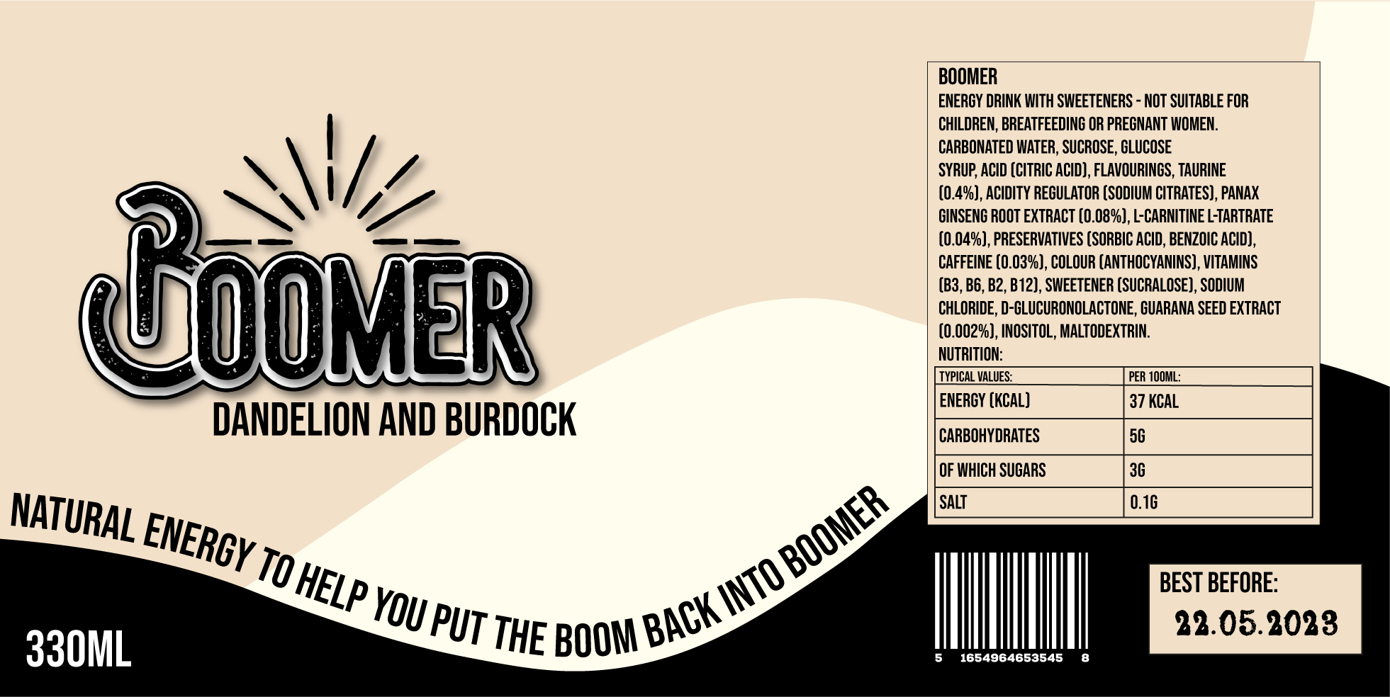
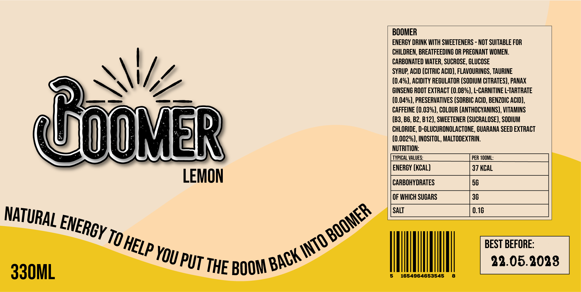
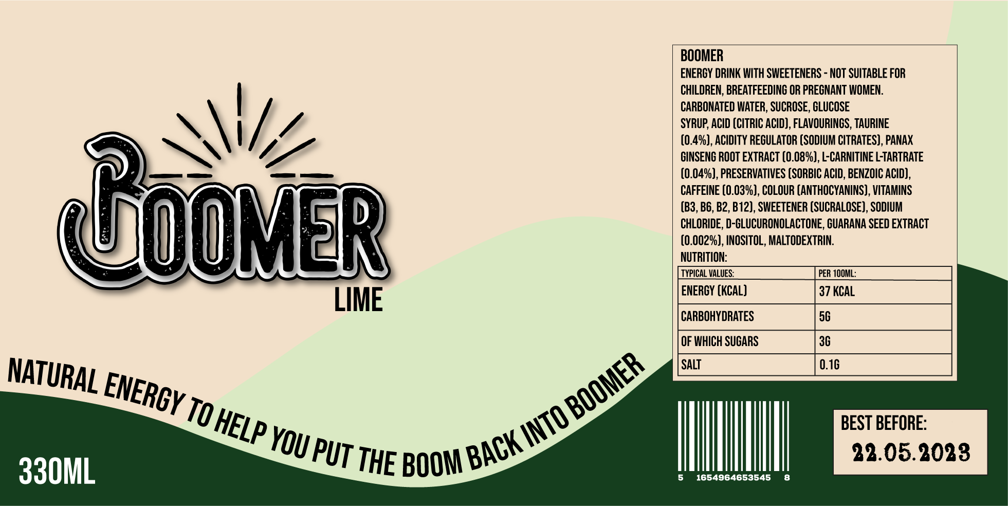
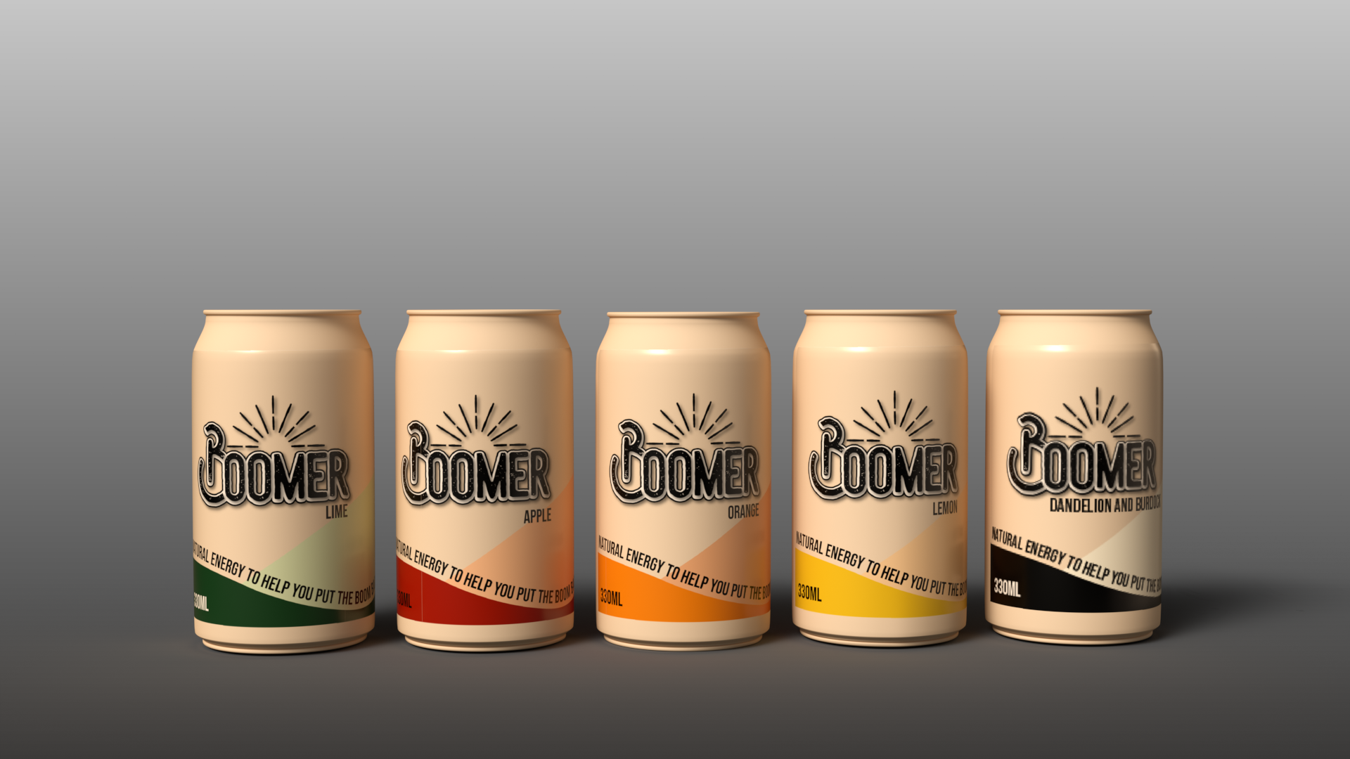
With the packaging it’s been attempted to make a product for the target audience, that is both vibrant to encourage emotion and clear to explain what the product is. Curved lines have been used where possible to keep the packaging as similar to the logo as possible, and the black secondary logo has been used to ensure there is no confusion with flavours.
References:
Reference list
Boots. (2023). Berocca | Boots. [online] Available at: https://www.boots.com/brands/brands-b/berocca [Accessed 26 Mar. 2023].
Government Digital Service (2012). Food labelling and packaging. [online] GOV.UK. Available at: https://www.gov.uk/food-labelling-and-packaging/food-labelling-what-you-must-show.
Invigor Medical. (2020). Why You Seem to Have Less Energy with Age – Invigor Medical. [online] Available at: https://www.invigormedical.com/anti-aging/why-you-seem-to-have-less-energy-with-age/.
Smith, K. (2014). Packaging Design For The Crowded Energy Product Category – SmashBrand – Package Design and Branding Agency. [online] SmashBrand. Available at: https://www.smashbrand.com/articles/packaging-design-for-the-crowded-energy-product-category/.
Tesco. (2018). Tesco Groceries. [online] Available at: https://www.tesco.com/groceries/en-GB/products/251028192 [Accessed 26 Mar. 2023].
Tesco. (2023a). Monster Energy 9 X 500Ml. [online] Available at: https://www.tesco.com/groceries/en-GB/products/313961443 [Accessed 26 Mar. 2023].
Tesco. (2023b). Tesco Groceries. [online] Available at: https://www.tesco.com/groceries/en-GB/products/272582527 [Accessed 26 Mar. 2023].
Warner, C. (2017). The Most Popular Colors Used by Senior Living Communities. [online] Warner Design Associates. Available at: https://www.warnerdesignassociates.com/popular-colors-used-senior-living-communities/ [Accessed 28 Mar. 2023].
www.ts-p.co.uk. (2023). The importance of getting food labelling right | Thomson Snell & Passmore. [online] Available at: https://www.ts-p.co.uk/news/the-importance-of-getting-food-labelling-right#:~:text=Penalties%20for%20non%2Dcompliance [Accessed 26 Mar. 2023].