“The commonality between science and art is in trying to see profoundly – to develop strategies of seeing and showing.”
Edward Tufte in Hollyweird Science: The Next Generation: From Spaceships to Microchips (Grazier, K.R. et al, 2017).
Who is Tufte?
Edward Tufte is a statistician and artist, who now teaches as a professor at Yale University (Strachnyi K., 2019). Edward Tufte’s book ‘Envisioning information’ gave designers a new way to provide complex information through visual means, giving illustrations throughout as examples (www.edwardtufte.com, n.d.).
What are Tufte’s five design principles, and how can they be applied to my animation?
Use of Colour:
Tufte suggests that colour can be used to give data to the reader, simply through using colour to visualise the data. He suggest that colour could be looked at as a noun, for example ‘blue is water’ or ‘green is land’ (Tufte E.R., 2017).
When we look at data, our brain automatically makes these assumptions based on learned experiences, in a split second. For example, every time we see water represented it is more likely than not to be blue, which means that from a glance, that would be our assumption.
Tufte also suggests to consider the emotional implications colour can have on a readers mind. Colours can represent lots of things, such as red can represent heat, anger, love, negativity (Tufte E.R., 2017). When choosing colour its important to consider what emotions colour choice may have, but to also consider that the reader is likely to have a vague idea at least of the data they’re visualising. For example, on a heat map, if a reader sees red, they are likely to know that this represents heat, rather than anger, love or negativity.
Tufte also talks about using colour to convey depth, using the example of the ocean. When wanting to convey deeper waters, a darker blue is likely to be used and lighter blue for shallow waters.
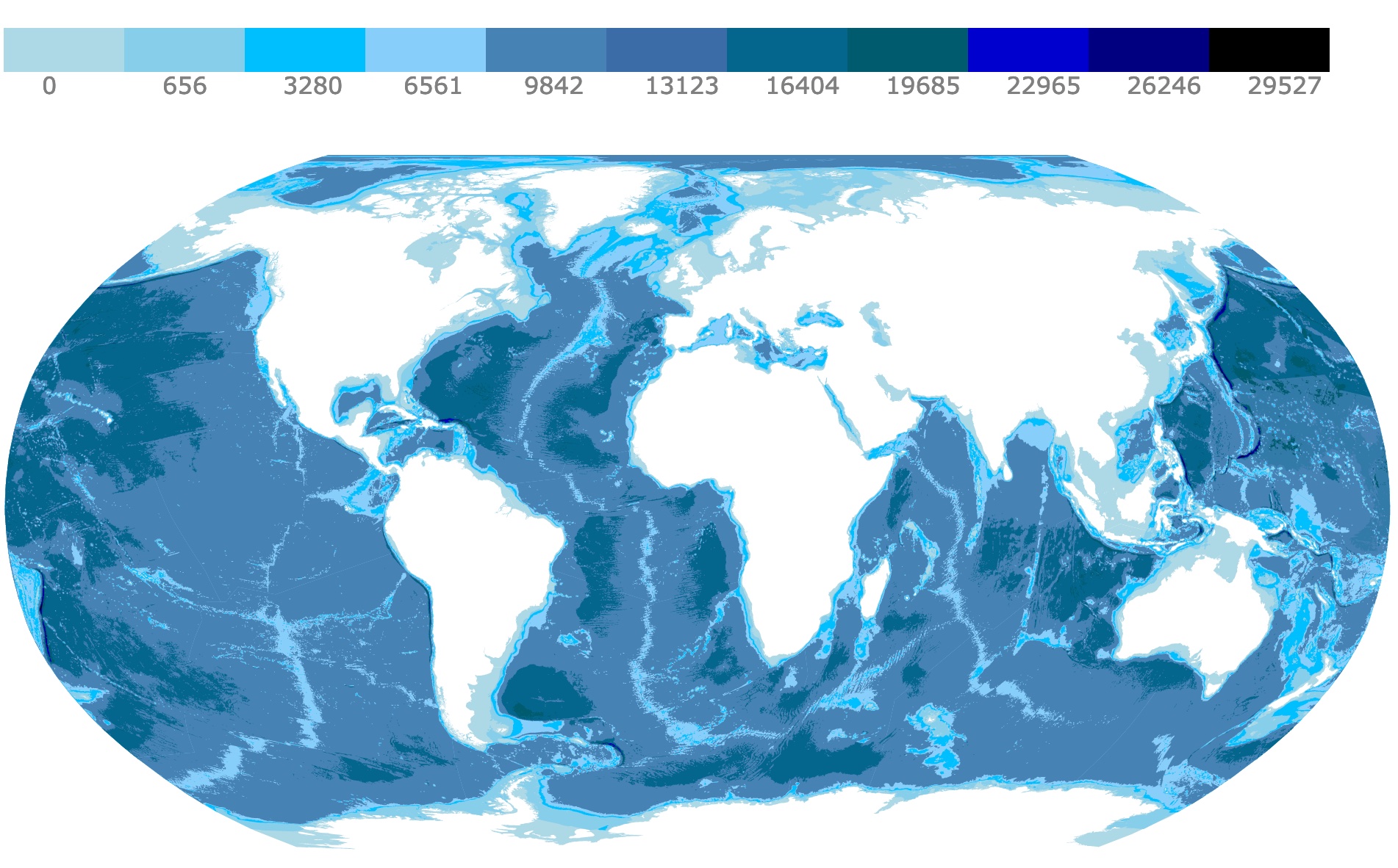
For my animation, I will ensure that colour is treated as a noun, for example, the water on earth will be blue and the land will be green. I will use dark colours to depict depth, for example I will ensure the sky is darker behind the planets.
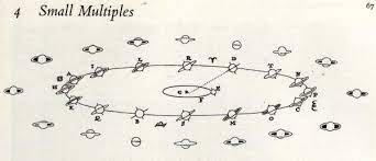
Small Multiples Encourage Comparison:
Tufte theorised that when people are presented with small multiples that are consistent in design, but with subtle differences, it encourages the reader to compare and understand the difference between the images (Data Analytics and Visualization Made Easy, n.d.).
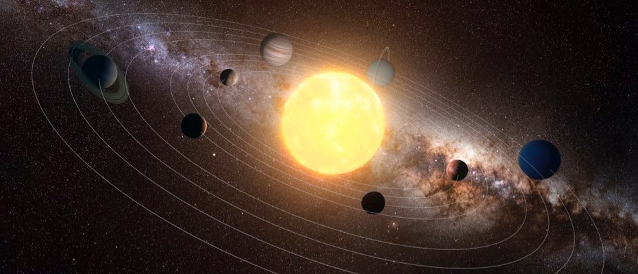
For my animation, I will be using small multiples to encourage comparison, by ensuring my planets are sphere with the correct textures, so it is immediately obvious that the viewer is comparing the planets.
Narratives of Space and Time:
According to Tufte, when you are wanting to give data that is to represent time, it must be done in a visually logical manner (Envisioning Information, 2017). This is often done through graphs or charts in an ascending time order.
For my animation, I will be structuring my animation with a start, a middle and an end, ensuring that the timeline is logical.
Layering and Separation:
For this principle, Tufte discusses the importance of proper layering to avoid clutter and confusion, and separating elements to convey information.
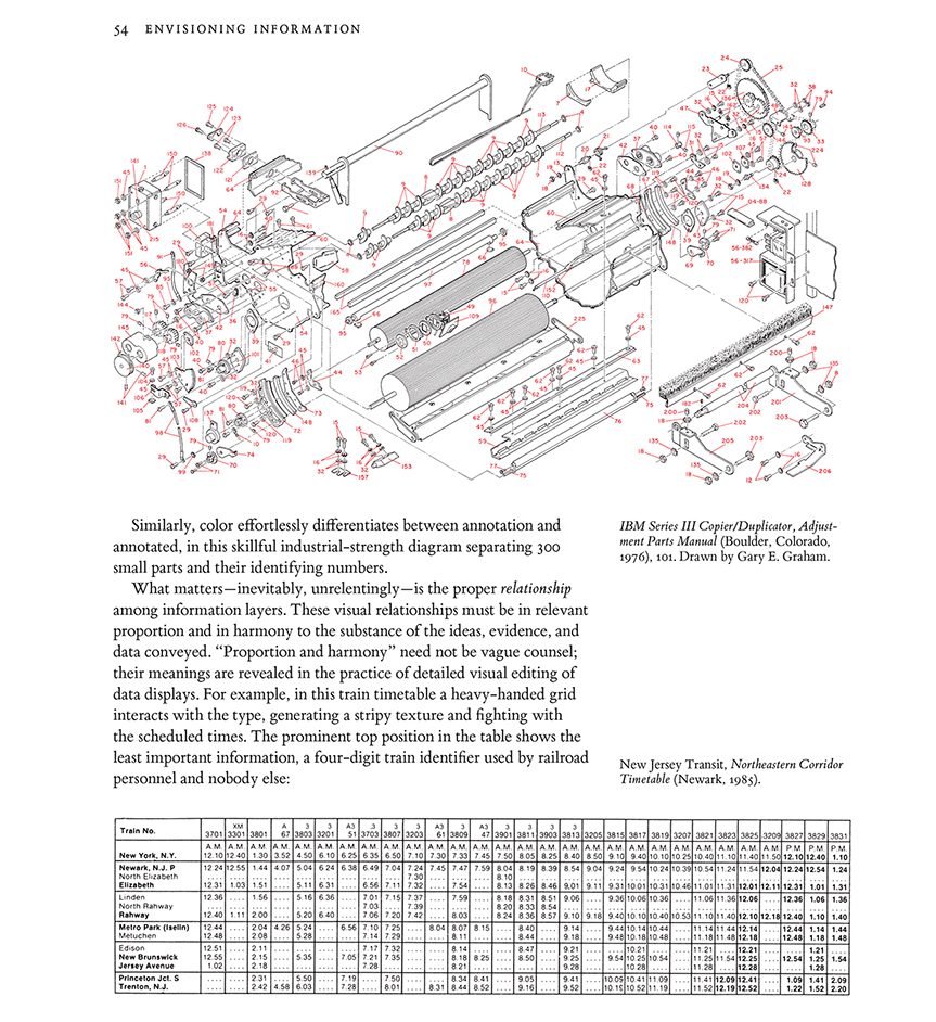
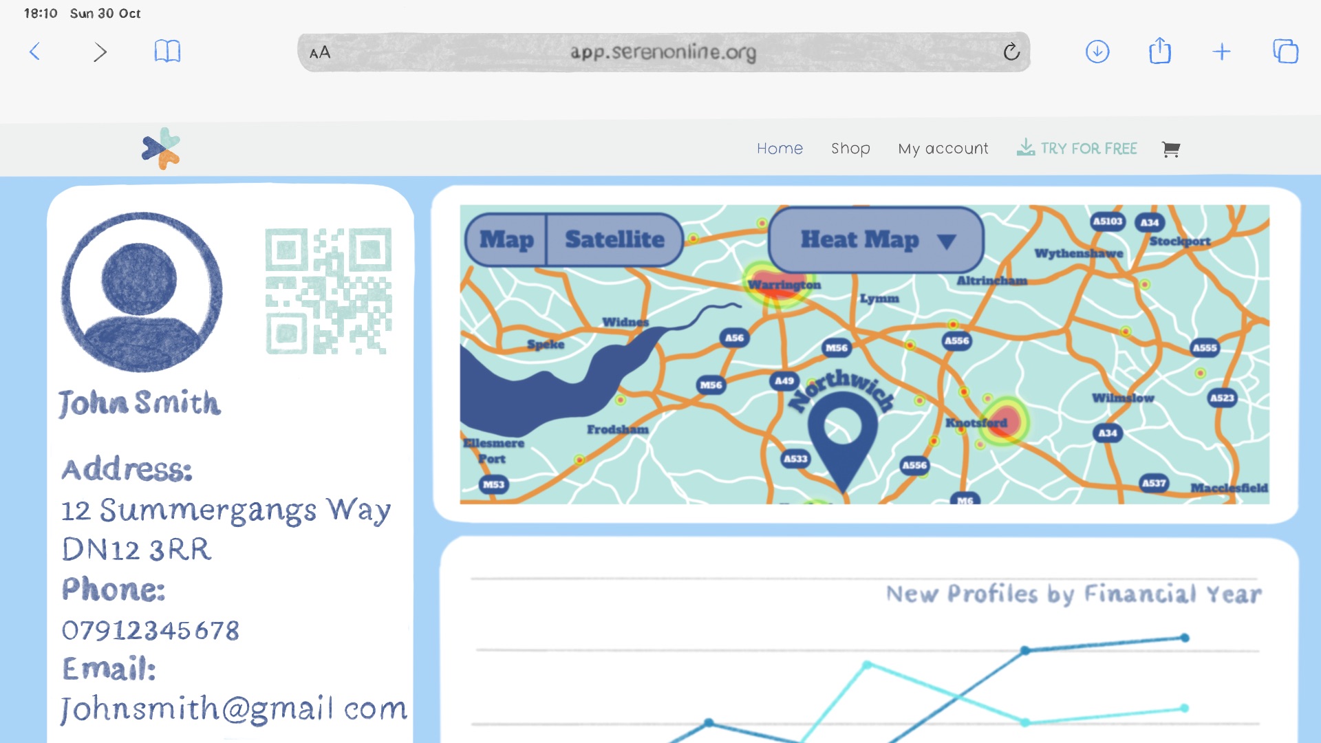
In my animation, I will be layering information in a visual format but only revealing it at the right time. For example, the tank is layered around the solar system, but it is not overwhelming in the beginning because I keep it out of view.
Micro/ Macro Readings:
This refers to when something looks like one thing, but from another viewpoint can look like another. For example:
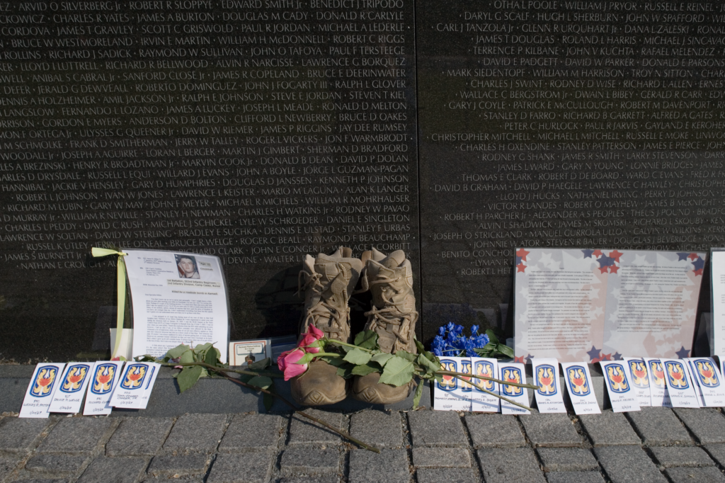
The Vietnam veterans memorial is designed in a way that you can only see the inscriptions when directly in front of it and they disappear at a distance.
In my animation, I will be using this principle in that in the beginning you only see our solar system, but as the camera zooms out, it is revealed that it is part of a bigger picture (a shop that sells solar systems).
Reference list
BBC Science Focus (2019). Solar System facts: 5 things everyone should know about our cosmic neighbourhood. [online] BBC Science Focus Magazine. Available at: https://www.sciencefocus.com/space/solar-system-facts-5-things-everyone-should-know-about-our-cosmic-neighbourhood/.
Data Analytics and Visualization Made Easy – Juice Analytics. (n.d.). Better Know a Visualization: Small Multiples — Juice Analytics. [online] Available at: https://www.juiceanalytics.com/writing/better-know-visualization-small-multiples.
databayou.com. (n.d.). World Ocean Depth Map. [online] Available at: https://databayou.com/ocean/depth.html.
Edward Rolf Tufte (2017). Envisioning information. Cheshire, Connecticut: Graphics Press.
Grazier, K.R., Cass, S. and Springerlink (Online Service (2017). Hollyweird Science: The Next Generation : From Spaceships to Microchips. Cham: Springer International Publishing.
Strachnyi, K. (2019). Edward Tufte –Data Visualization Pioneer. [online] Medium. Available at: https://datacated.medium.com/edward-tufte-data-visualization-pioneer-e70eb3a8e2f0 [Accessed 1 Aug. 2023].
Tucker, N. (2023). The Lasting Magic of the Vietnam Veterans Memorial | Timeless. [online] The Library of Congress. Available at: https://blogs.loc.gov/loc/2023/06/the-lasting-magic-of-the-vietnam-veterans-memorial/ [Accessed 1 Aug. 2023].
www.edwardtufte.com. (n.d.). Edward Tufte: Books – Envisioning Information. [online] Available at: https://www.edwardtufte.com/tufte/books_ei#:~:text=The%20book%20provides%20practical%20advice [Accessed 1 Aug. 2023].