Following research indicating that a real life approach can give more of an emotional impact, the decision was made to use a combination of real life and animation in the campaign. This also aligns with research that animation works best in enhancing teaching strategy in comparison with real life (Praveen and Srinivasan, 2022). Hopefully by using a combination of the two, the campaign can provide engaging and educational content, while also evoking an emotional response to increase the number of visitors to the website and overall improvement on the public’s perception and knowledge surrounding ADHD.
Another point to consider is that following research a channel on the social media platform TikTok was found that had very similar characters to the characters created for this project.
Another potential complication is that this channel uses a comedic factor to entertain as their primary purpose. By placing the characters in entirely animated content, there could be situations in which the characters from this channel could be confused with characters in this project. This would mean that there is the potential that the audience could see their content and it have a negative impact on if they would interact with this project. This project and @neurodivers_show have very different aims; this project to inform and @neurodivers_show to entertain. Although content may align in small quantities, it is unlikely that the content will match perfectly, and too much humour and/or cursing could damage this project because it will make evoking an emotional response more difficult.
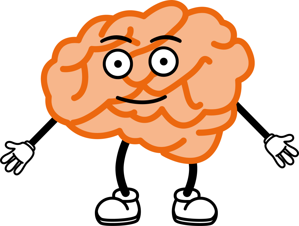
It was decided that the brain character as a concept would be kept for the design, due to the relevance it had to the project. ADHD is a neurological disorder, which is represented with the brain shape. To show the character as an ADHD brain, the colour orange was used because orange is the colour used to represent ADHD awareness month (Inclusive Employers, n.d.). By using a standard brain shape with the colour orange, it is representing a brain that differs from neurotypical.
Another potential design flaw was the facial features on the brain character that was created for the proposal. The facial features were very simple and it could have posed a potential issue when the character was talking because there would be limited expressions. To resolve this, the facial features were changed using a downloadable pack on the Adobe website (Adobe, n.d.) to allow for more movement and even blinking.
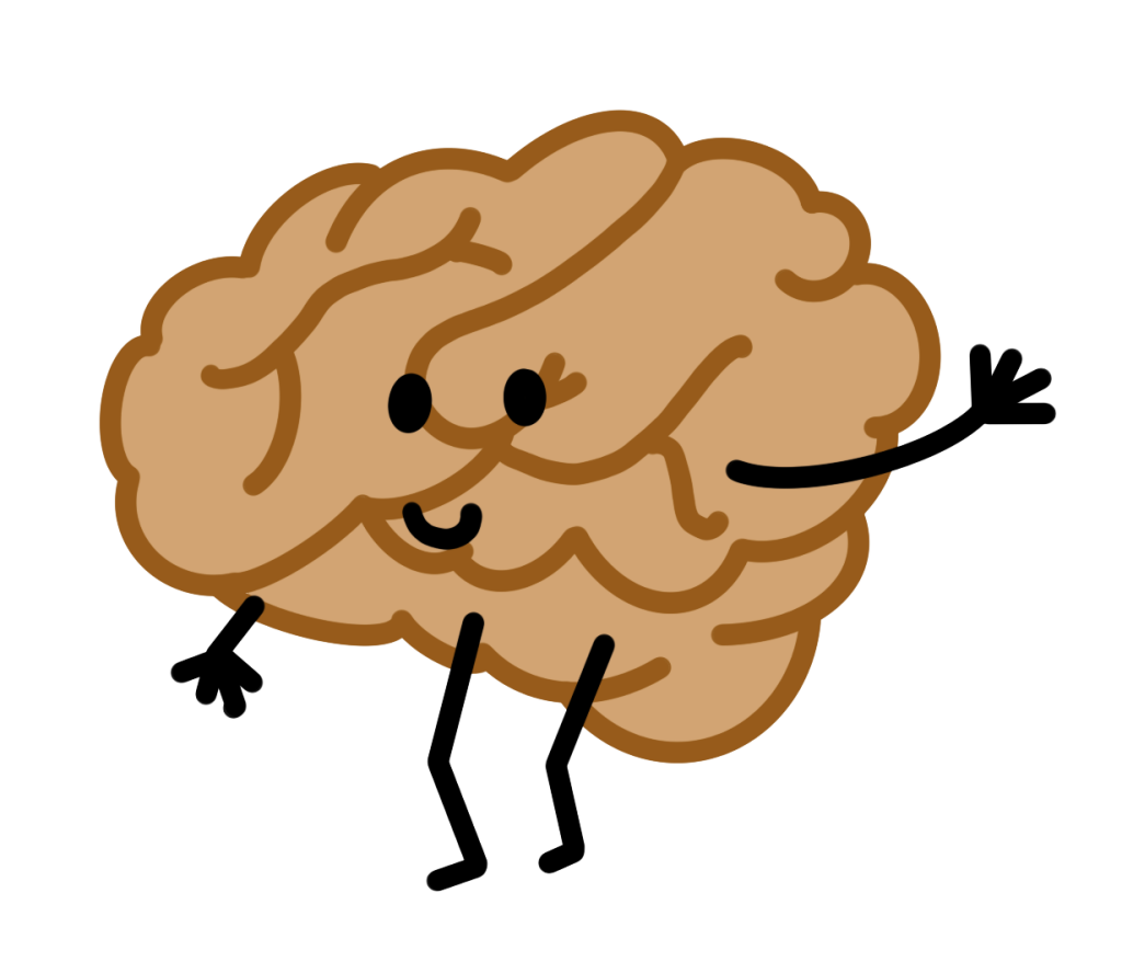
The initial design for the ADHD brain also looked more yellow than the intended orange, so this was altered to stick to the original orange to represent ADHD.
The hands and feet of the character were also changed to allow for more definition when the character walks, runs, points etc.
Following consideration of the complications that arose, it was decided that animation would be used to educate on the website and real life video would be used to encourage people to access the website.
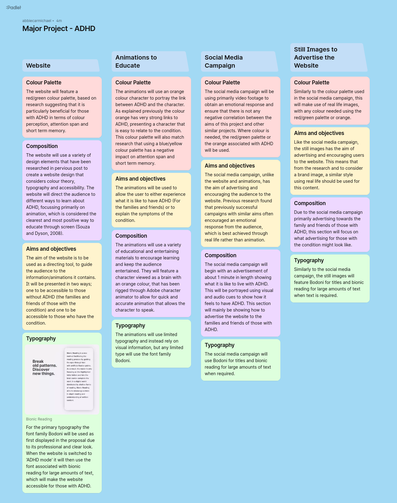
Following alterations and further research, the details for each aspect of the project, including details on the content are listed below:
If a direct link to the Padlet is preferred, please follow the following link: https://padlet.com/abbiecarmichael/major-project-adhd-eu9tjrwfqfiqkc2f
The final major alteration to the initial proposal is colour palette. Following on from previous research that indicated a different colour palette would be more beneficial to those with ADHD (a red/green palette), a new palette for the ADHD website was created that compliments an orange based palette (to symbolise ADHD in the non-ADHD section of the website. This way they can be used in conjunction, with the characters and the logo to ensure the brand remains recognisable.


Reference list
Adobe (n.d.). Adobe Home. [online] www.adobe.com. Available at: https://www.adobe.com/home?acomLocale=uk.
Inclusive Employers (n.d.). Understanding ADHD awareness month.[online] Inclusive Employers. Available at: https://www.inclusiveemployers.co.uk/awareness-day/adhd-awareness-month/#:~:text=The%20ADHD%20Awareness%20Month%20colour%20is%20orange. [Accessed 30 Apr. 2024].
Praveen, C.K. and Srinivasan, K. (2022). Psychological Impact and Influence of Animation on Viewer’s Visual Attention and Cognition: A Systematic Literature Review, Open Challenges, and Future Research Directions. Computational and Mathematical Methods in Medicine, [online] 2022, pp.1–29. doi:https://doi.org/10.1155/2022/8802542.
Souza, J.M.B. de and Dyson, M.C. (2008). Are animated demonstrations the clearest and most comfortable way to communicate on-screen instructions? Information Design Journal, 16(2), pp.107–124. doi:https://doi.org/10.1075/idj.16.2.03bez.