Following on from research about ensuring that the website look and feel interesting, I looked into ways that web design had been done in unique ways, to look for inspiration to making my website stand out. I understood that my website should not be overcomplicated to ensure it remains accessible, and looked for websites that used an ‘introduction’ for their design to grab their audiences’ attention.
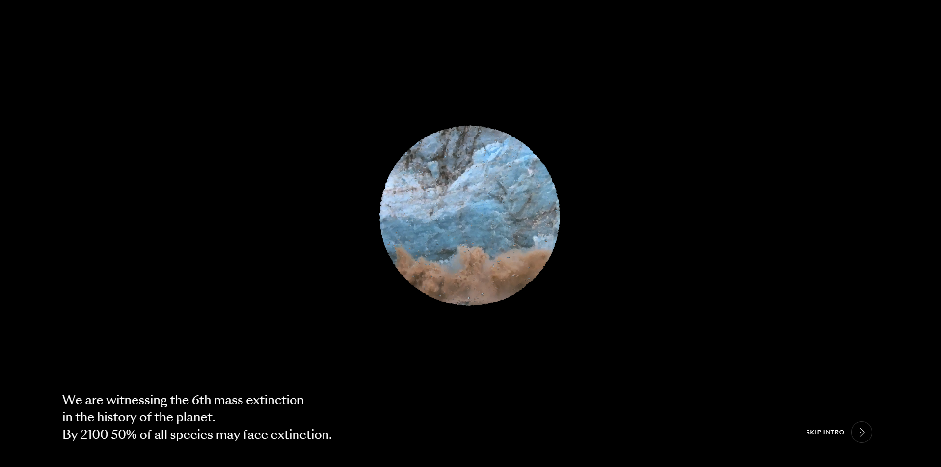
One website which really stood out was the ‘What is Missing?’ website, found at https://www.whatismissing.org/ (whatismissing.org, n.d.). They use audio and visual elements to educate their audience before giving access to the website and allowing them to look for further information. This allows them more control of what their audience sees when the enter the site, which if you know your target audience well, can impact the length of time visitors spend on the site. Alternatively by doing this method wrong, you could also drive away your audience unintentionally.
Following the inspiration I found, I created the following simple storyboard to create my own introduction to the website for my project.
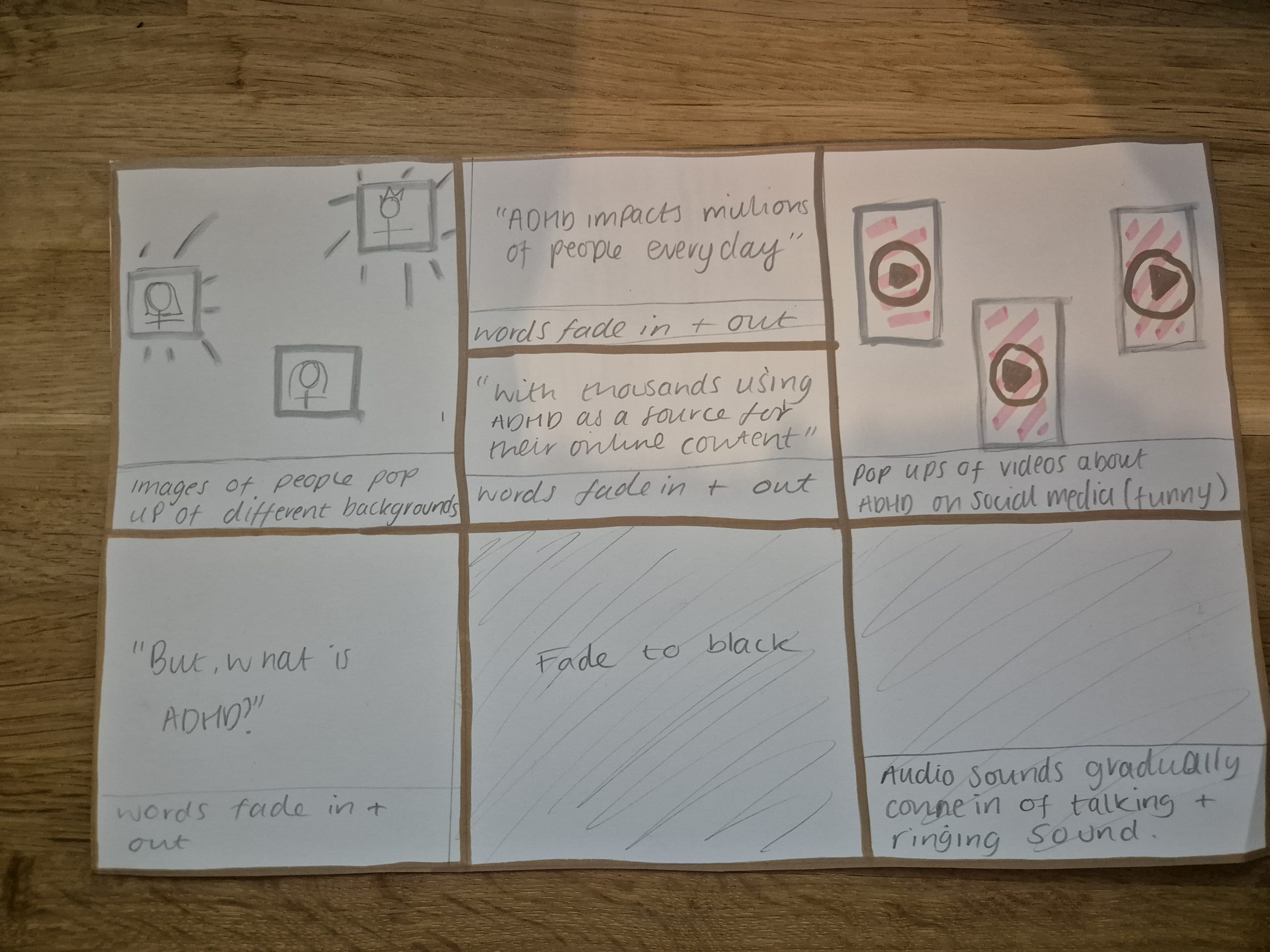
For this introduction I really wanted to get across how many people are impacted by ADHD everyday to show the user that it’s important to learn about the condition because it impacts so many people. I then decided to link it to viral social media content about ADHD which the user may have seen online, and link it to the question “But what is ADHD?”. Hopefully, this will show the user that although they may see content online showing the humorous side of ADHD, when asked the question ‘But what is it?’ they are likely to not know the answer. The introduction then links to audio effects which give a sense of what it can feel like to have ADHD.
Following creating the introduction, I then moved onto the website design.
Initially, I tried to create the website using only one palette that included the original colours plus red and green. I found that the red colour was too much for the content and with the introduction and then immediately having to respond to a question (do you have ADHD?), I was worried the process was made too overwhelming for those with ADHD.
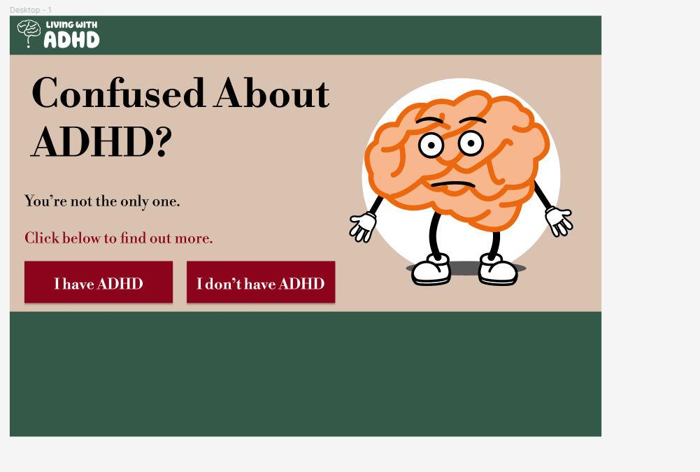
I then decided to have a toggle feature at the top right of the screen that automatically shows the ‘I have ADHD’ switch, so that the audience without ADHD (who will struggle less with their attention span) switches to ‘I don’t have ADHD’, rather than having everyone choose an option.
I used the colour palettes I created for both the ADHD and non-ADHD portion of the website, which can be toggled on and off with a trigger in the right upper corner.
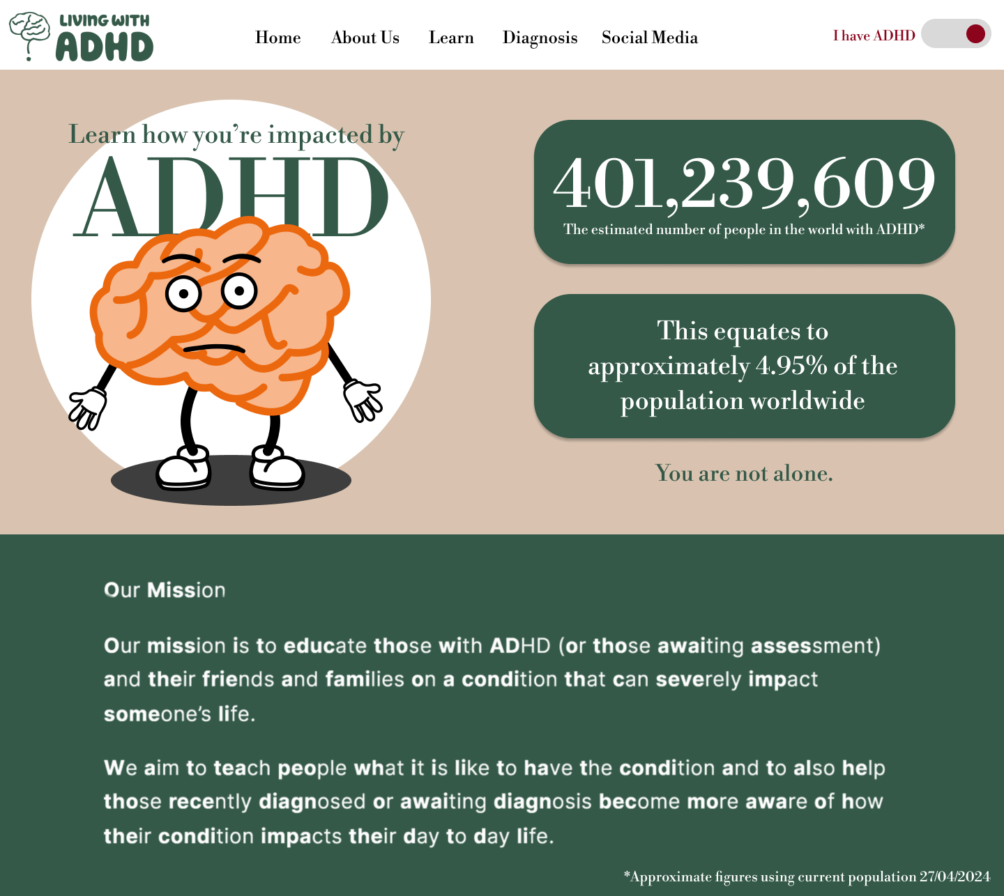
I used primarily the green and neutral colours with the character following review of research that showed a green/red colour palette assists in maintaining attention for those with ADHD, and I used the red colour to highlight the upper right corner, where the website can switch view.
I applied the bionic reading text to the mission statement, which allows the user to read about the aims of the brand more freely, and I included facts surrounding the numbers for ADHD.
Unfortunately the numbers surrounding the actual amount of people with the condition were not easily accessible, so with the assistance of someone studying data science, I worked out the approximate numbers using the method below:
7.2% of youth with ADHD/2.5%-6.7% of adults with ADHD (Abdelnour, O. Jansen and A. Gold, 2022).
As the figure for adults is not a set figure, the median of the percentage range was used for the calculation (4.2%).
Youth are approximately 25% of the population compared with 75% of adults (Institut National, 2024).
World population at the time of the calculation was 8,105,850,708 (Worldometer, 2024).
This equates to 6,079,388,031 adults and 2,026,462,677 youth.
7.2% of youth with ADHD equates to 145,905,312.
4.2% of adults equates to 235,334,297.
This gives an approximate figure of 401,239,609 people with ADHD at the time of calculation.
By using the actual numbers, I hope to give the audience a true picture on the amount of people that have the condition, rather than a percentage.
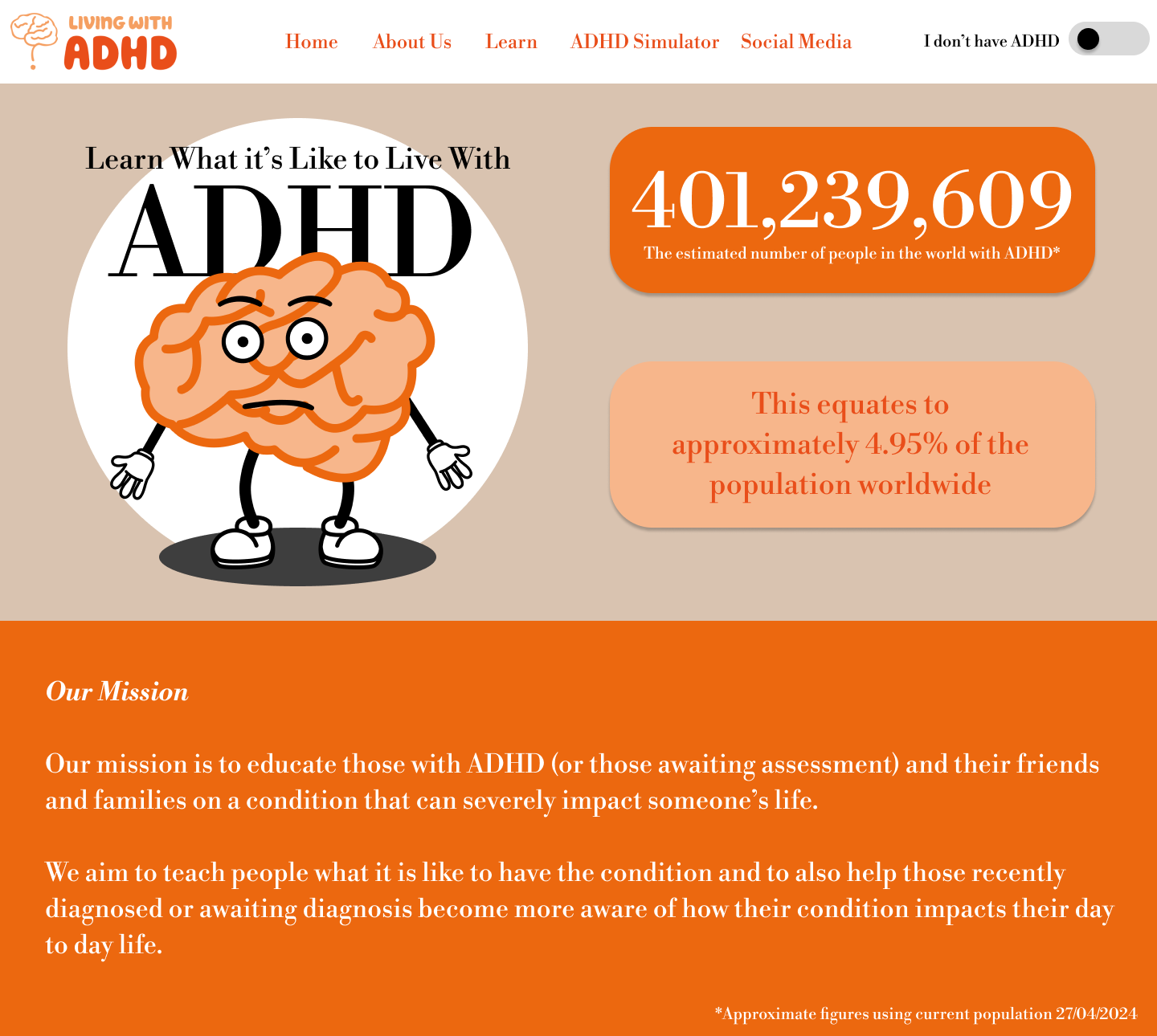
I used the original orange colour palette for the non-ADHD portion of the website, with Bodoni font and the figures calculated previously for the ADHD statistics.
The wording is changed with different menu navigation to suit each group. This was done to ensure both groups are not receiving any content that is irrelevant and may drive them from the website. For example, someone with ADHD would not need to experience an ADHD simulator (as they experience the condition everyday) and someone without ADHD would not connect with the wording ‘you are not alone’. The statistics used for the web design have different aims for each group. For the non-ADHD group the statistics aim to show them how common the condition is and how important it is to learn about it, whereas for the ADHD group it aims to show them they are not alone in struggling with the condition.
Reference list
Abdelnour, E., O. Jansen, M. and A. Gold, J. (2022). ADHD Diagnostic Trends: Increased Recognition or Overdiagnosis? MO Med, [online] 119(5), pp.467–473. doi:https://doi.org/PMC9616454.
Institut National (2024). Is it true that there are more children on earth today than older people? – The issue today – Demographic fact sheets. [online] Ined – Institut national d’études démographiques. Available at: https://www.ined.fr/en/everything_about_population/demographic-facts-sheets/faq/is-it-true-that-there-are-more-children-on-earth-than-old-people/ [Accessed 30 Apr. 2024].
Worldometer (2024). World Population Clock. [online] Worldometers. Available at: https://www.worldometers.info/world-population/.
www.whatismissing.org. (n.d.). What is Missing? [online] Available at: https://www.whatismissing.org/.