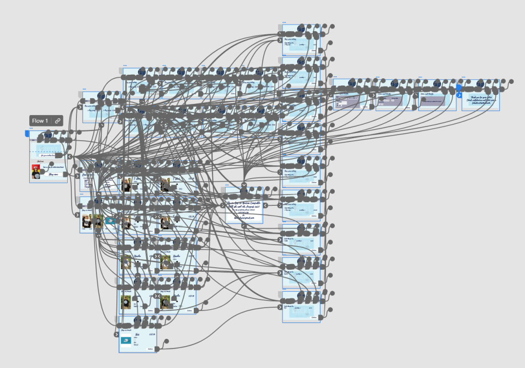
The following is a link to the festivals website in XD:
https://xd.adobe.com/view/34677f85-c7e2-4772-9bae-ab1b7836152a-6134/
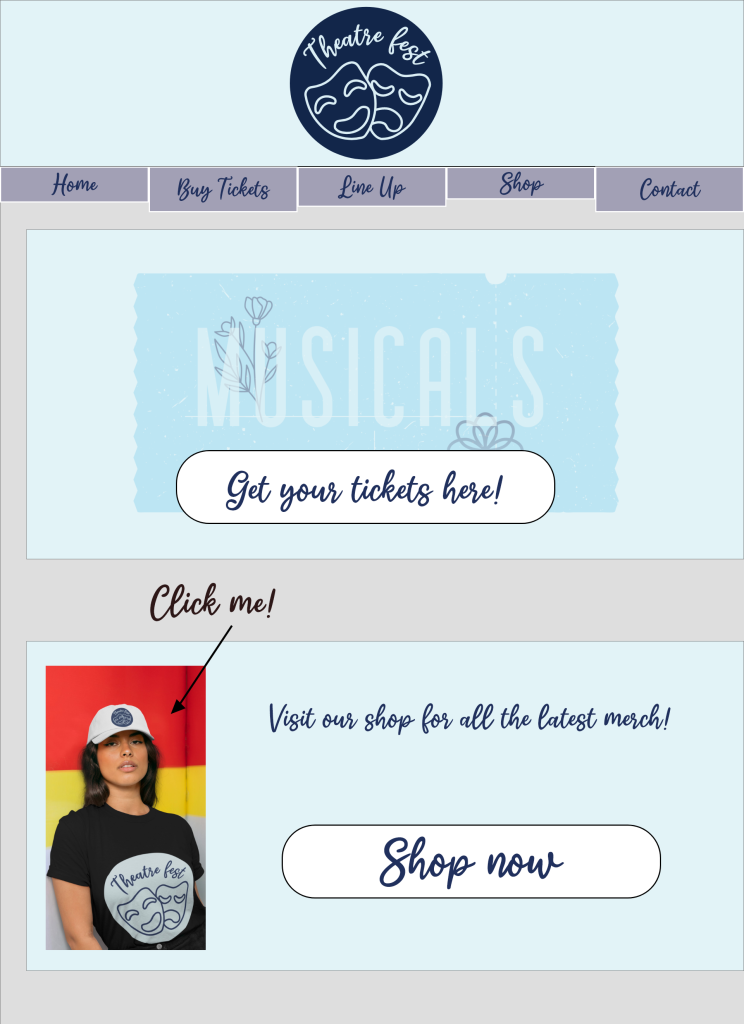
The website menu for this festival has five options. When you first enter the website you are presented with the new logo. This logo was changed from the previous because it appeared cluttered and the name ‘a weekend at the theatre’ too long.
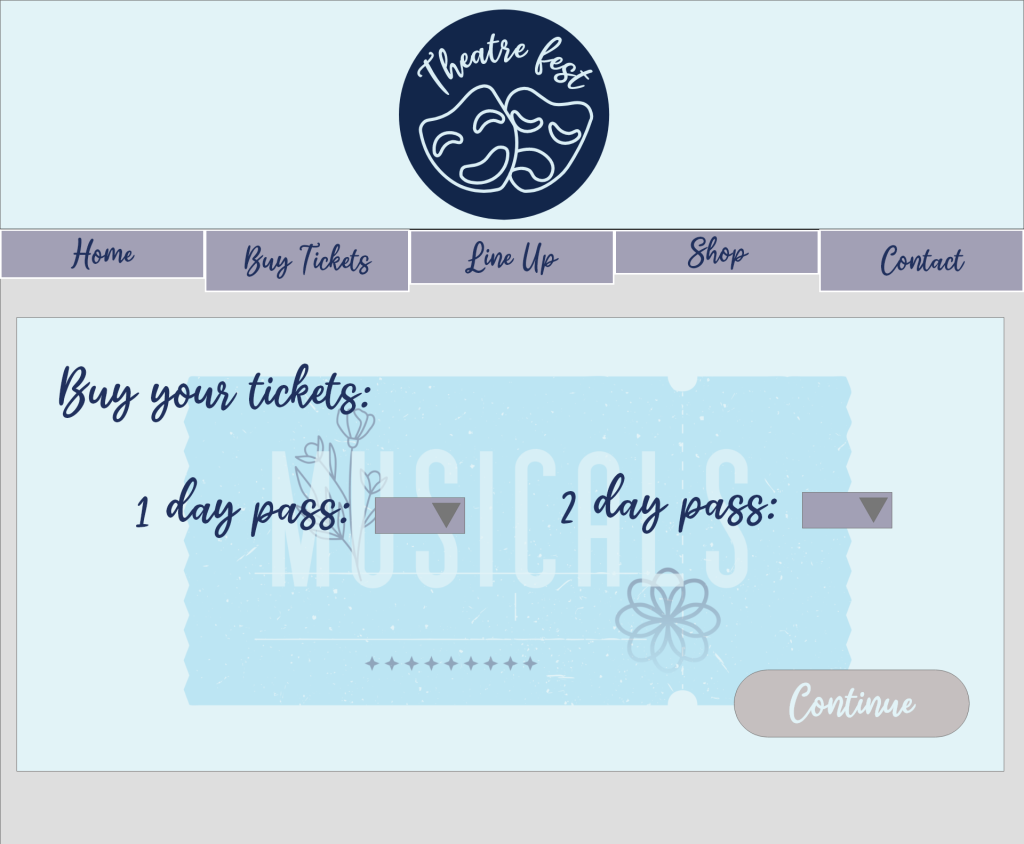
The main purpose for the website is to sell tickets. On the homepage one of the first things you see is the buy tickets button with a ticket behind it in the website’s colours. By making the button to buy tickets larger and with contrasting colours, this will make it easier for the user to navigate to purchase should they wish to. From there, they are then taken to a screen which allows them to purchase up to three 1 day or 2 day passes at a time. If the user tries to press continue without selecting tickets, they are reminded to do so when they hover the mouse over continue. This allows no confusion over what they must do should they forget to select their tickets.
From there, they are asked to provide their name, address and email address, and then from pressing continue they are asked for their bank details. The personal details have been kept on separate screens because it can be overwhelming for the user if they have to provide a lot of information at once, and by separating personal and card information, it could prevent abandoned baskets. After entering their card details, they then wait a few seconds for the transaction to process and then are thanked for their purchase. To save customers from remembering all the information for the event, they are emailed their confirmation and the information for the event, including a link to the app.
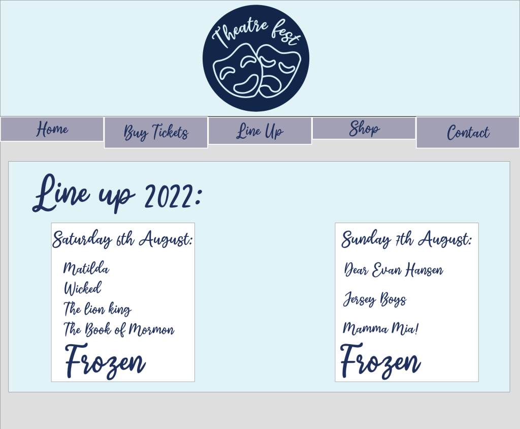
From all screens on the website they are given the option to click a link to see the line up for the event. The information is given using a dark font with light background to make it easily readable for the user and it clearly states which day different acts are on.
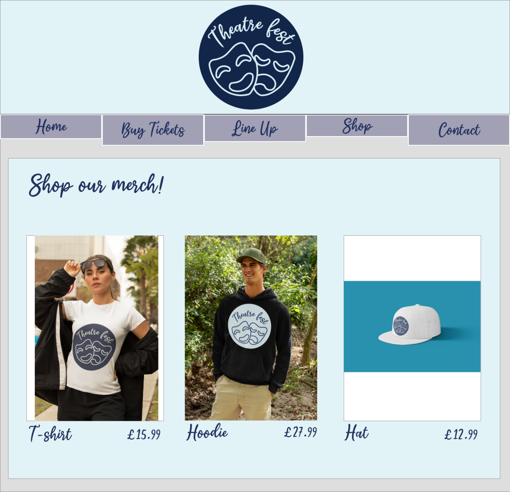
The user also has the option to buy merch for the festival in the shop. This is first shown on the homepage with a video that is played by clicking on it with an arrow that says ‘click me’ (created using placeit.com and inputting designs for the merch). This provides interaction for potential customers and helps to keep them interested. From clicking into the shop, they are offered three options for merch; a t shirt, hoodie and hat. Once, they have selected the item they would like, they can then choose the colour and the size. When the customer changes the colour, the image changes to show what they will receive. Once they have chosen their preferred colour and size they then go through the payment screens similar to the purchase of tickets.
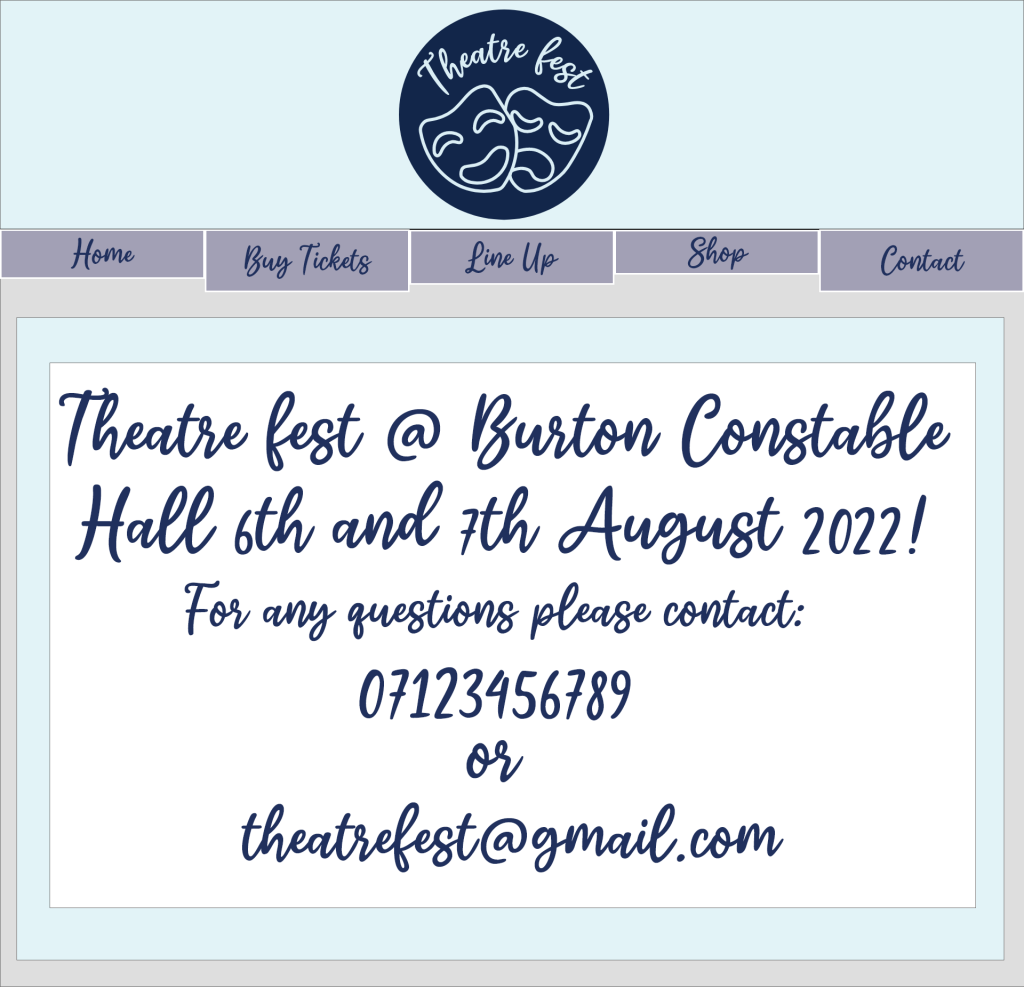
They also have the option of ‘contact’. This gives the location of the festival and a contact number and email to the customer in dark text on a light background.
On all screens customers are able to navigate through the menu to other screens, to make it as clear to navigate as possible.