Colour is an essential tool for graphic designers as it has the ability to change meaning dependant on combinations and also has the ability to subconsciously set the tone with a design (Dabner et al., 2020).
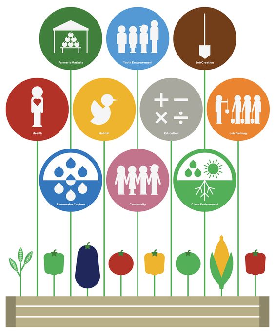
The image above is a graphic created by Manuel Miranda for Urban Omnibus. The designer has used analogous colours next to each other where possible which is linked to harmony and is aesthetically pleasing to the eye (Dabner et al., 2020). Immediately, on first look at this design, the eyes are drawn to the bubbles of information, which tells the audience the benefits of urban farming. Although in terms of colour, this design is aesthetically pleasing, it could still be improved my making the text more prominent in the bubbles or enlarging the text, because it could be difficult to read.
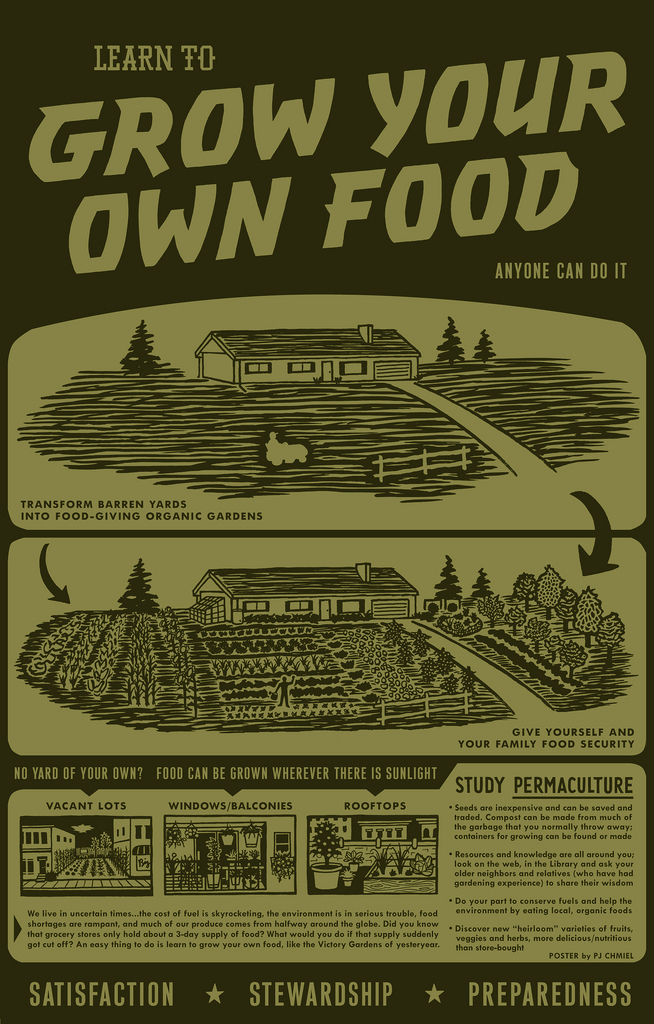
This design was used in an article on naked cuisine’s website. Naked cuisine is a website that shares recipes using local, organic fruits and vegetables. In addition to this, they also promote the use of free-range, grass fed, organic meat and poultry, and they also have a blog, posting information about daily life and new recipes (Naked Cuisine, N.D).
This design uses monochromatic colour in shades of green to give the benefits of urban farming. Because the same base colour has been used throughout, there is very little contrast or urgency surrounding the design, and it struggles to retain the attention of the audience. Although the majority of the informational text is relevant to the cause, it might be more beneficial to highlight key points on the poster rather than put large bulks of text that the audience is unlikely to remember.
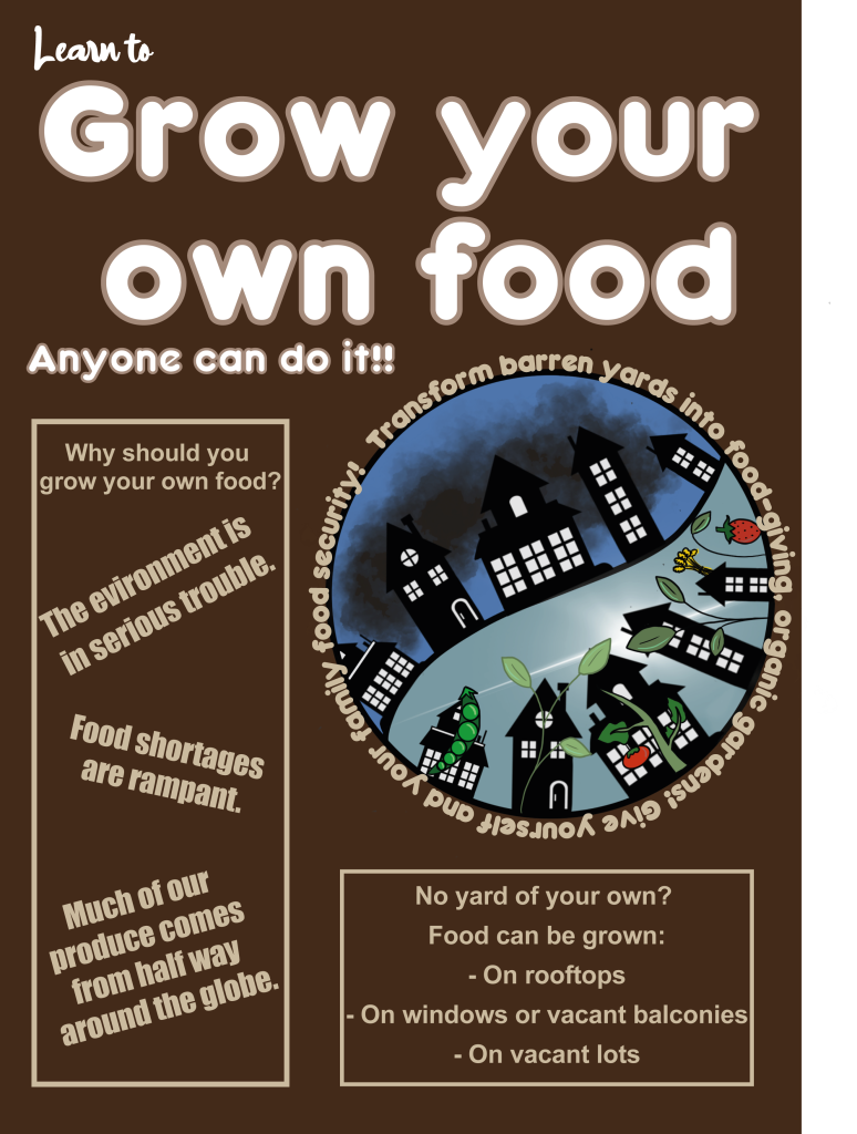
For this design, a similar concept of the before and after image of a house from the Naked Cuisine design has been used but in a ying and yang style format with the use of colour. The before image of the houses have a dark background with clouds to indicate gloom and darkness (Sensational Colour, 2019). On the flip side of the ying yang design, the sky is a lighter blue, to indicate peace and harmony and shows the sun from behind the houses. The fruit and vegetables are shown growing from and next to the houses in bright colours to contrast with and stand out from the rest of the design. The main colours used for the vegetables are green and red, and are complementary colours to attempt to stand out and contrast each other. The text that was originally in the corner of the previous design’s images has been circled around the image to allow it to be more accessible to the reader.
The title of this design has been written in white text with a light brown outline, different from the rest of the text in the design in attempt to make the title stand out and gain attention. While the re design does have less information than the design from naked cuisine, the main points from their designs have been taken to highlight what is important in the piece.
References:
Dabner, D. & Stewart, S. & Vickress, A. (2020) Graphic Design School. London: Thames & Hudson.
Naked Cuisine (N.D.) GMO’s will never feed the world, but here’s something that will. Available online: http://www.nakedcuisine.com/gmos-will-never-feed-world-heres-something-will/ [accessed 28.10.2021]
Sensational Colour (2019) Colour symbolism and the meaning of black. Available online: https://www.sensationalcolor.com/meaning-of-black/ [accessed 28.10.2021]