The following are examples of grids and frames within the real world:
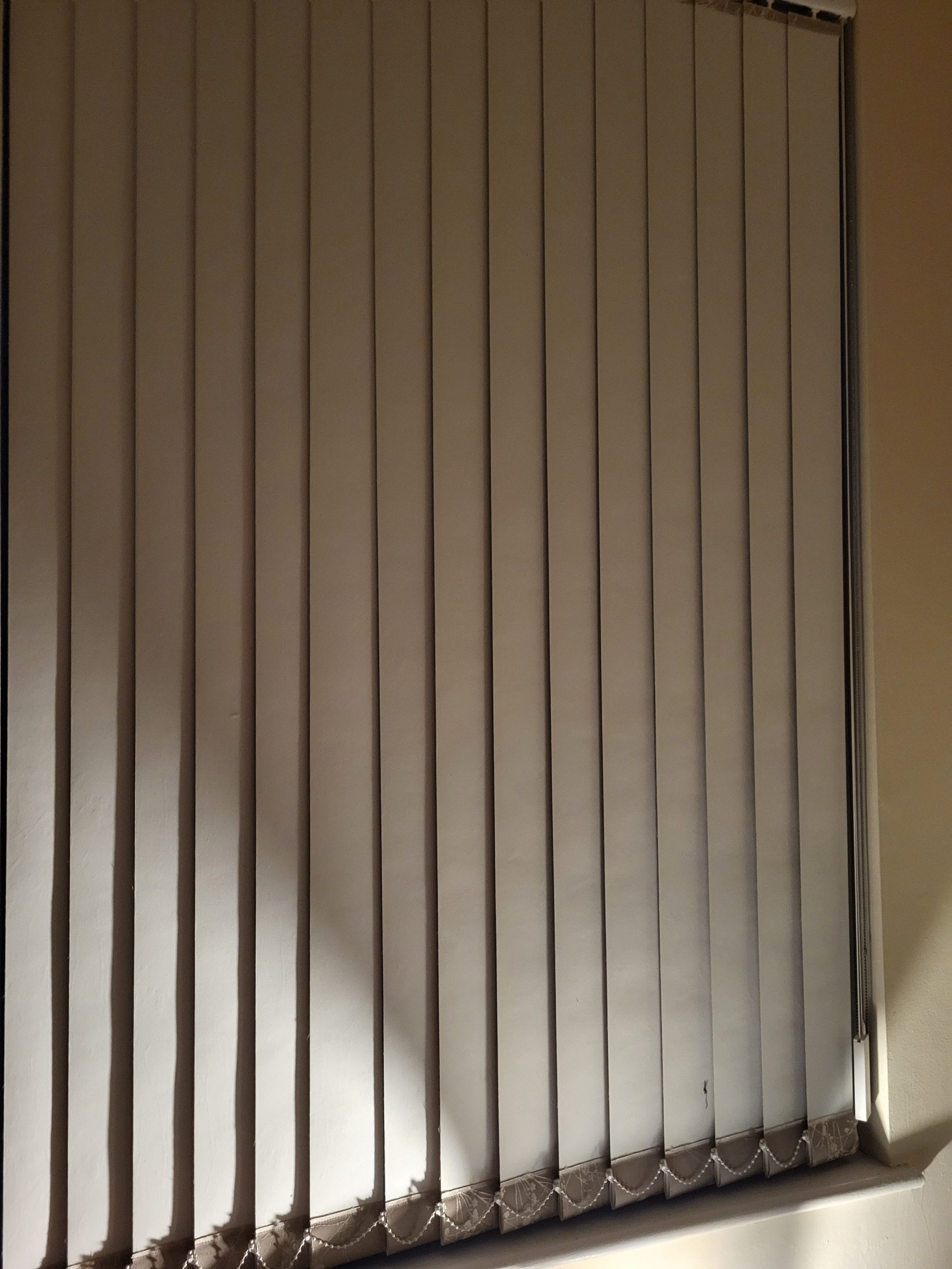
The first image was taken of blinds that cover a window in my house. I took this image because it reminded me of a multicolumn grid, which is referenced in the book layout essentials: 100 design principles for using grids (Tondreau, 2009). Multicolumn grids are made up of vertical containers and can vary in height and width. The image of the blinds has varying width columns that are all the same height.


The first image is of a chopping board found in my kitchen that uses typography in a grid format. The second is an image of Humber bridge in which the centre of the bridge looks like a grid. Both these look similar to the hierarchical grid, which breaks the ‘page’ (or in this case bridge and chopping board) into zones and mostly consist of horizontal columns which are not always necessarily the same height.

The information shown on the back of the fairy washing detergent (especially that under number 3) is most comparable with a modular grid. Modular grids are more often used to give complex information, and they combine both horizontal and vertical columns.
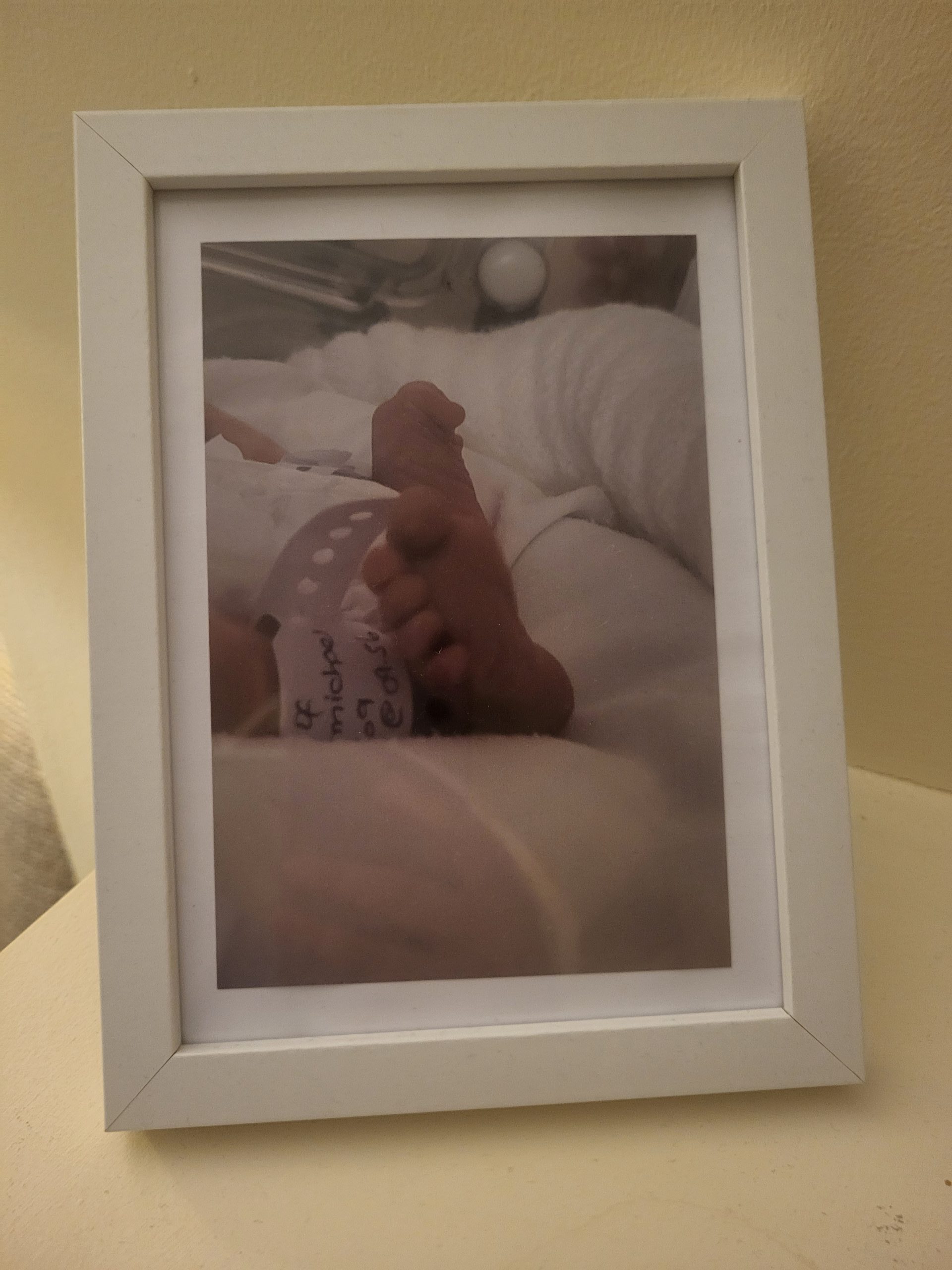
The image in the photo frame looks most like a single column grid. This is a grid that contains only one column and most commonly contains large amounts of information that the designer wants to showcase on the page.