Composition is the structure of elements within a design and how they combine to form a whole image. Composition refers to how the designer arranges and organises text and images to create a message through design (Dabner et al., 2020)
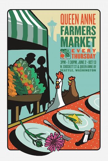
This is a poster from 2016 for Queen Anne’s farmers market. The design represents the community coming together for a meal as a community at the market. The market is Seattle’s only independently run farmers market and hosts live music, chef demos and activities for children (QAFM, N.D.).
This is an example of good composition because immediately your eyes are drawn to the area with the chickens and text, encouraging the viewer to read the information. Although the orange and the green of the title contrast very well with the yellow sky, the green does blend slightly with the shadow of the city. The next thing that is noticed by the viewer is the vegetables on the stall. They are designed in colours you’d expect for vegetables and they are very pleasing to the eye. The images used are all farmers market related making this design fit for purpose.
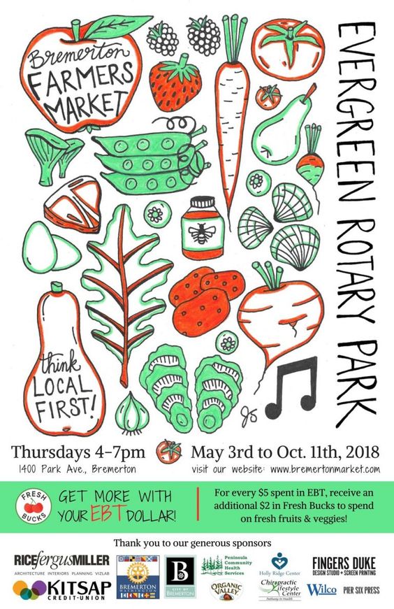
Bremerton market is a market that runs May to October, providing low income families with access to quality food, whilst also supporting local agriculture (Bremerton community farmers market, N.D.).
When looking at this design, there is no particular area that seems to draw focus. Although attempt has been made to draw attention to the text on the far left, due to the larger text, because it is tucked off to the side, it has not been effective. The important information does not stand out, making the viewer unsure where to look initially. The colour scheme uses mainly the same shade of green and orange, with the sponsors in varying colours. This could mean that the viewers eye is drawn to the sponsors rather than the main event, which while it is beneficial to the sponsors, does not benefit the main event.
The first thing you are drawn to when looking at the redesign is ‘evergreen rotary park’. This is due to it being central and in larger, more bold text than the rest of the design. It is important this is seen first as it is the primary location of the market. The next part the reader is drawn to is ‘Bremerton farmers market’ which tells the reader what the event is. To further give the impression of a farmers market, the colour green with brown has been used in varying shades from the pantone non-coated swatches, to indicate nature, pointing towards farming. There is then images of food items likely seen at farmers market, which further pushes the purpose of the design. The ‘think local first’ text has been typed in a handwritten, informal style font as it is not informative, like the rest of the text in this design. The date, time and address have been put in a white rectangle with black text to allow it to be seen as more crucial information in comparison with the website URL below.
References
Bremerton Community Farmers Market (N.D.) About us. Available online: https://bremertonmarket.wordpress.com/board/ [Accessed 31.10.2021]
Dabner, D. & Stewart, S. & Vickress, A. (2020) Graphic Design School. London: Thames & Hudson.
QAFM (N.D.) Building community. Available online: https://qafm.org/about [accessed 31.10.2021]