A visually responsive website is a website that will adapt to what device the user is using and still be accessible. For example, often in an app the menu which is horizontal on the website, is condensed into a side bar, which is accessed by tapping on 3 horizontal lines (sometimes called a hamburger menu).
Having a visually responsive website is extremely important in web design, because users could be using a variety of different devices to access the webpage, and if it is inaccessible for them, they will leave the site very quickly, meaning the objective of the website (ecommerce, to inform, to sell tickets to an event etc.) will not be fulfilled.
Examples:
The first example is skyscanner.
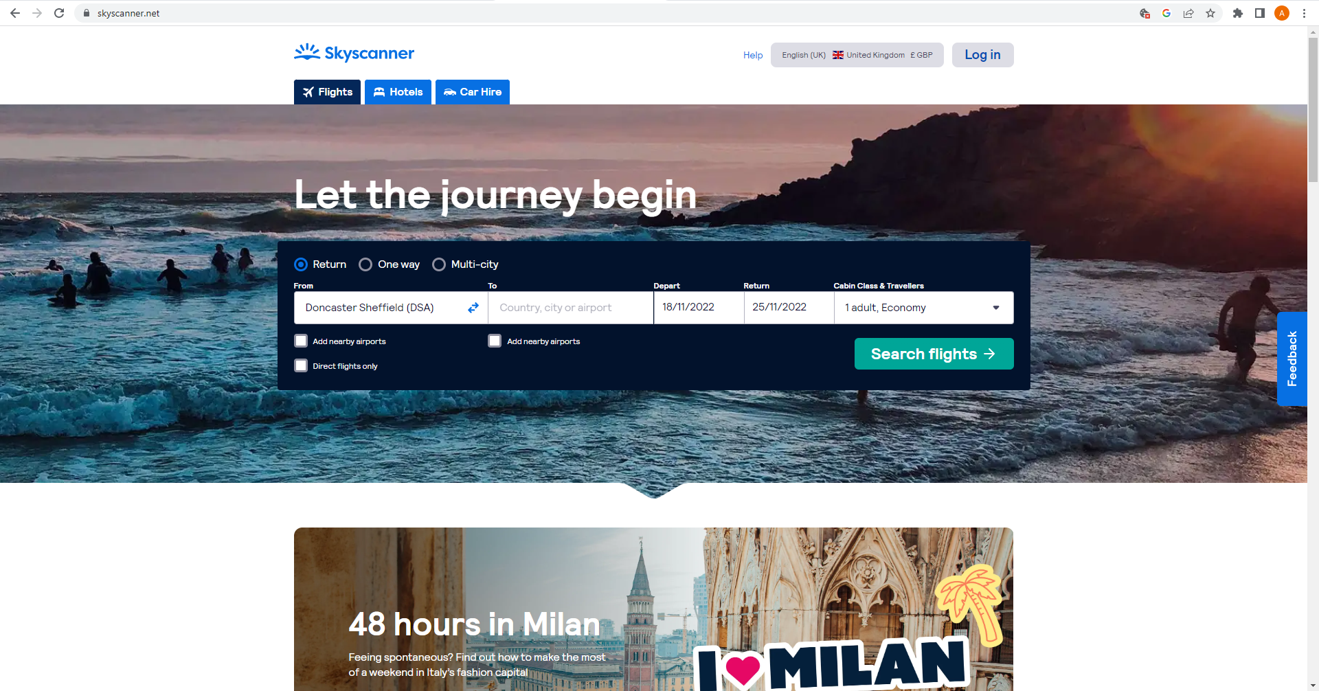
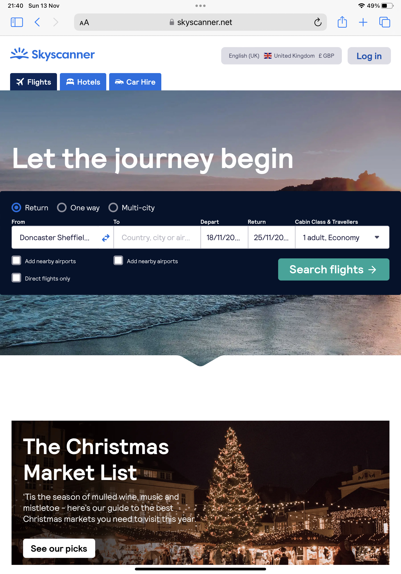
When you look at the Skyscanner website from desktop, you can already see how they have set out the website to be accessible for tablet. All the call-to-action buttons and information are central, leaving gaps either side for when you access the site on tablet in portrait mode and they’re cut off. You can see below how the site looks from tablet and which area of the site is not visible to the user.
Skyscanner also offer an app for mobile users, to make the mobile experience even more accessible.
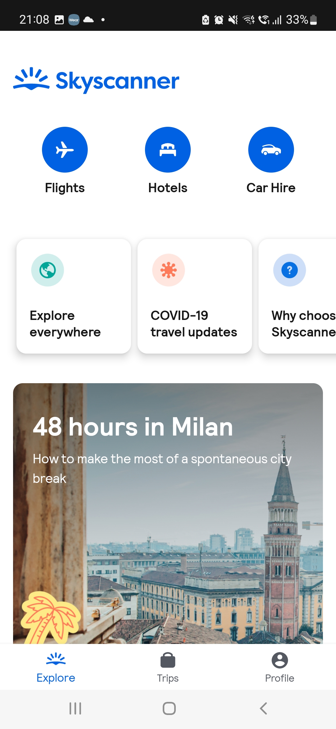
With the app it has been kept much more simple than the website, with three main call-to-action buttons at the top, prompting the customer to click to tell the app what they are looking for. This differs from the website, because the home page of the website has flights already selected with the option to change above in the menu bar. Because the app has limited space, due to a smaller screen size, they have tried to keep things as easy to use as possible with simple navigation, to remain accessible.
The second example is a design I’ve recently done through freelancing. The customer requested that I draw (in a non realistic way) a mockup of what their website may look like on different devices for their website.
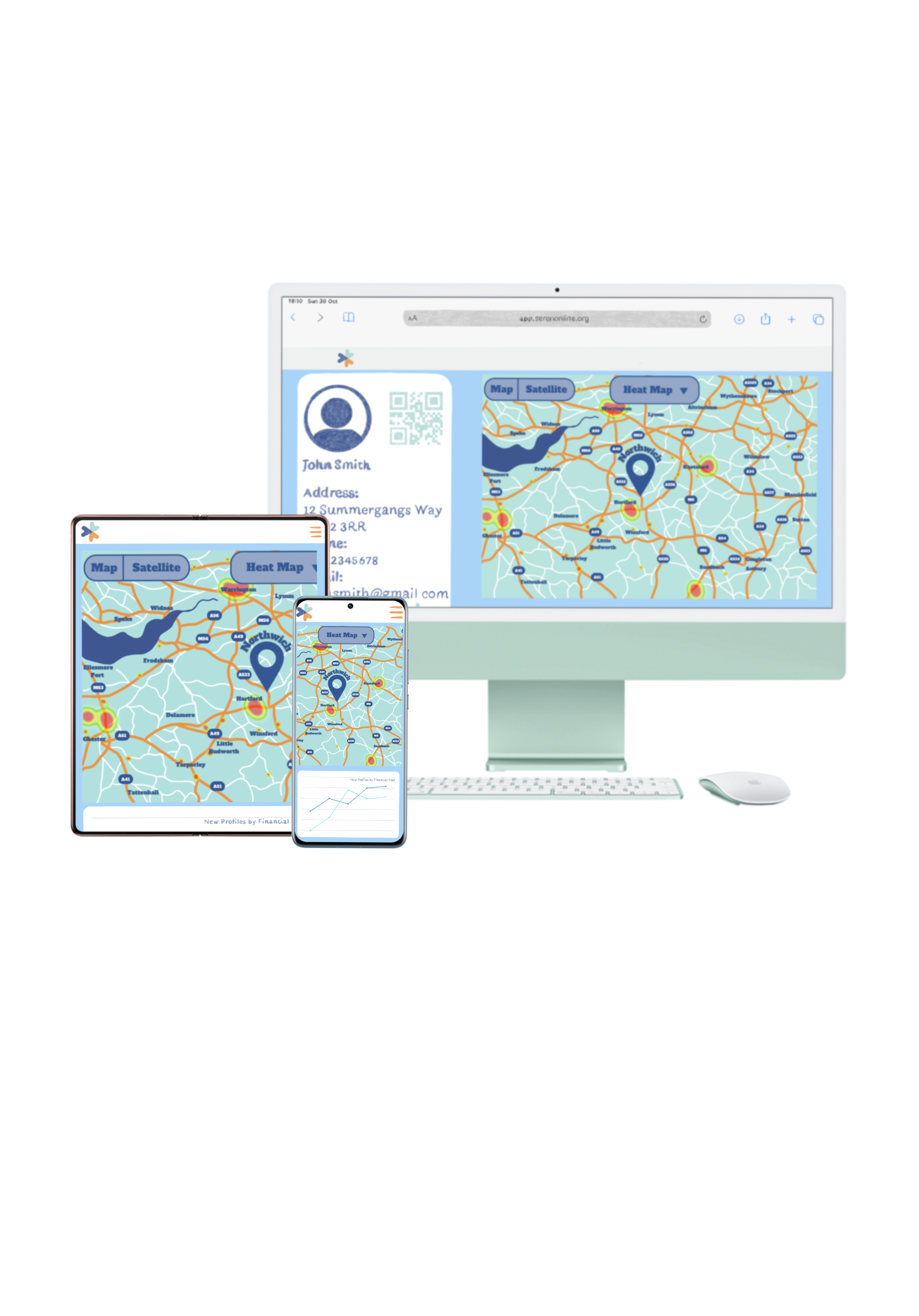
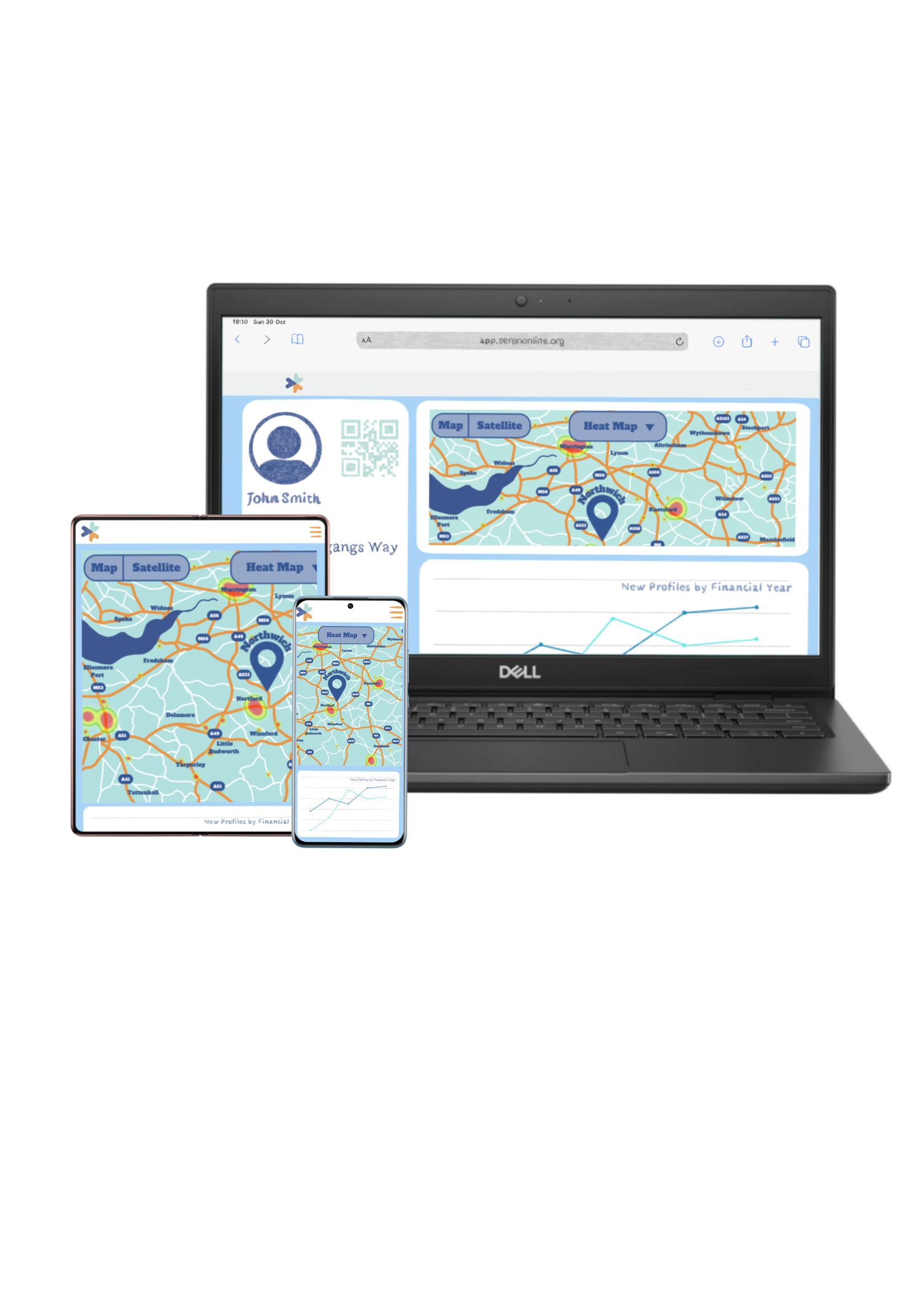
For this I created a website for them with the requirements that they requested, and then I made what I saw to be a visually responsive website and converted it to tablet and mobile (app).
For the tablet and app, I kept them quite similar, in that they are simple and accessible for the customer, with a menu that opens when you click it (the 3 lines) and showing just the map and graph, rather than everything squashed in.
Originally the top bar on the website did have a menu across, but that was removed at client request.
My third example is an example of a visually responsive website, that I feel does not do the job as well.
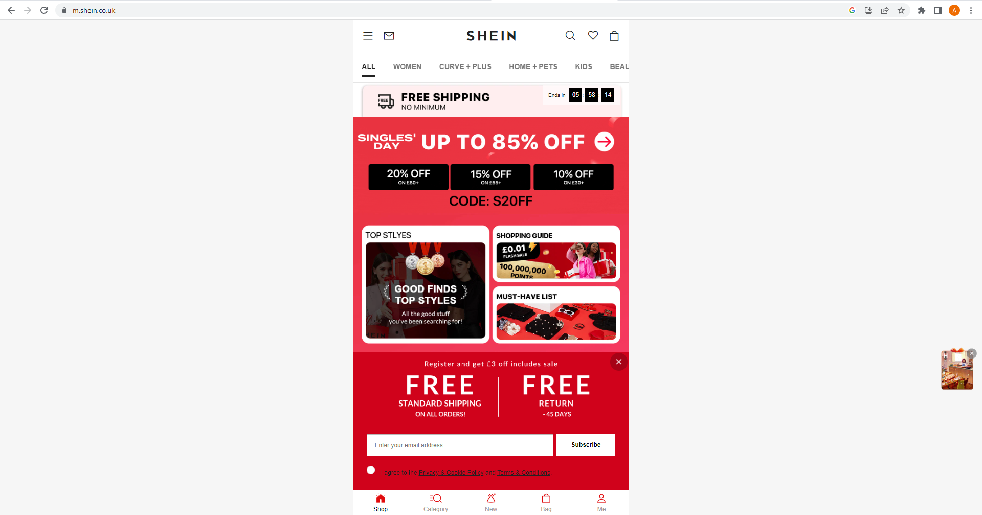
Shein is an ecommerce website that offers fast fashion. As can be seen from their website, their initial design caters more towards app and tablet users than web users. The screen is entirely central and is identical to the app, with no attempt at arranging the site to fit the standard web size (1280px x 1920px).
This gives off an unprofessional look and may make the customer less likely to place an order. It could also convince the customer not to order because they may think its a scam website, as so little effort has gone into catering for desktop users.
References:
Skyscanner (2022) Let the journey begin. Available online: https://www.skyscanner.net/ [Accessed 13.11.22]
Shein (2022) Homepage. Available online: https://m.shein.co.uk/ [accessed 13.11.22]