In terms of graphic design, brutalism is a style that attempts to look raw, haphazard or unadorned (Moran K., 2017). Looking at brutalistwebsites.com, they are a complete different style to what would be expected from a web page; they are bold, seemingly random in placement, and some difficult to navigate, which after studying accessibility last term, seem very different to what we have seen and been designing.
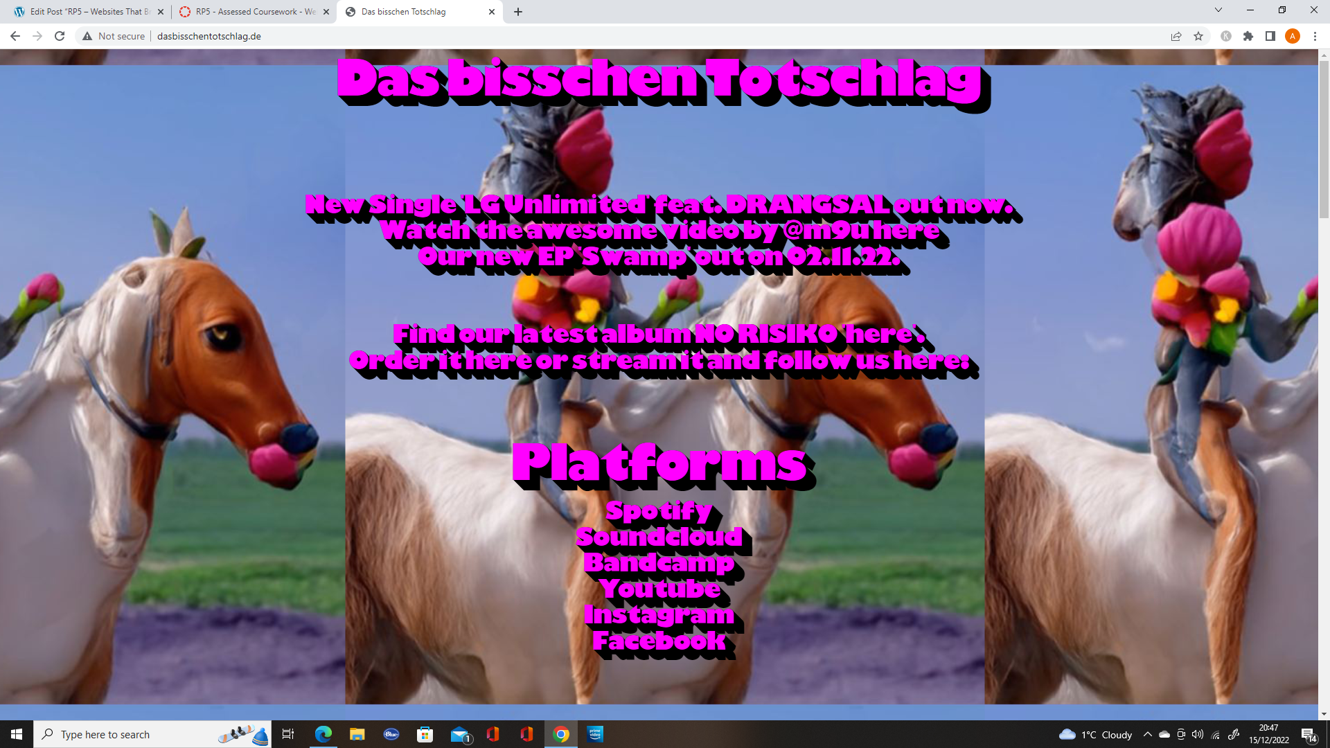
The first website that caught my eye on brutalistwebsites.com was http://dasbisschentotschlag.de/. This website appears to be a website for a band/artist to advertise their music on, with links to their social media.

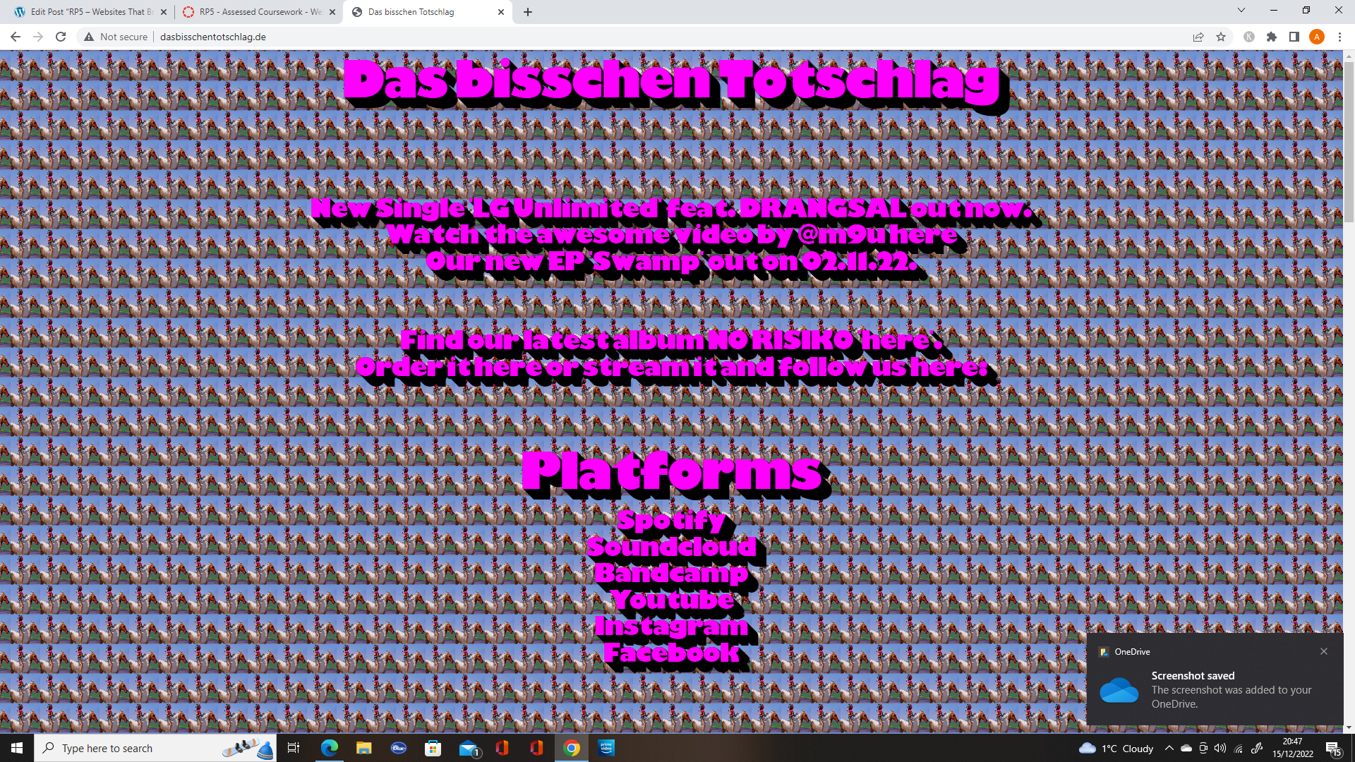
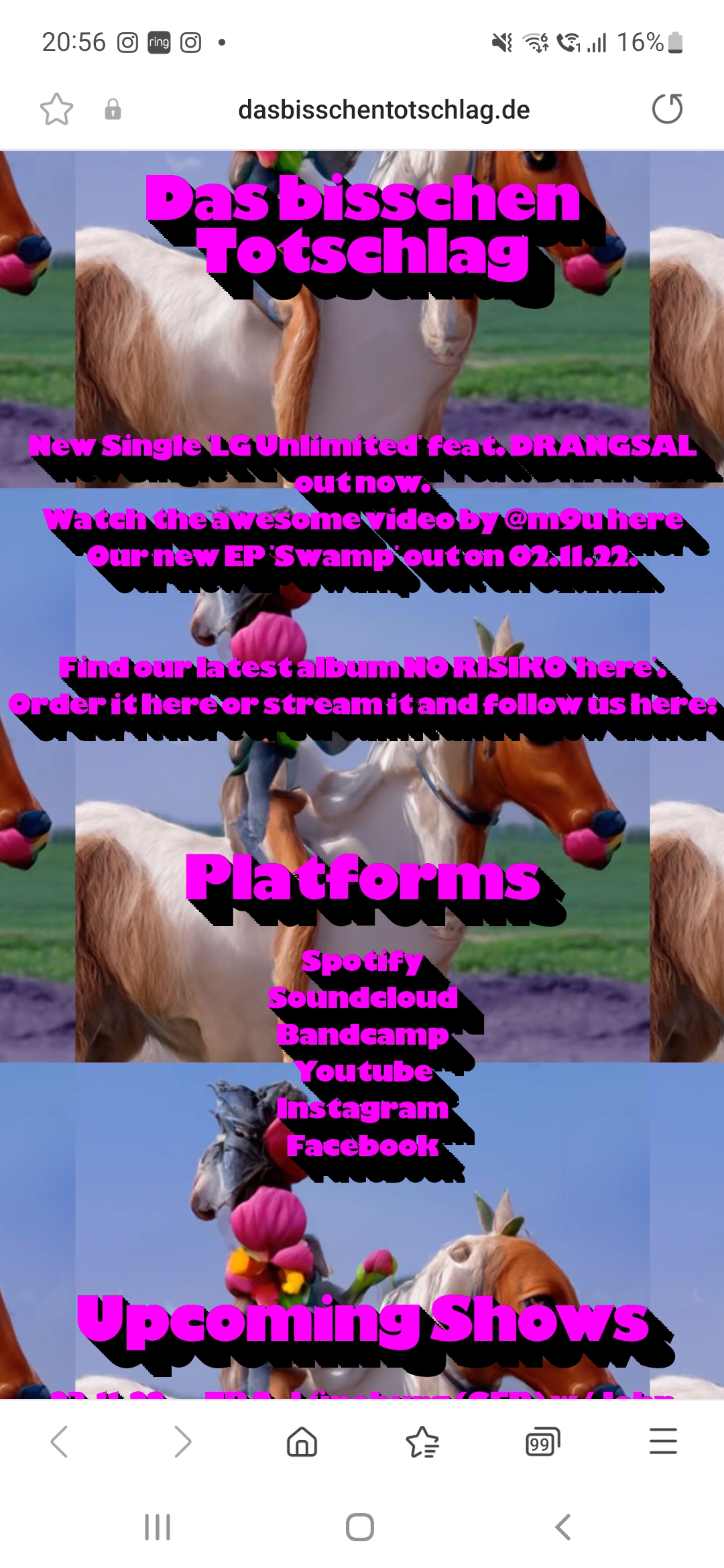
As shown in the images above, the appearance of the website is different depending on the location of the mouse. The background is an images repeated in a modular grid format and if the mouse is low, the images are larger (zoomed in), and if the mouse is high, they get smaller (zoomed out).
The use the same font, with the same colours, which is in a block style with a shadow effect, using pink for the text and black as the shadow.
They give the impression from their website that they are likely a quirky band, with the brutalist style of their website and use of images.
One thing that I did not notice until I looked at the website from my phone, is that you can actually scroll down and view their tour dates, but due to the animation with the mouse, it gives the impression that the website just has links to their social media. They could benefit from adding a link specifically for tour dates, as it is not obvious that they are there on PC.
The next website that caught my eye was http://www.pobzeznik.net/. This website has a wide range of images that are added one by one in a large modular style grid.
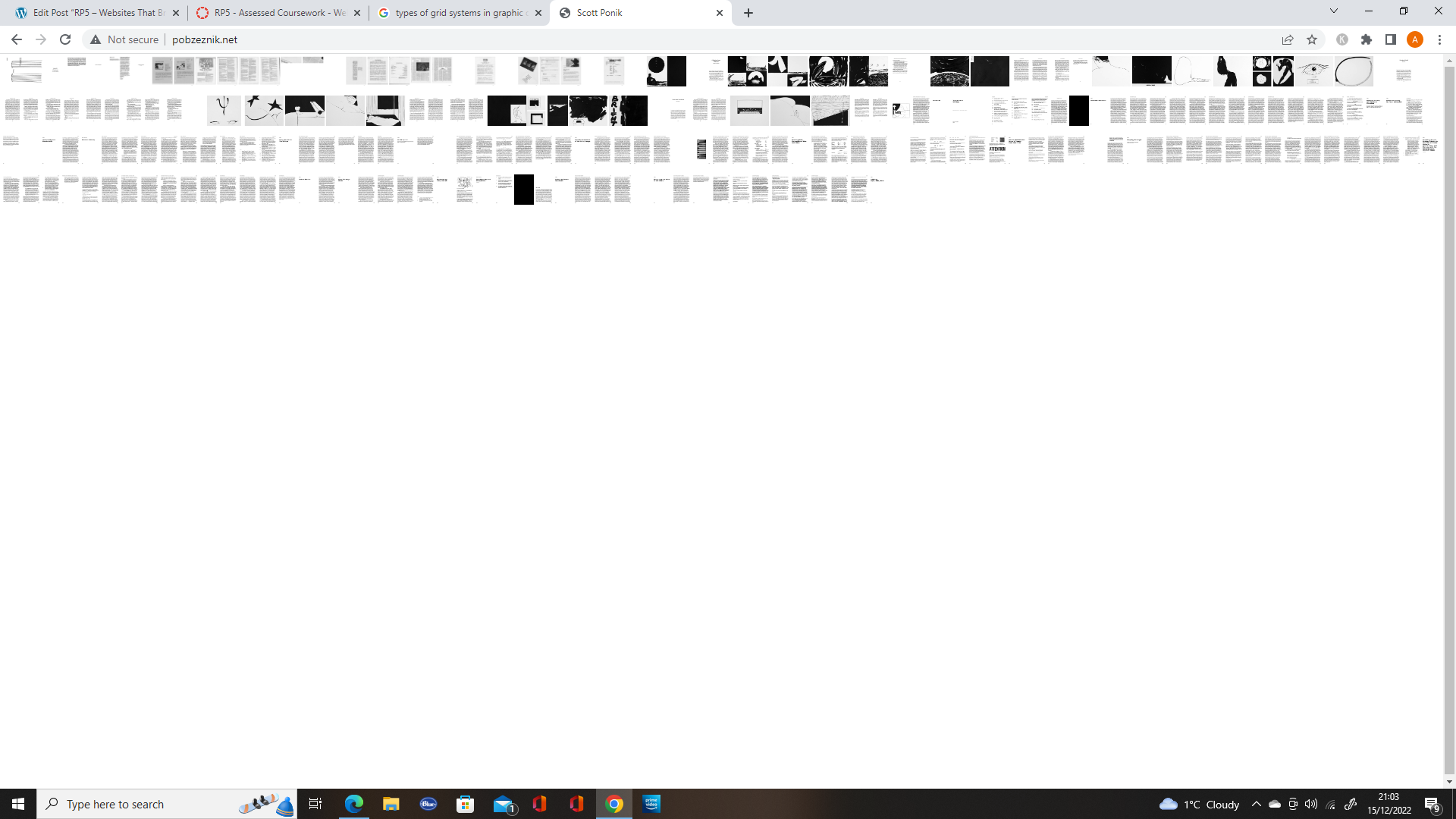
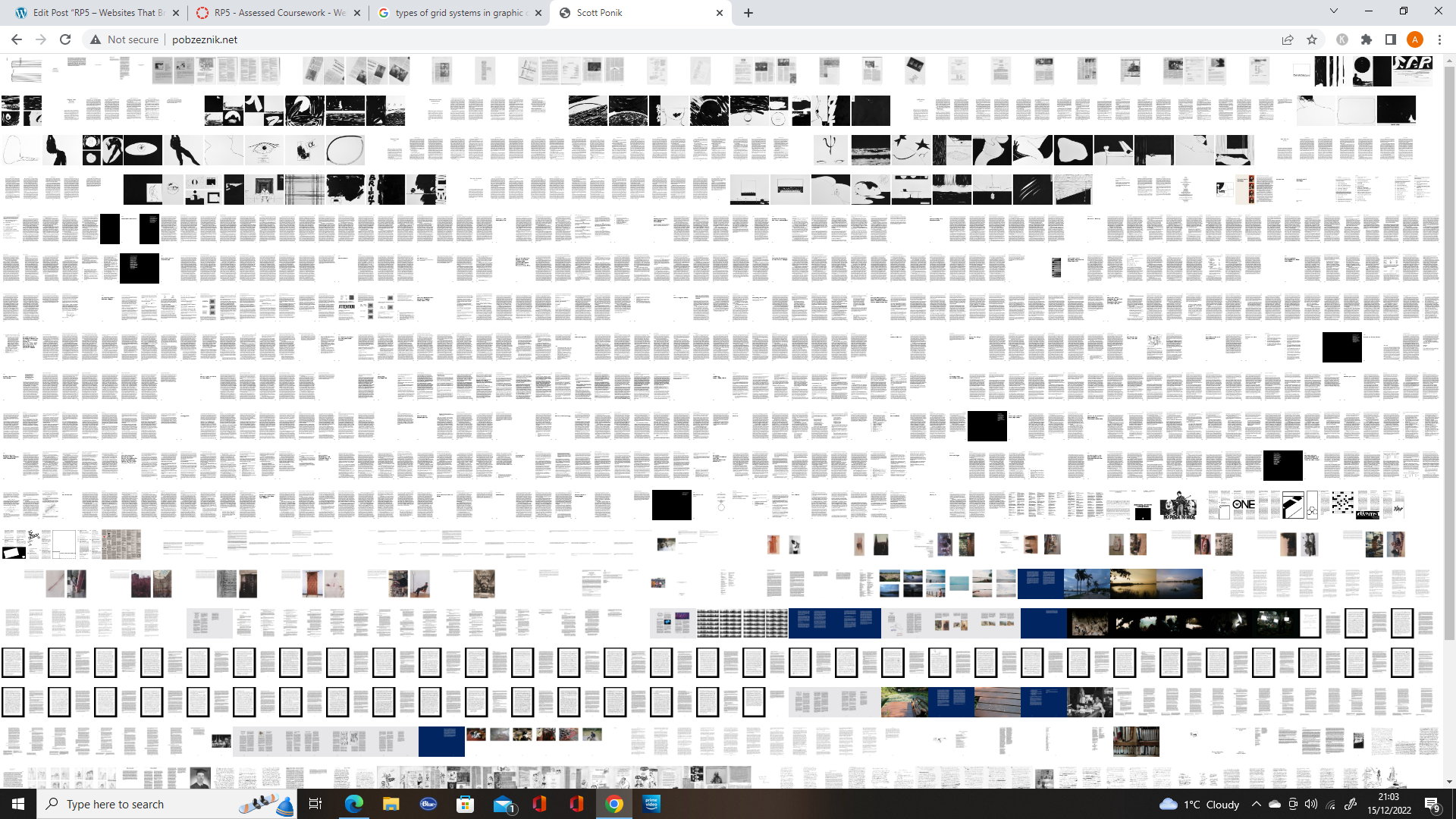
Once the images are all there, it can be a little overwhelming as there are so many and it’s impossible to see them, as they are so tiny. From there I attempted to use the zoom feature on Google chrome to view them.
It was when I did this I realised that you could view the images with a feature built into the website. When you scroll over images a circle appears with a clipped zoom if the image, allowing you to view it.
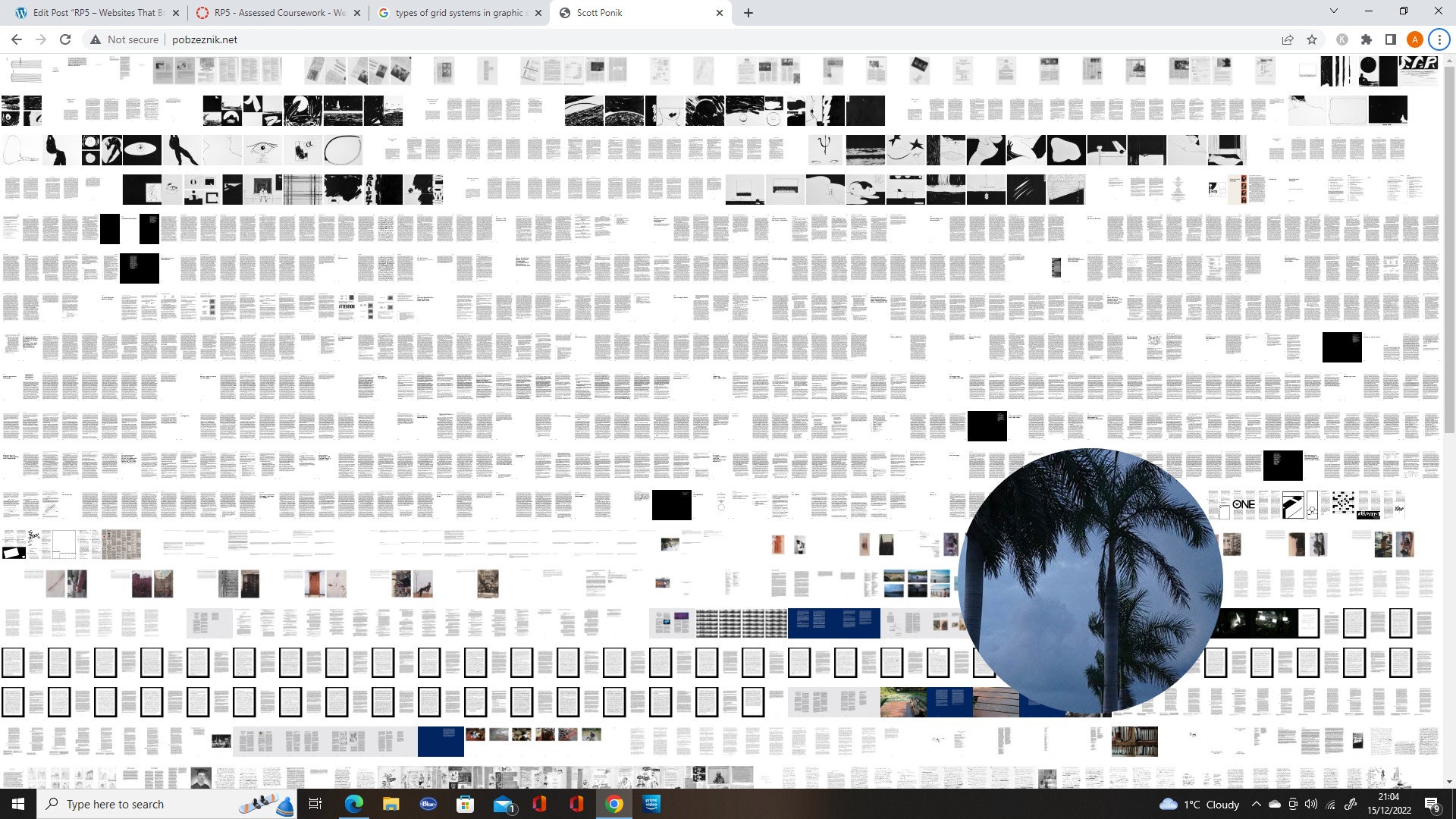
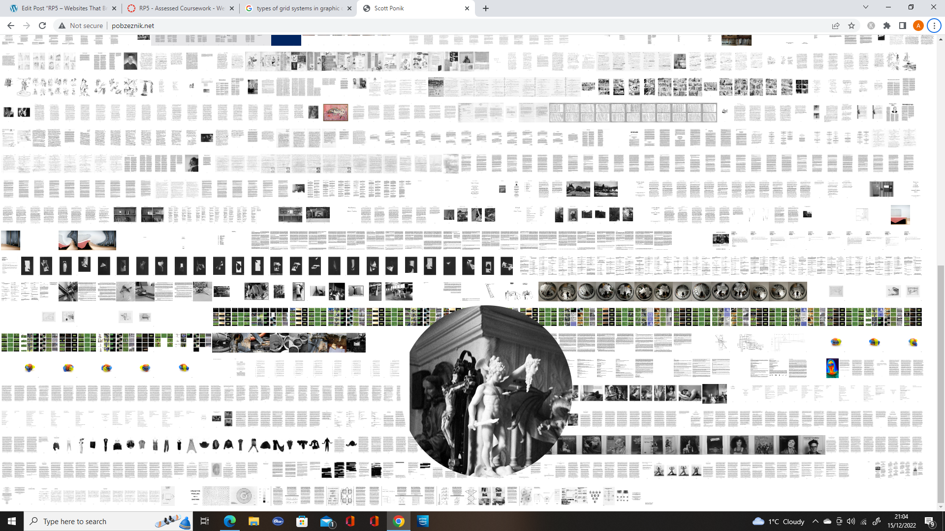
Fig 10. Image 2 of the zoom feature on the website.
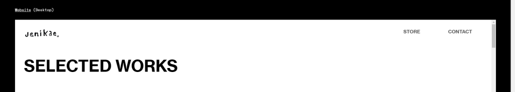
The third website I chose was https://sidleung.com/. This website is showcasing the works of a communication designer.
When you move around on the page the abstract style background moves with the mouse, creating an optical illusion style for the website.
On the website, the designer showcases their work in the works section, using different types of grid, to keep it interesting.
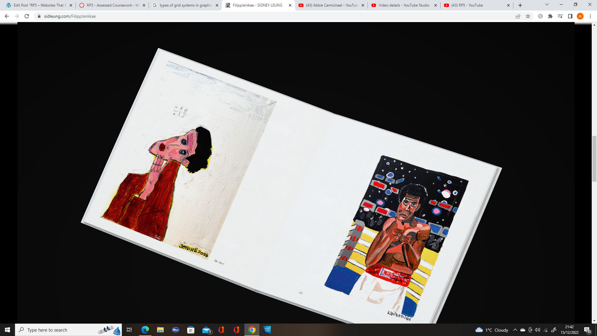
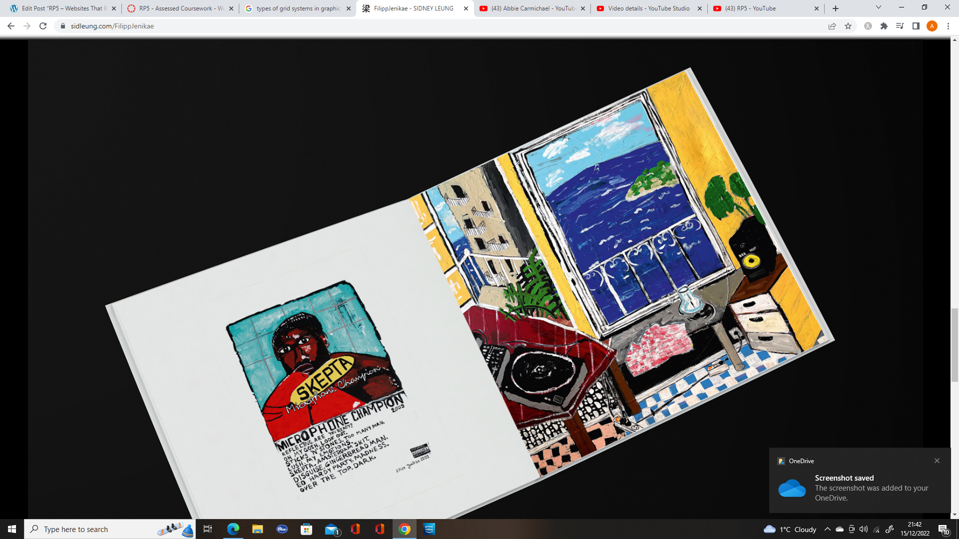
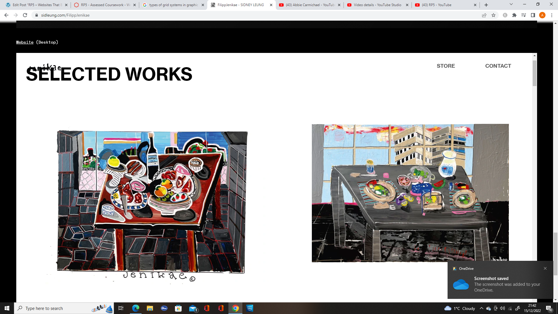
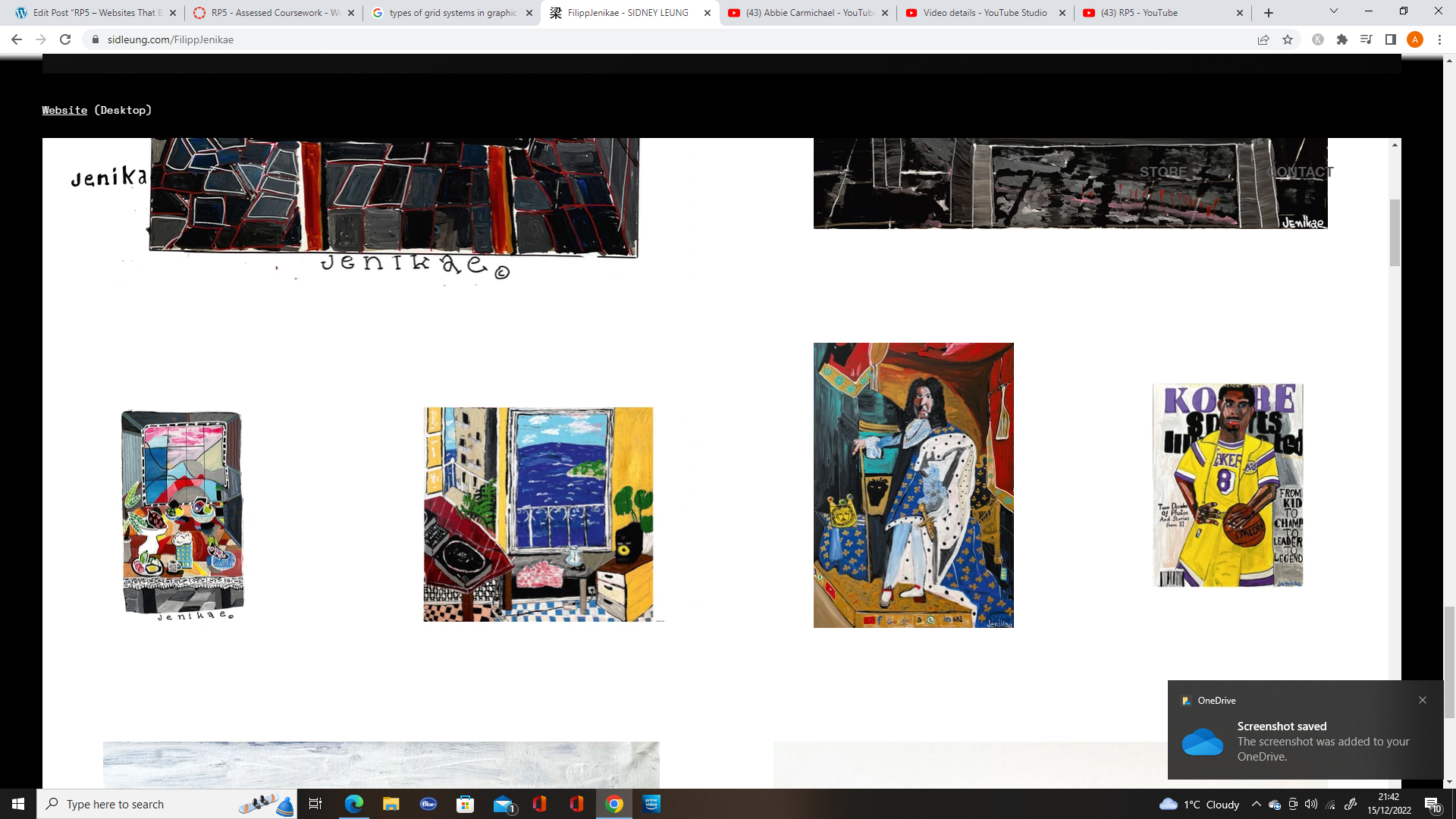
The designer also uses at least three different fonts, which is not usual for a website, especially when the text is so near to each other, but is more common in brutalist design.
References:
Moran K. (2017) Brutalism and Antidesign. Available online: https://www.nngroup.com/articles/brutalism-antidesign/#:~:text=Brutalism%20in%20digital%20design%20is,Craigslist%20and%20the%20Drudge%20Report). [Accessed 15/12/2022].