The website and app for the festival will include themes and colour schemes related to musical theatre to ensure it is fit for purpose. The site and app should immediately draw in the users attention to specific areas of the site (Such as the buy tickets link) to ensure full accessibility for the user and to achieve the purpose of the festival (to sell tickets). It should be obvious the theme of the festival from first glance.
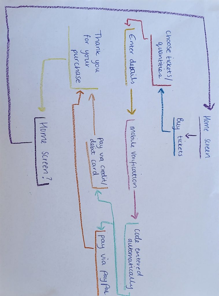
To ensure that the journey from getting from the website/app to purchase is as easy as possible for the user, the call to action process with be made as simple as possible, with ease to navigate. The user will be first greeted by the home screen that will have the option to buy tickets in a visible place to the user. From there, they will then choose which ticket they would like, with quantities and then straight to their details. Once they have entered the details required, their mobile number will be confirmed via sending a verification code to their phone, which will automatically be entered on receipt of text. From there they can choose to pay via PayPal or debit/credit card, which once successful will take them to a thank you page and they will receive a confirmation email with their tickets.
Although sound can add to a website and/or app, it has been chosen not to be used so to accommodate to those with sensory issues, who may struggle with sudden/unexpected sounds.
There will also be options in the header to get more information on being a stall holder or selling merch and what’s needed to do so. It might take them longer than the user to navigate, but because the main purpose of the website is to sell tickets, this should hold most of the focus.