The following is a rejected low fidelity design for the festival website:
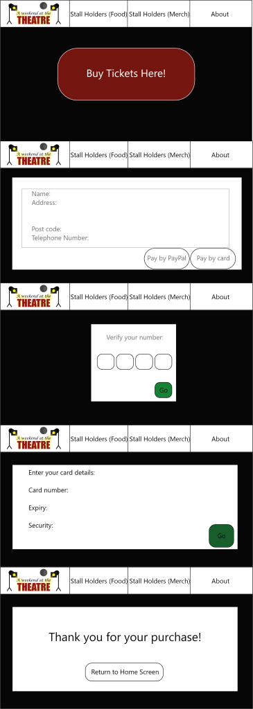
The text forming the menu on the top header is too cluttered and would be better formed as a side bar to allow users to look at other things should they be interested. The webpage itself looks quite dull in comparison to what the festival is about with use of black and white as the primary colours. This can be improved by using bright colour (Yet contrasting enough to remain accessible) and by including more images.
It may also be beneficial to include a countdown to the event to create a sense of urgency to buy and encourage more sales.
By using the festival concept to inspire design on the website, it will let the user know that the festival is going to take into account their interests and is not just trying to get sales regardless of the audience.